Friday, May 31, 2019

Worldbuilding Magazine Cartography Contest

Shortly after I'd finished my entry for the Monochrome Map Challenge, the Worldbuilding Magazine Cartography Contest popped up on my newsfeed.  Each issue of Worldbuilding Magazine typically features some aspect of worldbuilding as a central theme; the theme for the August issue will be “geography" and they partnered with Wonderdraft to run a contest for maps with the winners to run in the August issue.  I can't resist a contest, so I decided to put together an entry.

Unlike the Monochrome Challenge, there are no real restrictions on the map for this contest.  The only real requirement is that “Image size should be at least 1536x2048px."  That's actually a little bit of a challenge for me.  Obviously I can generate a map with any given pixel dimensions (SVG scales without loss) but I don't think they really want a very high resolution small map; they're looking for a more traditional “continent" sized map.  I have done some work on generating continent-sized maps but that is not complete, and it's a bit of a pain for me to work on big maps because they take a long time to generate and render.  But needs must as they say.  At least I can do most of the styling work on smaller maps before moving on to a bigger map.

I'm not going to step through every design decision I made for this entry (like I did for the Monochrome entry).  But I will hit some highlights.

For an overall style I settled (somewhat randomly) on a muted palette to give the feel of an old, faded map.  I won't present it as a book page, but as a standalone map.  Along those same lines, I'll use a compass with a muted color scheme and a simple map border.

I decided to use a faux 3D style for representing mountains, as shown in this excerpt:
Since this contest is sponsored by Wonderdraft, I expect a lot of entries created with that tool, and I wanted to distinguish my map from those.  Wonderdraft represents mountains with icons so I wanted to avoid that style.  When I started playing with the style above, I realized I didn't have any way to control how dramatic the coloring is, so I added an option for that.  For example, I can turn the coloring down to create a more subtle indication of the landform:
Overall I'm going for a subtle, faded style in this map so being able to dial in the terrain shadows is very useful.

Adding a Lost Coast to this map triggered a bug.  It was possible for the Lost Coast to be on a part of the map that wasn't visible (beyond the edge of the map).  That was fixed by checking visibility as candidate locations are investigated.  Another problem was that the Lost Coast was right on top of a barrier island.  Both features look for a section of flat coast for placement, so this should have not been a surprise.  The fix involved setting the Lost Coast (which gets created after the islands) to stay away from the islands.

While I was working on barrier islands, I decided to fix their generation.  When I first implemented barrier islands I had an issue with the underlying Voronoi regions on the map being too big to properly show narrow, broken islands next to the shore.  I addressed this by adding the ability to represent land as a polygon unconnected to the Voronoi regions.  This worked well as far as it went, but the polygons I could generate were somewhat unsatisfying -- long blobs:
Since then, I revisited how I generate the Voronoi regions and adopted an approach where I use very dense Voronoi grid early in generation and then “downsize" the grid after capturing the detailed coastlines.  This permits me to generate very detailed land without later overwhelming the browser trying to display the map.  With this approach in place, I can generate barrier islands using the dense Voronoi regions, allowing me to generate more detailed and broken islands:
These look much better.

I also wanted to include an ocean illustration on this map (since it will be a continent-sized map and the larger ocean will have ample room for an illustration), and discovered in turning that on that it had a bug resulting from a new way I adopted for loading external SVG.  There are so many different features in Dragons Abound that I often find old features that have stopped working for one reason or another.

With those changes in place I was close to a finished map, but I then ran into another problem -- I was unable to save the whole map as a PNG file.  It's surprisingly difficult to save an SVG image out of a browser.  Unlike (say) a JPG image, there's no “Save Image" or “Save As" option for SVG elements.  There's no way to save a web page as an image, and if the image is larger than the screen you cannot use a screenshot.

So far, I have been using the SaveAsPng library to capture images.  This has generally worked fine, but it runs into problems with larger maps and crashes the tab.  The method for converting an SVG into a PNG is a horrible kludge -- it involves turning the SVG into a data URI, writing that into an HTML canvas element, extracting a data Blob from the canvas, and then writing that out as a PNG.  The SVG for a map of the size I'm doing for this contest is almost 300M, and at this size the step of writing that into canvas element overwhelms Chrome.

I took a look at the SaveAsPng code and I don't see any obvious way to avoid the problem.  In the meantime, there are a couple of possible workarounds  for getting a screenshot, although they all have drawbacks.  The SaveAsPng code actually works (at least in limited testing) on Firefox, but there are other problems on Firefox -- it has aggressive security code that rejects some fonts, and prevents images in the map (such as the compass) from being captured by SaveAsPng.  It might be possible to work around the image problem but overall it's not a good solution.

Another approach is to save the SVG, view it in Inkscape, and then print from there.  This sort-of works -- again, there's some problems with fonts that have to be manually corrected.  It's also a slow multi-step process.

There are some Chrome extensions that promise “full page" screenshots.  Unfortunately, the ones I've tried fail to actually capture the whole map.  It might be that I could adjust my HTML to help them work better, but they also take a long time -- several minutes -- to create a capture, so that doesn't seem like a workable solution.

Finally, the Chrome developer tools include a screenshot tool that can capture the entire screen.  This works quite well and only takes about 15 seconds to capture a large map.  The drawback is that it is only accessible via the Chrome developer console, so it can't be used as (say) a button on the map webpage.

For the moment I can use the Chrome developer tools to get my screenshots, but in the long-run I'd like something that would work from the webpage itself.

With the basic style established, I then generated some candidate maps using different random seeds, and selected one that I thought looked interesting:  a single continent with two extensive river valleys on opposite sides of some interior highlands, a complex southern coastline and expansive forests.  In the final step I tweaked a few location names and adjusted some labels.  This is the final result (click through for full size):
This is the sort of thing I can tweak forever, but I spent far too long on this as it is, so this is the version that I will submit.

Monday, May 27, 2019

Map Borders (Part 12)

Now I'm going to jump in on representing and displaying Celtic knots.

Recall that we can show the design of a Celtic knot as an array of walls and dots like this:
Every gray and black dot is an array location.  Note that because there are black dots in every corner (that is, the top and last rows start and end with black dots, and the same for those columns) that this array must have an odd number of rows and an odd number of columns.

(Now, we really don't ever use the black dots, so it's possible to condense this array to be just the gray dots.  You'll see this done in some of the tutorials and implementations around the Web.  However, that means you have to treat each row (and column) as offset from the previous row (or column), and that's a little confusing to picture.  And there's no real need to optimize this code, so I find it more straightforward to include the black dots.)

Each location in the array can have four possible values:  UNUSED, to indicate that it is a black dot, CROSSING, to indicate that it is a gray dot without a wall, VERTICAL, to indicate that it is a gray dot with a vertical wall, and HORIZONTAL, to indicate that it is a gray dot with a horizontal wall.  To create a default Celtic knot, we initialize all the gray dots to CROSSING, all the black dots to UNUSED, and then the gray dots along the top and bottom to HORIZONTAL and all the gray dots on the ends to VERTICAL.

After putting together a simple routine to output the appropriate dots and walls, here's what an initialized 25x5 knot looks like:
Walls around the edges, and everything else UNUSED or CROSSING depending upon location.  So far, so good.  Now let me work on drawing the whole knot.

Eventually I'll want to draw this as part of the map, so I'll need a number of parameters for drawing the knot (all of which will be need to draw the parts of the knot as well).  First is a location, which I will take to be the center of the (0,0) element of the array -- the upper left corner.  Next is a size, which will be the distance between two elements in the array in the x or y direction, i.e., the distance between (0,0) and (0,1) or (0,0) and (1,0).  On the drawing above, this is the distance between the centers of the gray and black dots.  (This assumes that the elements in the knot are symmetrical.  I might want to change this later, but for the moment that's what I'm assuming.)  I'll also need a width and a color for the cord.  Finally, when drawing any particular part of the knot, I'll need to know the “handness" for that location so I know which way to cross cords if necessary.

I'll start with drawing the crossings (gray dots).  These are drawn as Xs on the gray dots, sized so that each arm of the cross goes halfway to the next gray dot.  So two crosses kitty-corner to each other will meet:
With solid black you can't see whether the crossings go over-under appropriately, but you can at least see that there is the correct pattern.  However, I'm drawing round ends on the lines, and I'll need butt ends.  I'll also add a frame for debugging purposes:
Now you can see that the crosses have butt ends and stop short of the edges of the knot (where they'll eventually be met by pieces of the knot drawn where the walls are).

To see if the knots are crossing properly, I can draw the knot twice, once in black and then again in white a little narrower.  This will give the cords edge lines and show how they are crossing:
Or maybe not.

A little more thought and I realize that I can't draw all the black and then all the white to show the crossings.  Oh well, it's these occasional glimpses into my failures that make me a sympathetic character.  Or something like that.

I can draw the black and then the white, but I need to do it individually in each crossing, rather than all the blacks and then all the whites:
That's an improvement, and shows that the basket weave is working.  However, there are faint black lines on the image.  I tried to draw the outline the way I did above -- drawing a fat black line and then a thinner white line on top of it.  Although the two lines are on top of each other and the white should completely cover the black, SVG uses antialiasing and other techniques that create the faint black line showing through.

The solution is just to draw each outline line separately:
There's still some mild anti-aliasing problems, but I'll leave those for later.  And since here at Dragons Abound I believe in thorough unit testing (or at least one extra test if it's easy) here it is with thicker cords:
Before I move on from drawing crossings, I want to add a couple of additional features.  This page in one of the online tutorials on drawing Celtic knots suggests emphasizing the shape of the cord by drawing the edge somewhat inside the cord.  I can do this by adding a parameter that offsets the black edge line away from the actual edge of the cord:
You can see now some white gaps where the cords cross.  This becomes more evident if I set the background to black.
The same page says that the central space in each cord is often filled with another color in medieval manuscripts to further sell the interlacing effect.  I'm not sure I'll use this, but it seems like a nice option to have.
This is making the dreaded anti-aliasing artifacts more visible.  I'll address these a bit later, but for now let me move on to drawing the rest of the knot.

The next step is to draw the cords at vertical and horizontal walls.  I'll start with the horizontal walls.  Recall that the pattern at a horizontal wall is for the cord to “bounce" off:
You can see how the cords at the top and bottom of the wall “bounce" off and get redirected.  The simple approach to this is to draw the cord from the neighboring gray points through the gray point at the middle of the horizontal wall, like this:
But drawing the cord that way creates a problem:
Because the cord has a thickness, it sticks out past the horizontal wall.  Here I'm only drawing half of the cord pattern I need, but if you look along the top row you'll see the problem -- the pattern sticks outside of the area.  And if you look at the bottom row you'll see that when I'm draw both halves of this pattern, they'll be drawn on top of each other.

To avoid this, we have to shorten the “bounce" so that it doesn't cross the horizontal wall.  And in fact, we have to shorten it a little more than that so that there's a visible gap for the wall.  This is why the cords do a three point turn in the above pattern:
I'll have to implement something similar:
Again, I've only implemented half of the wall, and I'm showing the wrong half on the bottom.  But you can see along the top wall how the pattern is working.  Implementing the other half just requires duplicating the code and swapping plusses and minuses in the right spots:
Now I need to add some logic to suppress the unneeded half when drawing this along the top or bottom.
Wow, that suddenly looks good.  For fun, I can try putting a horizontal wall in the middle of the pattern.
Cool, it actually works! :-)

Now I have to do the same thing for vertical walls.  This is a straightforward adaptation of the code for the horizontal walls; basically just switching X and Y.
Note how in the corner the bounce from the horizontal wall meets the bounce from the vertical wall to form a U turn.  Corners often get special treatment; at some point I'll implement some styles with special treatment in the corners, but this style looks fine.  For now, let me try introducing some vertical walls inside the pattern.
And voila!  A Celtic knot.

That's enough for now.  Next time I'll fix the anti-aliasing problems, develop some more styles and implement some capabilities I need to use knots in borders (such as generating random knots).

Monday, May 20, 2019

Map Borders (Part 11)

I have two major items left on my initial map borders list: Celtic knots and corner boxes.  In this post I start working on Celtic knots.  Although they look simple, it was not intuitive to me how to construct and draw them, so this installment proceeds fairly slowly to describe Celtic knots and illustrate how they “work." 

For those of you who are unfamiliar with Celtic knots (or unfamiliar with the term), Celtic knots are a kind of illustrated braidwork that has been used as a decoration for many years, including on medieval manuscripts.  Here's a simple example:
The interlacing of the various strands is the defining characteristic of Celtic knots.  Among their uses, they've long been popular as an element in map borders.  Here's an example from one of my inspirational maps:
Here's another one, with a more complicated pattern:
The key feature of Celtic knotwork is that each cord crosses other cords in an alternating pattern: first over, then under, then over, and so on.  If you trace any cord in the example above you'll see that's true.

What was not so obvious to me initially is that a row of crossings always have the same “handedness".  That is, every crossing in the top row of this braid has the same cord on top:
And then the next row of crossings has the other handedness, to maintain the over/under pattern:
So you can immediately tell how two cords should cross by the row they appear in.  (Or to put it another way, you can draw all the crossing in a row the same way.)

Another feature of knots is that the crossings alternate columns:
The crossings in all the red columns have the same handedness and the crossings in all the blue columns have the other handness.  (Another way to put this is that the rows are offset from each other.)

Now take another look at the example knot:
Notice anything about it?  It was drawn incorrectly!
In the bottom row, the cords go over-over (and under-under) instead of over-under as they should.

(Ironically, the first Celtic knot from my inspirational maps is not a true Celtic knot either; it has three rows and Celtic knots always have an even number of rows.)

With some insight into the crossings, let's look at the edges.  When a knot is artistically drawn it may not be immediately apparent, but at the edges of the design the cords “bounce off" of invisible walls at 90 degree angles:
Here you can see how the blue cord hits the top edge of the pattern and “bounces off."  In the corners, the cord bounces twice.  Knotwork is usually drawn with the cords following the walls (as in this example) or with rounded turns (as in the broken knotwork example above) which somewhat obscures the way the cord bounces off the edges.

That's about all you need to know to understand a simple braid.  What about a more complex pattern?
More complex patterns are created by adding additional walls where the pattern is interrupted and reflects off the new walls just as it does with the edges.  In this case, I've added three walls:
In the bottom corners, the pattern now bounces off three walls in row.

The last thing you might want to note is that spaces between the crossings form a regular grid, and the walls always connect two dots on this grid:
The crossings (or reflections of walls) all happen halfway between the red dots.  Here's a picture of the above pattern showing just the walls and the grid:
The big black dots here correspond to the red dots above, and the gray dots are the in-between dots where the cords cross or reflect off of walls.  This diagram also suggests a representation / implementation for Celtic knots:  an array where the black dot positions are ignored, and the gray dot positions are either “open," “vertical wall," or “horizontal wall."  Patterns can be created by placing a few walls into the array and leaving most positions “open."

The illustration above comes from a very useful online Celtic knot tool that you can find here.  That will let you play around with placing walls and designing patterns.  Try it out, it's quite entertaining!  For more interesting information on Celtic knotwork, see the tutorial here.  The tutorial has a clear explanation of how knotwork is designed and drawn.  The tutorial here provides an alternate explanation in terms of graph theory.

Now that I have an understanding of Celtic knotwork and an idea of how to represent a knot, let me  consider how to draw a knot from the representation.

My initial thought was to draw the knot as a series of paths, each one tracing completely through one of the loops of the knot.  I could start at one of the gray dots and trace through until I returned to the same dot, creating the path to draw.  However, I realized pretty quickly that this wouldn't work.  The problem occurs in the crossings.  In each crossing, I need one path to be atop the other path.  I thought I could do this by masking out the lower path.  (A mask blocks an area of the image from showing, so by blocking whichever path was supposed to be on the bottom, the other path would appear like it was on top.)  But many times a path crosses itself.  In that case, masking out the bottom path would also mask out the top path!

So I will have to draw the paths piecemeal.  I can certainly draw a whole path from one crossing to the next crossing, but since I'm drawing piecemeal anyway, it seems worthwhile to think about the smallest pieces I can draw.

As it turns out, you can draw any Celtic knot using just four pieces:  a left-handed crossing, a right-handed crossing, a two-sided vertical wall reflection and a two sided horizontal wall reflection:


(If you allow rotations, this is only two pieces, but for illustration purposes I am using four.)  There are two tricks to keep in mind.  First, at the edges of the knot you use only half of the reflection patterns.  Second, where two reflections meet (as in a corner) it is usually drawn more smoothly than just sticking two reflections together.

Here's a simple example of a knot:
And here's the same knot with the different pieces identified:

Note that there are holes between each of the pieces, corresponding to the big black dots in the diagram above.  Nothing needs to be drawn in these areas.  This is clearer if the path is drawn as a thin line:
You can see that in the red and blue tiles, you draw two lines crossing the tile; in the yellow and green tiles you draw two lines along the edges of the tiles.  If you make the lines connect properly at the edges of the tiles, you get a Celtic knot.

To review:  Celtic knots are composed of cords that follow an over/under pattern of crossing and reflect off the edges of the pattern and off of internal walls.  A knot can be represented as an array of points.  Points represent crossings or vertical or horizontal walls.  All crossings in the same row of array cross the same way, and alternating rows have alternating crossings.  To draw a knot from an array, you draw in each point the appropriate crossing or wall, and connect each point to it's neighboring points.

Next time I'll get started on implementing a representation and displaying it.

Monday, May 13, 2019

Map Borders (Part 10)

Addressing more map border problems and adding some new features.

One problem I created when I added elaborate map borders is that they now clash with the map caption (if there is one):
This happens because the caption is placed a fixed distance below the bottom edge of the map.  That was fine before, but now it needs to be placed below the bottom edge of the map border.  The only tricky thing about this is that because the border isn't (necessarily) drawn inside to outside, I actually have to test after every element of the border whether that element is the outside edge.  But once that's in place I just have to place the border outside of that edge:
You can see that the caption is now getting close to the edge of the “paper."  I just have a set amount of space around the map right now, and if I happen to generate a wide border it eats into that space.  The fix is probably to resize the “paper" after the map and border is complete; that's on the TODO list.

Sometimes Dragons Abound generates a “caption box" to frame the caption.  This is intended to look something like the name plate on a painting.  Those are usually centered in the bottom of the frame.  For a similar look, I will center the caption box in the map border.
It looks a little odd when the border line color doesn't match the color of the caption box.  However, there are only a few borders that have non-black lines, so for the moment I'm just going to let this go.

Another element I'd like for pattern borders is a stylized flower shape.  This is just a few petal shapes with a circle in the center.  For each petal, I draw two lines out from the center and then connect them with a quadratic curve:
This looks pretty good unless they get too small:
This is still okay, but just barely.

The number of petals can also be 6 or 7:
Beyond 7 petals the shape becomes illegible.  Right now flowers just draw from the standard border colors, but maybe there should be some flower-specific colors.

Stars and flowers are a nice combination:


Over on Reddit, Watawatabou suggested leaving the dark sides of moons visible like the do on tarot cards.   If you look at the examples on that link, you'll see there's actually a few ways that they do that.  One way is by essentially outlining the whole moon, both the light side and the dark side.

I looked at adding that to my routine for generating a moon shape, but that was decidely non-trivial, since the resulting figure – a circle with an embedded crescent – is not a simple polygon.  Then I realized there was an easier way to do this.  Since the Map Border Description Language (MBDL) can handle drawing a circle, and drawing two things on top of each other, I could just draw the circle for the moon outline and then draw the moon over it.
That's pretty nice and is certainly a good option.

Another possibility is to draw the rest of the moon in a different color.  This could be a slightly lighter or slightly darker color than the background.  Since I'm using a midnight blue border color here, I can try a darker version of the same color.  I use the same trick as above, drawing an entire dark blue moon behind the crescent.
It's somewhat visible but doesn't really stand out.  The very dark blue also registers as black and seems to break the color scheme.  It might be better to use a lighter color instead.
This is more visible, at least, but I'm not sure I really like the effect.  Maybe.

The most interesting approach is to extend the horns of the moon, as in this fanciful example:
Image result for moon tarot
I like this quite a bit, but drawing this is problematic for Dragons Abound.  The outside of the moon shape remains a portion of a circle – that's okay – but the inside of the shape is not an easy curve to describe.  It's certainly not an elliptical curve between the two points of the horn!  Maybe it's a smaller circle offset within the larger circle?  Maybe it could be approximated by two Bezier curves, but I'm not sure.  Beyond that problem, I don't have a good idea of how to move this through the phases from full moon to sliver and back again.  So I'm not going to tackle this (now) but maybe someone will suggest a good way to draw this curve and progress it through the phases.

One problem with my borders has been that if I have a square offset corner and a pattern, the pattern might not fit nicely in the legs of the offset.  It might get stretched or cut off:
One way to address that problem just occurred to me (somewhat belatedly).  For other layout reasons, before I display a border I go through and measure the length of any patterns in the border to find the maximum length pattern.  Since I know that when I set the square offset, I can use the maximum pattern length as a minimum size for the offset.  This guarantees that the pattern will fit at least once into the corner:
I can imagine complex borders with multiple patterns where this might fail, but it works pretty well for most cases.  The user can still force a particular corner size if that's desirable.

Speaking of corner offsets, another feature I want to implement is a diagonal corner.  I have exactly one example of a diagonal corner in my set of inspirational maps:
It's not impressive, but at least it gives you an idea of what I mean.  The truth is I don't have much interest in diagonal corners, but I tried to implement round corners and ran into such problems that I gave up.  Diagonal corners is a (hopefully) easier place to start.

My approach to a diagonal corner is to stop the horizontal and vertical sides of the border short and join them with a diagonal line.  To start with, I'll get the vertical and horizontal lines to stop the correct distance away from the corner:
Now I need to draw a diagonal line connecting side to top.
That's close-ish.  The problem is that the top line stops short.  This happens because when making a mitered end to a line, the line drawing routine keeps the end of the line at the furthest point of the miter.  This is nice because the line doesn't extend past where it should end, and further it correctly meets a miter from the other direction when they both have the same endpoint.  However, in this case that leaves the miter about a half a line width short of where I want it to be; the fix is to extend the top line a half a linewidth to the left.
Here I've only fixed one side, but it looks about right.

However, this has a glaring problem – the diagonal lines are wider than the horizontal and vertical lines.  This makes some sense when you think about it.  These lines are meeting the mitered ends of the horizontal and vertical lines.  The mitered ends are at a 45 degree angle, so each mitered end is about 1.4 times the width of the line.  (Since the cosine & sine of a 45 degree angle is the square root of 2.)

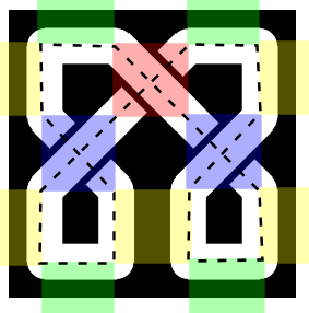
Fixing this is complicated.  What I need to do is overlap the diagonal line and the horizontal line this way:
Now both lines are the same width and meet at a 45 degree angle.  I know the coordinates of the center of the horizontal line:
And I need to calculate the center of the end of the diagonal line:
And in order to layer lines from inside to outside properly, I need to know the point where the insides of the two lines intersect:
My teeth are hurting just thinking about this!

I did what I always do when I'm faced with a math problem I can't easily solve – I sent it to my kids.  They're much better at math than I am.  (This is an under-appreciated advantage of being an older developer.)  Sure enough, one of them solved for the red point based upon the blue point and the upper vertex.  And it turns out that the pink point is basically offset by the tangent of 22.5 degrees times the width of the line.  (I did that myself so it's probably wrong, but it seems close enough.)  So with those calculations in place:
And now all the lines are the same width and everything matches up nicely!  At least in this corner, I still have to do the other three, but that's mostly a matter of bookkeeping and flipping the sign on the offset calculations appropriately.

The second step of diagonal corners is to make patterns go around the corner.  Initially I wrote two routines that could handle drawing patterns vertically and horizontally.  And those routines were also sufficient (with some tweaking) to handle offset corners, because those are just more vertical and horizontal pieces.  But as I started thinking about implementing diagonal corners I realized that it was better to think about drawing a pattern as laying out elements along a path.  With an algorithm that could “follow a path," I could just trace where I wanted the pattern – around the map, through an offset corner, or any other path.  (For example, I could also use this to draw patterns for map compasses.)  So I decided to refactor my patterns code to follow a path.

The basic code for this idea came together pretty quickly and without a lot of debugging.  This is often the case when you're refactoring code.  It's the second time through, so you understand the problem and you have working code to reuse – both things that improve productivity.  Unfortunately, when I try to draw around the entire map in one path, problems become evident in the corners:
The problem is that the algorithm treats corners as just like any other part of the path, and that can result in elements overlapping, because the algorithm doesn't realize that the path has turned a corner.  In my initial implementation, I drew one segment of the border at a time and carefully added length to one end of each pattern so that the corners would get filled in correctly.  But here the path-following routine doesn't know that extra distance is needed between the pattern elements to avoid an overlap.

There's probably an approach to handle this automatically based upon calculating the distance between the centers of adjacent elements, but there's an easier compromise – I can continue to use the path following routine, but I'll use it to draw each segment of the border (instead of my specialized vertical & horizontal routines).  If this turns out to be particularly painful I can revisit the corners problem.

So with path-following in place, I can handle diagonal corners pretty easily.  There's a little bit of tweaking needed because making lines stack correctly in corners (the pink dot of the math problem above) changes the position of the lines a bit and the pattern needs to account for that.  But once that's all in place:
If the diagonal is too short for a pattern, the program tries to fit it in as best as possible, but the results can look awkward:
I can avoid this by forcing the diagonal corner to be long enough to hold a complete repeat of the pattern.  This works well unless the pattern is too long.  In that case, the diagonal corner becomes quite long clips off a big chunk of the map.

The last thing I need for diagonal corners is a way to clip the map to a diagonal border.  This doesn't happen automatically when I specify a diagonal border because there are times when you want the border (or a piece of it) to be “on top" of the map (as is the case in the first diagonal example map above).  So I have to implement a separate diagonal clipping option.  This turns out to be the same as the square corner clipping area, with one point removed in each corner.
I wouldn't say that was easy, but now that I've worked my way through the challenges of diagonal corners, let me take another shot at implementing round corners.  I have a few example maps with round corners, like The Dominion by Zach Bodenner:
(And before I go on, take a moment to appreciate the clever way Zach flipped the border decoration over to run it through the corner.)

To make a round corner, I want to do essentially the same thing I did with the diagonal corner, except stacking arcs instead of diagonals:
So how do I draw those arcs?  Suppose those arcs are circular.  If think about it a moment you'll realize that in order to stack seamlessly, they need be parts of circles with the same center point:
I can pick the center point arbitrarily, but I want to pick one that is far enough away from the corner so that I get a fairly shallow curve in the corner, and so there's no danger the circles shrink to nothing!  Likewise, I can pick the point where I stop the inside line (the blue line above) to be anything I want.  Then I can measure the distance from the end of the line to the center point I've picked, and that's the radius of the blue circle, and I draw the portion of the blue circle between the two blue lines.  The next line (the green line) I stop a line width closer to the corner and repeat.

Or that's the theory, anyway.  Let's see how it works out.  I'll start by stopping the top and side some distance back from the corner.  Each succeeding line stops a linewidth closer to the corner.
Next I need to draw an arc of a circle from the end of the top line to the end of the left line:
This doesn't quite work.  It's the same problem I had with diagonal lines which required me to use the family math experts.  To get the arc to properly overlap the two side lines, I need to draw to a point that is back inside the side lines.  In this case the calculation is simpler, because I know the radius of the circle:
The spacing is not correct yet, and there's a small problem with one end of the green line (which turned out to be a typo in the code), but it's not bad.  Adding in the correct line stacking:
This is pretty good, at least for reasonable center points.  

Moving on to drawing patterns around the curved corners, it's not much different than the diagonal corners.  I have code to draw a pattern along a path, so I just have to calculate the circle just as I do for lines, but use that as a path rather than drawing it directly:
There's a little bit of kludging here because I don't want to calculate the actual angle at which the circle meets the edges (it varies depending upon how far the border is from the center of the circle) so I use a median value that works well for all reasonable borders.

The last thing to be done for rounded corners is to add the appropriate clipping area to the map.  After a little work to tweak the placement and spacing, this is the result:
And I think that's enough map borders for today!  Next up I finally tackle Celtic knotwork...