A notice recently came across my RSS feed for the
Monochrome Mapping Competition from
Daniel Huffman (aka Something About Maps). It's just an informal competition, and I'm sure not intended for mapmaking programs, but I thought it would be an interesting challenge to generate a monochrome map for the competition. In this blog post I'll run through how I configured
Dragons Abound to produce the map I entered.
To start with, I used the same seed I've been generating while developing map borders, since that's a fairly interesting land shape. Here's what that looks like:
I want to keep the same terrain but display it as a monochrome map. To start this process, I have an “old gray" map style that sets a bunch of parameters to create a gray map:
There are various problems or areas I want to adjust in this map, so let me start working through them.
First of all, the map has the test border from my work on map borders:
That's fine -- it's a nice showy border and I'm happy to use it. But it has some colors in it. One of the parameters in the “old gray" map style puts a filter on the map to force everything to gray scale, but the border is not included because it's not actually part of the map. I can't include it in the map (because it's largely outside the map's boundaries). The quick fix is to change the border so that it doesn't use colors.
Another problem is that the page title is getting printed on top of the border. (You can see it just above “Meat Point.")
Dragons Abound allocates a fixed amount of space around the map for the page sides, but when I implemented map borders I've started getting elaborate borders that intrude into this space and clash with the elements there. The fix -- resizing the page appropriately after the map is created -- is on my list but not yet implemented. The quick fix is to add enough margin to make the title work even with a map border.
You'll notice in this image that the ocean has both a background pattern and horizontal lines around the coastlines. These two features don't work very well together, so I should probably turn off one or the other. Although I really like the ocean pattern, it isn't procedurally generated, so it seems like a bit of a cheat to use it, so I'll turn that off. However, the coast stripes (the horizontal lines) are not one of the better coast decorations in my opinion, so I'll try one of the others.
This looks better, but now there's less visual separation between the land and the sea. With a monochromatic map, we generally want a brightness contrast between the land and the sea to help visually separate the land from the sea. The ocean pattern created this distinction. Without that, I need to give the ocean some color to create the distinction. But it doesn't take much of a contrast difference:
Dragons Abound has an option to shade deeper water to create a little variance in the ocean, but I don't think it works well on this map:
While I'm dealing with the ocean, the windrose lines on the compass can look a little cluttered on a monochromatic map that already has a lot of linework. So I'll turn those off. I also like a bolder compass; the current one is getting a little lost against the linework on this map.
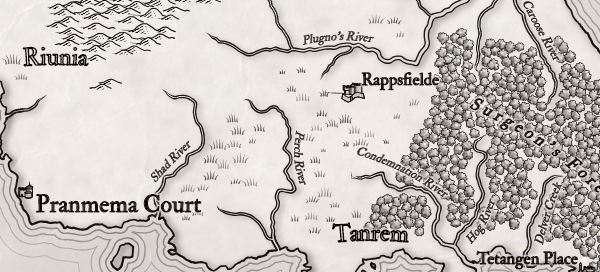
Turning now to look at the land, I don't like the heavy black rivers, and I think the forests can use some tweaking (or perhaps a different forest style). First let me switch to a more traditional river style.
That looks better. Now let me see about forests. Before I tried tweaking the forest mass, I tried turning on the alternate forest visualization that uses individual trees:
That actually revealed a bug in my gradients code, but once that was fixed I kind of like this look. I'm keeping it for now, might delete later.
The mountains right now are being styled with a variant of the mountains on the
Iskloft map.
This style is a bit too bold for the way this map is shaping up, and I want to at least try removing the mountain color. I also softened the mountains, and with a little tweaking, that gets me to this:
I think this looks pretty good and matches the map style nicely.
I'm going to make a few more tweaks. First, I'm going to turn on the faux-3D land styling that adds some shadows and highlighting to the whole land mass:
Next I'm going to tweak the biomes so that I have a nice mix of the different biome types. The default here is pretty good, but I'd like a little more deep grass. I'll also turn off the borders, which I think are too distracting on this map. This gives me some patches of deep grass near the forests:
The last steps are to tweak a few names and adjust some labels. Here's the final map I will submit:
Click through for larger version. Note that some changes in the terrain generation eliminated the compass and led to a few other changes. But I like the overall feel and balance of the map.


Was it on purpose to remove the tree trunks and shadows when changing the look of mountains ?
ReplyDeleteMan, I'm always surprised at how keen-eyed my readers are! That's a good catch. No, it wasn't an intentional change. When I create a style, I force settings for to get particular effects but there are a lot of other settings that are random. Usually these don't change much since I'm using the same random seed. But some changes have ripple effects and cause a change like this one. It was unfortunate, as the map is probably more consistent if both the mountains and trees have shadows.
Delete