Tuesday, August 29, 2017

Decorating the Oceans, Part Six (of Five)

I ended my last posting claiming that I was done with ocean decorations and moving on to labeling, but that turns out to be a lie.  I ran into some issues with illustrations, and resolving them makes some interesting use of SVG filters so I thought I'd write up what I did.

I ended the last posting with this image of an illustration on a map:
Per my comment in the last posting, I started experimenting with recreating these illustrations as SVG drawings for better flexibility.   While playing around with that, I discovered that illustrations didn't look nearly as good when there was a pattern on the ocean:
The pattern is underneath the illustration and shows through, making it very obvious that the illustration has just been "stamped" onto the top of the ocean.  In actuality, these sorts of illustrations usually appear on maps with heavily patterned oceans, and the artists took care to work them into the pattern:
Although, it should be noted, not always:
At this point I'm not interested in trying to actually work the illustration into the background.  But at least I can work on removing the background under the figure so it isn't so obviously dropped in to the map.

In general, the way to do this is to mask (or clip) out the background underneath the figure.  In this case, there are two difficulties with doing that.  First, the figure is actually being applied via an SVG filter, and it turns out that SVG masks do not work on SVG filters.  Second, to mask the figure out we need to create a mask of slightly larger size than the figure.  And since these illustrations are not nice geometric shapes, this is a problem.

There's a workaround that I can use to address the first problem.  It's used in this tutorial, although it isn't completely explained.  I can summarize the basic idea this way:  You use SVG filter capabilities to create an image representing the area you want to mask.  Then you combine this image with the filter using the SVG "feComposite" capability in a way that only keeps the parts of the filter that also have parts in the mask.  This is pretty esoteric SVG wizardry, so I won't go into great detail.  But if you want more info, email me and I'll give the full scoop.  Just trust me that I got it working :-).

Now that I have a working mask capability, I need to create the actual mask to use for wiping out the background behind the figure.  My first thought is to create a rectangular mask the size of the illustration.  (You can create a rectangular image in an SVG filter using "feFlood".)
This at least demonstrates the mask works, but it looks terrible.  One way to improve this would be to blur the edges:
That obscures the hard edge but is otherwise not much of an improvement.  I need a way to get the outline of the illustration.  Unfortunately, there doesn't seem to be any way to get the outline, or to fill the outline to create a mask. However, I do have the illustration itself, so maybe I can use that somehow.

Using the illustration itself as the mask won't work, because that will just block out the parts of the background that are already covered by the illustration.  But I could use the blur technique again to smear some of the illustrate outward (and inward):
I've reversed the masking here to make the effect more visible.  You can see some bits of the pattern showing through underneath the image, e.g., with the mask the right way around, these parts would be hidden.  The problem is that the effect is very slight.  What I really need is something like a filled-in version of the illustration.

As it happens, SVG filters have an effect called "feMorphology."  This effect makes lines heavier or thinner.  To demonstrate, I'll apply it to the actual illustration and thicken up the lines slightly:
That's not pretty, but demonstrates how I can use feMorphology to turn the illustration into something more useful as a filter.  If I increase the dilation a bit and add a blur I get this:
Which starts to look like something I could use as a mask.  Some tweaks give me this:
By adjusting the dilation and blur, I can make the cut-out tighter or sharper:
This approach doesn't work as well for an illustration that doesn't have as many lines or has large empty space in the middle:
This illustration is intentionally dim.  The masking works nicely around the heavy outline, but fails to cover the empty space in the middle of the fish.  By luck, in this case that happens to look okay.  The pattern that shows through looks like shading for the back of the fish.  But it doesn't usually look good:
This illustration is light enough that outside the dark sucker areas, the masking has hardly any effect.

To some extent, this problem can be addressed by careful selection of the illustrations, but if I want to be able to use a wide variety of illustrations with patterned backgrounds, I may need to create separate masking images for each illustration, and use those to accurately mask the illustration.

Wednesday, August 23, 2017

Decorating the Oceans, Part Five

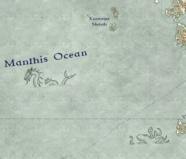
The last bit of ocean decoration I'd like to talk about is the ever-popular sea monster:
Two nice examples shown here.  These sorts of nautical illustrations are used to add interest to areas of blank ocean, as well as to indicate unknown waters, i.e., "Beware monsters!" or even "Here Dragons Abounde" :-)  Adding these to the map isn't too hard.  Assuming I can find some appropriate illustrations, I can essentially "paste" them into the map.  But there are a few challenges.

The first challenge is getting the size of the image.  For everything I've done so far with images (such as using them as a pattern or texture for the ocean), the size of the image has been irrelevant -- at least to the code.  It loads in an image and displays it at 100% size and just lets the image fall where it may.  For some cases where the size is actually relevant, like compasses:
I finessed the problem by creating all my compasses to be exactly the same size.  But for sea monsters and other such decorations, the size really will matter.  They won't all be the same size or proportions, so to place them properly I'll need to know the size.  The problem is that the browser doesn't know the size of an image until it has loaded the image.

There are a couple of possible solutions to this problem.  One possibility is to just measure my sea monster images and hard-code the dimensions into the program.  The drawback with that approach is that adding new images requires modifying the code.  Another (better?) possibility is to somehow force the browser to load up the sea monster images and measure them before I get around to using them.

The way to do this is described in this StackOverflow answer.  The basic approach is to create an <img> element, set the URL for that image to the sea monster image and then give control back to the browser to load the image.
function getMeta(url){   
    var img = new Image();
    img.onload = function(){
        alert( this.width+' '+ this.height );
    };
    img.src = url;
}
Some time later (after the browser has finished fetching and loading the image) the browser will execute the callback function (the one attached to img.onload) and you then have access to the width and height of the image.  The trick is to do all this before you get around to using the image, so that you'll have the size available when you need it.

As it turns out, I'm already doing something like this to pre-load all my fonts, as I described back in this post.  So I need to do essentially the same thing with the images.  The map creation takes a long time (in web browser terms, anyway) so anything I do when the page loads is long since completed by the time I get around to actually displaying the map.  So I'll add some code that executes when the page first loads to fetch and measure the images.

The next step is to find a spot for the sea monster.  These are really just decorations intended to liven up empty spots on the map, so a reasonable approach is to look for a point in the ocean that is the farthest away from land or a map side:
The green circle in the lower right is the spot most distant from land or the map edge.  I find it actually works better to de-weight the map edge a little bit, which gives us this result:
You'll notice that in this case, the label for "Romel" is within the green circle.  I'd really also like to avoid labels as I'm avoiding land or map edges, but there's a bit of a chicken and egg problem here. I'd like to place this image before the labels so the labels can avoid overlapping the image.  But I'd also like to place the image far away from where the labels end up.  I can't do both things at the same time.  The best solution might be to treat the image as a label and let the labeling work out the best spot.  I'll return to that anon, but for now I'm just going to place before I do labels.

Whichever your preference, I can now paste the image into the map at that location.  For the image I use a line art picture of a sea monster, with the background set to transparent so that the sea shows through:
There are a couple of problems here.  One problem is that there are white parts of the image that look weird.  They're not actually white, just lighter grey than the rest of the image, but it's obvious that any part of the image that is lighter in luminance than the sea behind it is going to look strange.  The simple solution is to darken the image until the problem goes away:
But you have to make the lines quite dark, and the result to me is too "heavy" looking.  One way to address this is to reduce the opacity of the image:
This allows some of the water to show through and reduces the overall darkness of the image.

The second problem is that the image is too big -- it takes up too much of the free space.  Since I have the size of the image available, I can scale it to fit into the available space.  For example, I can size the image so that it's longest dimension uses up half the diameter of the free space circle:
Here the image is placed in a tighter area and scaled down accordingly.

Another way to bring this image into the map is to use an SVG filter, the way I did with ocean patterns.  Adding the image this way, I can "multiply" it with the underlying ocean image. This has the advantage that it does a better job of blending in the colors.  The lines are not so heavy, and there aren't any artifacts from colors that are too light:
One advantage of this approach is that all the colors in the image don't have to be dark black.  Lighter colors show up as less opaque, which permits fading out parts of the image if I want to do that:
Overall, adding the image this way seems preferable.  There are a couple of challenges with this approach, though.

First, I'm using pixel images (not vector images) so they may not scale well if I ever have to make one bigger than its base resolution.  This is the same problem I had with the map compasses; I fixed that by finding or making vector art compasses.  I've started doing the same for these illustrations, but so far I haven't found much appropriate vector art.  If anyone can point me to free illustrations - or even good and relatively cheap commercial art - I'd appreciate it!

The second challenge is that a particular SVG layer can only have one filter applied to it.  If you attach a second filter, it simply replaces the first filter -- they don't "stack" up.  Right now I'm only showing one sea monster, and as it happens the layer it needs to go on doesn't already have a filter on it.  But if I wanted a second illustration, or to apply some other filter, I'd need to create new layers for the new filters.

Just to check in on where the map stands, here's an example of how the illustration looks with some other bells and whistles:
(Click through for a larger view.)  

You might have notice that the maps for this posting have labeled islands.  The next series of posts will start talking about labeling various ocean features.

Thursday, August 17, 2017

Decorating the Ocean (Part Four)

A simple coastline embellishment is to darken the water around the coastline:
This is easily done by drawing a darker line around the coast and blurring it into the ocean, and creates subtle effect that helps create visual interest and a break between land and ocean.  It's sometimes seen combined with the horizontal lines embellishment:
The gradient and the shading lines reinforce each other, in a way very similar to the mountain shading used above.

Interestingly enough, this effect also looks pretty good if the water is lightened around the coastline:
This doesn't create as compelling a contrast between the land and the ocean, but it does suggest a surf line (or shallows) which is nice.

A variant of this embellishment is to turn the dark edge into a drop shadow by making it more distinct and offsetting it opposite the light direction:
This creates the impression that the land is floating above the ocean; not my favorite effect but it is dramatic and works well on certain sorts of maps.

This map demonstrates another lovely ocean decoration:
This is an Oriental-inspired map by Ilanthar at the Cartographer's Guild.   He has decorated the ocean in this map by overlaying it with a Japanese-inspired wave pattern.  It adds a lot of interest and character to the ocean.

In SVG, to overlay a pattern of some sort onto a graphic, you use a filter that composes the base image with the overlay image.  If the image is small, you can tile it using an feTile filter. The whole stack looks like this:
// Create a new filter
<filter>   
  // Bring in the overlay pattern
  <feImage>   
  // Tile the image to repeat over the whole area   
  <feTile>   
  // Blend the pattern into the background via "multiply"   
  <feBlend mode='multiply'>
</filter>
You have to take some care when doing this to pick sizes that display and tile correctly.  Non-square patterns also offer some challenges.  If you're just using one pattern, you can work out the proper values and hard-code the solution, but if you're picking between multiple patterns it gets a bit tricky.

Here's an example of a map using a pattern on the ocean:
Keen-eyed observers may detect a tiny little problem:  There's a noticeable gap between the repeats of the pattern!  Bad programming?  No.  It turns out I have discovered yet another bug in Chrome. Perhaps not unsurprisingly, I seem to be testing the limits of what SVG can do in the browser and uncovering areas that no one else has explored.

The work-around (and it took me an embarrassingly long time to think of this) is to tile the pattern myself into an image bigger than my map size and then use that as the pattern.  This also has the advantage that it eliminates some of the fussing to make tiling work, although you are limited to the tiling that you create in the big pattern.  And obviously this can break if the map size gets bigger than the pattern, but for the moment is fine:
One unexpected hurdle for this decoration is finding good patterns.  The pattern that Ilanthar used in his original map and I re-used above can be found fairly easily on the Internet, but there's not a great deal of other usable patterns to be found.  (Even, so far as I can tell, in paid resources.)  Here's an example of another pattern:
Ilanthar has another map where he uses an ocean pattern; in this case it's a more of wave texture than a graphical pattern.  It also doesn't seem to tile perfectly, creating some artifacts.
Here's a quick attempt to re-use this pattern:
Some artifacts are visible here, as I haven't yet put a lot of effort into cleaning up this pattern.

There's a lot of flexibility with ocean patterns and probably some nice opportunities to create interesting effects.  For example, using the wave pattern above at a much smaller scale has the effect of creating a water texture rather than a graphical pattern:
And just to suggest more possibilities, this example map has an interesting approach:
It uses the horizontal lines decoration on the coast, but the rest of the sea is decorated with dots.  That could be easily done with a pattern.

Thursday, August 10, 2017

Decorating the Ocean (Part Three)

In the previous posts, I've described how Dragons Abound draws oceans and how it creates a common coastline embellishment where a series of parallel lines are drawn outward from the coastline:
In this post I'm going to describe how I've implemented another common embellishment.  Here's an example map that illustrates what I'm going to try to do:
In this map, the ocean is indicated by parallel horizontal lines that radiate a short ways from the land before trailing off.  These might have originated as more illustrative wave symbols, but now they're more graphic and stylized.  This example map is nicely hand-drawn and quite artistic.  A fair number of fantasy maps use this technique, but few of them do this nice job with it.

The straightforward approach to implementing this embellishment would be to walk along the coast and draw lines outward and some interval.  But there are a couple of problems with this approach.  First, you can see that the lines are at regular vertical intervals.  If you just step along the coast a certain distance, the lines will be closer together where the slope of the coast is shallow (i.e., close to flat).  Another problem occurs when the coast bends so that the lines from two parts of the shore meet, as happens on the example map near Dennies Point to the upper right.  You would need to make sure as you walk along the coast drawing lines that the lines you draw on the left side of this feature meet up with the lines you draw on the right side of this feature.  A final problem is that you sometimes have to draw lines that don't start from the shore at all, as happens on this map at each of the Points.

It's probably better to think of this embellishment as a pattern that is filling a buffer zone around the coastline.  After some thought, my approach to implementing this was to fill the entire ocean with parallel horizontal lines, and then mask away the parts that were away from the shore.  Let's see how that can be done.

To start with, I need to fill the ocean with the basic line pattern.  This is simply a matter of drawing a series of horizontal lines into the ocean layer of the map, like so:
All I've done here is fill the ocean with color and then draw lines on top.

The next step is to mask away the lines that aren't near the coasts.  However, as I mentioned in the previous post, the problem of "draw a line X pixels away from this polygon" is actually very difficult.  So I can't just expand the coastline and use that to cut off the lines.  Instead, I'll make use of the same trick I used in the last post -- drawing the coastline with a big pen.

To see how this will work, let's first visualize the desired mask.  Typically, a mask is just a black and white image that blocks drawing where it is black.  To start with, I can create a mask that is entirely black and use that to mask the ocean stripes.  This is the unsurprising result:
The mask blocks out all of the lines.  Now I want to modify the mask so that it shows the lines near the coast.  To do this, I want to paint the mask white in a swath around the coast.  How do I do that?  Remember how I used big pens on the coast to create the previous embellishment?
I'll do the same trick, only (1) I'll only draw one big white coastline, and (2) I'll draw into the mask instead of into the display.  The mask will then allow the stripes to show through wherever the big white pen drew:
And indeed, the stripes are now showing along the coastline.

This is too obviously mechanical, so let's working on making it more artistic.  To start with, I can vary the width of the mask so that the distance from the coast isn't always the same.
This effect is subtle, but you can see how the ocean stripes have shrunk in some areas and grown in others.

If you examine the example map above, you'll see that the stripes in that map don't all abruptly end but trail off or get spotty near the end.  Having the stripes trail off (get narrower) is not possible the way I'm doing this, but I can make the ends spotty and irregular.  What I'll do is apply a noise filter to the map to perturb the edges of the map.  A little blur helps too.
That's not quite the same as the hand-drawn version, but it does a lot to break up the artificial edge.

Another problem is that the lines are too regular.  We can start to address that by adding a slight variance to the spacing.
Now I'll add some variation of the line width as well.
Finally, I can add some jitter to the lines so that they aren't so straight.
And putting it all together:
I think the final results look pretty good.

Saturday, August 5, 2017

Decorating the Ocean (Part Two Revisited)

In Part Two of this series, I mentioned that my method for drawing repeated coastlines didn't work well with a mottled sea. The coastlines themselves are made of solid colors, creating a weird effect where they butted up against the mottled sea:
If you look at the peninsula in the right-middle, you can see that the colors in-between the coastlines seem to change as you go around the peninsula.  Actually, that color is staying the same, but it appears to change because the color next to it (the sea) is changing.  For this reason, this coastline embellishment doesn't always work well unless the sea is a flat color.

After posting this to /r/proceduralgeneration, /u/Azgarr suggested that I could use opacity to overcome this problem, by essentially making the areas in between the coastlines transparent so that the sea behind them shows through.  It turns out it isn't quite possible to do it that way, because the way these coastlines are drawn, making pens transparent just reveals the pen underneath, not the sea. But it is possible to get the same effect through careful masking of the pens.

The basic idea is to draw each pen and then mask away the portion where we want the sea to show through for a later pen. That's not too difficult to implement, although just for fun I made it a lot harder by over-generalizing the routine and also re-writing my "change luminance" routine at the same time:
You can see that now the changing sea color is visible underneath the coastlines.

However, there's an odd thing happening around the smaller islands:
It looks like the coastlines are getting clipped.  The problem is more obvious if I make the coastlines black and thicker:
It looks like the lines are getting clipped to a rectangular box a little bigger than the bounding box for the island.  This seems pretty strange, but I've seen something similar before, with SVG filters.

SVG filters have a specification for both an origin and a width and height to define the area of the filter.  This defines the area where the filter will be applied.  Normally a filter is attached to an SVG object, and by default the filter area is set to be bounding box for that object.   You might expect that the filter would then get applied to everything inside the box.  And it does.  For example, a blur filter would be applied to everything inside the box, and the resulting graphic would then be shown on the screen. But -- and this is a little non-intuitive -- the effect of the filter is also limited to the box.  For many filters this doesn't matter, but if you have something like a blur filter that might smear the object out beyond the edges of the box, that doesn't happen.  Instead the smear ends at the edge of the box:
That is an SVG circle with a blur applied.  You can see the straight edges of the filter limits.

The solution is to manually increase the size of the filter area.  And apparently the same is true for masks.  In the case of my map, the mask is getting clipped to the overall bounding box for coastline path of the islands.  Although I've used filters in other places in the program, they'd always been applied to the whole map, so I hadn't noticed this issue.

As with filters, the solution is to manually specify a bigger area of effect:
With that fixed, here's an example of another style:
One problem with this method occurs when adjacent coasts cause the coastline embellishments to overlap:
Since the embellishment lines are not completely opaque, when they cross each other they "stack up" and make a new color.  That's a little unartistic.  The impact can be minimized by keeping the outermost area very light, but I can't offhand think of any easy way to prevent the problem.

Despite that problem, I think the new approach is an improvement, so thanks again to /u/Azgarr for the suggestion!