Thursday, December 29, 2016

The Incredible Shrinking Mountain

In previous posts I've described how Dragons Abound creates mountains.  I'm now going to look at putting those mountains onto a map.

So far I've been generating mountains at a fairly large scale -- around 150 pixels square -- and located at the origin of my coordinate system.  There are a couple of advantages to that.  For one thing, at that scale I can see the lines clearly and it's easier to detect and fix problems.  A less obvious advantage is that when I'm doing things like combining mountains, having everything in the same coordinate system and the bottom of the mountain on the X axis makes the calculations easier to understand.  But to place the mountains on the map I need to scale them to the map dimensions and put them where they are needed.

(Apologies in Advance: Blogger seems to do some re-coding of uploaded images. Normally this is inconsequential, but unfortunately the small scale images in this posting seem to lose some of their sharpness.  Or at least they do as I'm composing -- they may be fine when actually posted.)

As it happens, I'm generating Scalable Vector Graphics (SVG) and SVG has such transforms built-in.  To scale a mountain to 1/4 size and place it at (115, 237) I just need to add an attribute

transform(translate(115 237) scale(0.25))

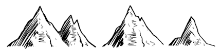
to the mountain.  Here are some examples of mountains scaled to 1/4 size (which is about what fits into my current maps):
To my eye, there are some problems with the mountains at these scales.  First, the line widths are very narrow.  While this is proportional, it doesn't look "right" -- we perceive narrow lines as gray rather than black, and I suspect such narrow lines look wrong because we know that a human artist couldn't use such a narrow pen.  Second, the outlines are not definitive -- they now disappear in the shaded areas.  And finally, the shaded areas themselves lose all texture -- for the most part they just appear to be mottled gray blobs.

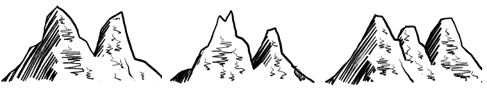
It might be instructive to look at how some of the human-drawn examples fair when reduced to a similar size:

These show some of the same problems -- the outline has disappeared and the shaded areas have become solid blocks of gray.  On the other hand, the faces seem to retain a bit more interest thanks to the face scribbles.  That seems to be true for my generated mountains as well:
But setting that aside for the moment, let me see if I can tweak the drawing parameters to address some of these problems.  To start with, I can increase the line width used to draw the mountain outline to make it more visible at the reduced scale.  Here's a before/after comparison after making the lines about twice as thick:
Obviously this will be a matter of  taste, but this certainly makes the mountain outline more obvious.

The shading in the examples above isn't terrible, but I'd like make the individual lines of the shading more distinct.  To do that, I increase the spacing between the shading lines and make them thicker. Here's the side-by-side:
This restores some of the detail/texture in the shaded areas, and the overall effect is something like applying a "sharpen" filter to the originals to bring out the details and contrast.

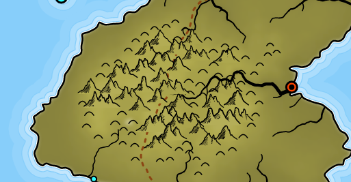
These values also have to be balanced against how the other terrain features are drawn.  Right now that's only hills, which are simple semi-circles. Here's what this looks like on the map:
I'm not entirely happy with the look of these mountains.  They make a bit of a jumble, and they lose a lot of the style they exhibit at the larger scale.  I think the details and the "hand-drawn" perturbations end up creating a lot of noise when reduced in scale.  After removing some of those features and simplifying, I have this:
 I think this looks better -- cleaner and more interesting.  However, there's still room for improvement, and I've asked the experts over at The Cartographer's Guild for their suggestions.  (Sadly, I got no response at all from that posting -- apparently this whole endeavor is less interesting to real map-makers than I would have thought.)

There are a couple of other concerns with the way I'm using these mountains on the map, as shown in this example:
The first problem is that mountains along the coast line get cut off by the sea.  Or if I put them on top of the sea, they stick out into the ocean.  This sort of problem arises because these are symbols, not faithful representations of the underlying territory.  I'll probably address this by making sure that no mountains get placed in a way that crosses the coast line.

The second problem is that I fill these mountains with color so that they cover up whatever lies underneath them.  This ensures that the mountains properly overlap if I draw them from north to south, and the back mountains don't "show through" the front mountains.  But SVG's fill capabilities are pretty limited.  Right now about all I can do is fill the mountain with whatever color is under the center of the mountain.  But if the background color varies, or has texture, etc., that won't look very good -- as the mountain in the upper-right shows.   As long as the background color doesn't vary too radically and the mountains aren't too large, this usually works out okay, but I'd still like to be able to do a better job with this, so I'll revisit this in a later posting.

Thursday, December 22, 2016

Two Mountains Are Better than One

In my previous posts, I described how Dragons Abound creates hand-drawn mountains like these examples:
I think these look pretty good individually, but I'd like to put them together into groups as well.  To start off, the simplest case is just to overlap mountains.  This requires that a mountain cover over anything that's already there when it is drawn.
So the mountain on the right appears to be in front of the mountain on the left.  When drawing mountains on a map, we can draw them from top to bottom, so that the overlap properly reflects how far away the mountains are from the viewer's eye.
This looks fine, particularly at map scale, and this is how you'll see a lot of maps done at the Cartographer's Guild.  But some artists merge mountains, as in these examples:
I like how that looks, and I'd like to be able to do the same thing. In the examples above, there are basically two styles of merging.  In one of the styles, the two mountains overlap, but the line that defines the front mountain is removed where it overlaps the rear mountain:
I can generate two overlapping mountains by hand and eliminate that line in Photoshop to see how that would look:
Pretty good, I think.  It actually doesn't look bad to erase only part of the line, either, as in this Photoshopped example:

So I'll keep in mind that I might want that as an option.

But in the simpler case, basically all I need to do is to arrange the two mountains appropriately, find the intersection of the left mountain's right side with the right mountain's left side (!) and then delete the left mountain's right side from that point to the end.  However, there are a couple of complications.

One is that the right mountain (particularly the shading) might stick out underneath the left mountain.  Generally when mountains overlap this isn't a problem because the baseline of the back mountain is higher than the baseline of the front mountain.  But in this case the mountains have the same baseline.  I can address this by extending the left mountain's mask downward.

A second possible complication is that if the right mountain is steeper and/or narrower than the left mountain, it might intersect the left mountain again lower down.  In that case, I need to erase the line only between the two intersections:
Actually the real case is even worse -- because both mountains are jaggedy, there can be multiple intersections with both the left and rides sides of the right mountain!  But in general I think I can walk down the left mountain's right side from the top, start erasing when I hit an intersection and stop erasing if I hit another intersection.  This does break the line up into multiple lines, which is a minor pain.

Here's some examples of that algorithm in action:
Overall, that looks good.  But here are some examples where it didn't work as well:
In the first mountain, the left mountain intersected the right mountain on an upward jag, and then immediately jigged downwards, leaving a kind of odd cut-off piece of shading.  This is just an example of how the random shapes will sometimes combine in awkward ways.  In the second two bad examples, the right sides of the two mountains are nearly parallel, creating various problems.  One problem is that my algorithm assumes that when two mountain sides intersect, they cross.  That seems reasonable, but there's an edge case when the intersection is the end point of a segment.  In that case, the next segment can reverse direction and the lines don't end up crossing:
In this example, the black line doesn't cross the red line, it just touches in one spot.  If you're an avid reader of this blog, you may recall I had a similar problem with intersecting scribbles.  I haven't had any brilliant ideas since then about how to deal with this, so I'll let it go for the moment and use geometries that avoid the problem as much as possible.

(Note:  Okay, to be fair, I realize that the "right" solution might be to make use of a good library for boolean polygon operations.  Maybe at some point I'll bite that bullet.)

One neat thing is that I can use this algorithm twice to combine three mountains:
So far these results look pretty good.  Let me see now if I can add the second style I showed above, where the mountain side continues on for a while after the intersection.  Here's some examples:
The algorithm here is pretty simple.  Instead of cutting off the line at the point of intersection, I cut it off about 2/3 of the distance to the end of the mountain.  I thought something more complex would be needed, but this works surprisingly well.

Now I'll tackle the other way of combining mountains, as illustrated by these examples:
What seems to be happening here is that the right mountain is in front of the left mountain, but the shaded side is cut off at the point where the mountains intersect along a line parallel to the ridge line.  Pfew!   Perhaps an example will make this clearer:
The top shows the two separately generated mountains.  The middle shows them overlapped normally, with the right mountain in front.  In the bottom, they are overlapped, but the right mountain has been cut off along a line from the intersection of the two mountains to the bottom roughly parallel to the ridge (shading) line.  The effect is that the right mountain is sticking out of the face of the left mountain, rather than just overlapping.

This should be too hard to implement -- I have at least some of the tools already written.

(Sounds of typing and muttering.)

Okay, a little bit harder than expected.  There were a few issues I didn't anticipate and it took a while to find an approach that looked good.  To my eye, in many cases putting the mountains together this way just looked like two overlapping mountains, one with a rather steep side.

It works a little better if the right mountain shading narrows to the bottom to make it look like a cleft:
I'm probably going to be tweaking this for a while before I'm totally satisfied, but here are some examples of mountains with all the options in play:
I think next I'll spend a little time putting these onto a map to see how they look in a map context.


Tuesday, December 13, 2016

How to Decorate a Mountain, Part 2

In the previous post, I cleaned up the algorithm for drawing mountains a bit, and then I added some extra details / decorations to the drawings.  In this posting, I'm going to continue on with adding details.

Looking back at my hand-drawn samples for inspiration, I notice that one style features scribbles on the mountain face:
These scribbles suggest extra texture or features and help to break up the empty area of the mountain face.

One immediate challenge in adding scribbles is just finding a spot on the mountain face.  Just picking a random spot inside a polygon is non-trivial.  Fortunately I'm not too worried about performance, so I'm free to use inefficient but easier-to-implement algorithms.  My approach to finding a a random spot inside the face of the mountain is to construct a bounding box for the mountain face:
And then randomly select points within the bounding box until I get one that is also inside the mountain face.
This works but is not generally a recommended algorithm because it can take an indeterminate amount of time to find a point inside the polygon.  But in my case roughly 50% of the points are going to be inside the polygon, so I'm willing to take that risk.

(ADDENDUM:  After implementing this and using it for a while, I realized I was rarely starting scribbles up near the top of the mountain.  I didn't like that much, so I switched how I pick the starting point for a scribble.  Now, I draw a line from the peak of the mountain to a random spot on the right side of the mountain, like these examples:

Hey, maybe I should implement volcanoes...  Uh, anyway, I then pick a random spot on the line as a starting point for the scribble.  As it turns out, this fits in well with the next step.)

Now that I have a point, I want to identify the area where I'm going to draw the scribble.  To do this, I project a line from the peak down through the point and create a box where the scribble will fall.
Projecting a line down from the peak ensures that the box for the scribble will have the right slope for it's placement on the mountains -- if the scribble is near to the right side of the mountain it will be sloped about like the right side of the mountain; if it is near the center of the mountain it will be close to straight up and down.

Once I've established the box, I need to check to see if it goes outside the mountain or if it interferes with any of the existing decorations.  In the example above, it does both.  When this happens, I throw the box and the point away, generate a new starting point and try again.  (Again, this can take an indeterminate amount of time -- possibly forever if it isn't possible to position a scribble.  So the algorithm has to have a guard on it that gives up entirely after a few hundred attempts.)

If there isn't a problem, then I can draw the scribble.  To do the drawing, I'm using a different approach than with scribbling in the shaded side of the mountain.  In this case, I don't have to fully fill the area, and I also want this to look different than the shading.  So I'm just taking a line and perturbing it side-to-side.
Here are some more examples, with various size scribbles:
My intention is to use these face scribbles as an accent, but it turns out to look interesting if you put a lot of scribbles on each mountain:
And maybe even more interesting at map scale:
The scribbles give the mountains a "textured" look.  I'm not sure this is my favorite style, but in some ways it looks pretty good.

Another option I'd like to add is to have more flat-topped mountains.  Currently, every mountain starts off as an upside-down V.  Both sides do get perturbed, so occasionally that results in mountains with round or flat tops:
But I'd like to be able to intentionally generate mountains with flat tops.  Then (for example) I could have an area of the map with "old" mountains that are generally flattened, and another area with "new" mountains that are sharper.

To get flattened mountains, I need to insert a flat section between the two sides of the mountain.  Hopefully the perturbation and smooth line drawing routines should turn that into some interesting shapes.
The look of the mountains is also dependent on the curve algorithm I use to draw them, so I can relax that to get mountains that look more rounded.
In the next posting I'll talk about how I combine multiple mountains.

Thursday, December 8, 2016

How To Decorate a Mountain

My previous post ended with Dragons Abound producing mountains like this one:
There are still a few problems I want to clean up and a few details I'd like to add to improve the quality of these mountains.

The first problem is that the program still occasionally scribbles outside the lines:
That's undoubtedly due to a mistake in the logic of stopping and starting scribbles across the concavities, but I don't feel like trying to untangle that problem any further.  Instead, I'm going to apply an SVG clipping path to the scribble area.  This will clip off any scribbles that go outside the scribble area.

You might wonder why I didn't just use a clipping path in the first place and scribble back and forth across a big bounding box and let the clipping path fill in the scribble area.  The problem with that approach is that you lose the nice "turnarounds" at the ends of the strokes, and that's really what makes a scribble look like a scribble.  You end up with something that just looks like hatching:
This image illustrates the next problem:
The red line here is the "ridge line" that comes down from the top of the mountain and forms the edge of the shaded area.  Because it is seen end on in perspective, the back-and-forth line of the ridge is exaggerated.  But you can see the problem:  The perturbation up at the top is enough to send the ridge line outside the silhouette of the mountain.

I can solve this problem by scaling the perturbation by the width of mountain.  Up at the top where the mountain is narrow there will be less perturbation, and down at the bottom where the mountain is wide there will be more.  Measuring the width of the mountain at every point down the line is tedious, but it turns out that it is sufficient to scale the perturbation as if the mountain were a perfect equilateral triangle.

It's hard to show an example of a problem that isn't there, but here's a few mountains generated with these fixes in place:
Now let me move on to some additional features.  When I compare the above mountains with these examples:
I notice that the hand-drawn examples have additional details on the lit side of the mountain.  Basically just lightweight, random scribbles running up the face of the mountain.  I'd like to add something like that to my mountains.  A starting point might be a line like this:
I call this a "minor ridge line" because it represents a ridge running down the mountain, not end-on to the viewer like the ridge line that separates the lit and shaded sides, and not in total silhouette like the two sides of the mountains, but rather at an angle in between.  Adding some shading can improve this illusion:
(Ironically, my "hand-drawn" examples look more mechanical than the computer-generated examples!)

To start with, let's see if I can get a line down the lit face of the mountain.  To start with, I'll make a line from the peak of the mountain down to the middle of the lit face, and pick a spot about halfway down:
That will be the starting point for my minor ridge line.  Then I'll pick a spot on the baseline of the mountain to create a line at about the same slope as the right side of the mountain:

Let's see if I can generate that.
Okay.  It looks a little odd if this ridge line is straight while the mountain side is concave, so I'll add some code to make the ridge line approximately as concave as the mountain side.
Now I need to add some perturbation.  Since this ridge line is roughly at 45 degrees to the viewer, I'd expect to do some perturbation in the Y axis (as with the mountain sides) and some in the X axis (as with the main ridge line).  However, it turns out that adding perturbations in the Y axis looks weird:
So I only add perturbation in the X axis:
Now I'll set the color to black, use the "hand-drawn" line, and make the line grow from narrow to wide:
This might need some additional tweaking -- that center line is pretty angular -- but there are lots of knobs to play with.

In the meantime, I want to try adding some shading above the minor ridge line.  The line itself is a high spot on the mountain, so this shading represents the low spot or hollow behind the ridge.  Like the minor ridge line itself, I want the shaded area to be narrow at the top of the ridge and wide at the bottom.  I can reuse the ridge line as one side of the shaded area, and then add another line that starts from the same point but gets wider near the bottom.  If I apply the same perturbation to both lines, I get something like this:
Then I just need to scribble in that area with some shading.  Because this area is relatively small and I don't want it too dark, I use lightweight lines.
This minor ridge line won't appear on all mountains; it will be an option to add flavor.

Another detail I want to add doesn't appear in my examples of hand-drawn mountains, but is something I think can look good.  The idea is to add some additional lines along the right side of the mountain to suggest structure.  Where there's a sharp angle in the right side line, I'll extend the mountain line along one of the existing lines, as with these Photoshopped examples:
To start off implementing this, I write a routine to scan down the right side of the mountain looking for angles between 0 and about 90 degrees.  I start the scan part-way down the mountain, because putting a horizontal structure line up near the peak is likely to run into the shading area.  Here's an example of a mountain with the potential structure points identified:
Now I have to (randomly) select one of the two line segments and extend it.  I'll also taper the line so that it trails off.  Here are some examples of what this looks like in action:

I'm pleased with how this turned out -- it's a subtle effect, but it really adds to the "hand-drawn" quality.  I can do the same thing on the ridge line that defines the shaded area.
Implementing these last two details forced me to write some code to try to keep the decorations on the mountain from overlapping.  One thing the human eye does effortlessly is find open space, and not draw one thing on top of the other.  That's much harder for the computer.

This is getting long, so I'll save some more of the detail work for next time.  On a final notes, sometimes the mistakes can be striking: