Friday, May 26, 2017

Area Labels

The city labels in Dragons Abound are point labels -- they label a particular point on the map.  For point labels I defined the following factors to optimize (in rough order of importance):
  1. Going outside the map area. 
  2. Distance of the label from its anchor point.
  3. Overlap between labels.
  4. Overlap between labels and map features. 
  5. Label placement penalty.
The Dragons Abound maps also have "region" labels that identify the countries or the regions on the map.  These are larger, curved labels, like the "Cucunonomwa" label in this map:
So far, I've treated region labels as point labels.  I calculate the centroid of a region, and I make that the anchor point for the region label.  In the map below, I've marked these anchor points in red:
You can see that this doesn't always work out very well.  The anchor points for Tigpolbo and Hestigbo both end up in rather awkward places.  The Tigpolbo label ends up crammed into a busy area just to be close to the anchor point.

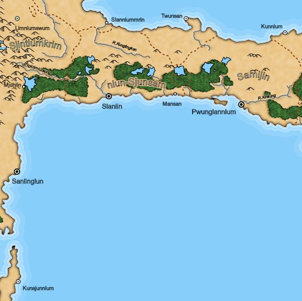
The problem is that these are area labels, so tying them to an artificial point doesn't always work well.  When I was using a force layout algorithm, I addressed this by spending a lot of effort trying to find a good anchor point within the region.  With simulated annealing, it makes more sense to drop the notion of an anchor point for these sorts of labels and instead just try to keep them within the area they are labeling:
  1. Going outside the map area. 
  2. Distance of the label from its anchor point. 
  3. Going outside the label area.
  4. Overlap between labels.
  5. Overlap between labels and map features. 
  6. Label placement penalty.
Right now, the only area labels in Dragons Abound are the region labels, but eventually I will have others -- such as naming a forest, or an area of mountains.

Ideally, I don't want any part of an area label to go outside of the area, but that's fairly hard to compute (especially if the label is curved).  But as a simple approximation, I can try penalizing an area label if the center of the label is outside of the area.  Using this factor, the above map now looks like this:
You can see that the Tigpolbo label has moved to a much better location.

This simple approach works pretty well for regional labels because it turns out that if the center of a label is in the areas, but some other part of the label goes outside the area, the label incurs a different penalty for crossing a coast or a border.  This seems to be enough to keep labels from being half-in and half-out on most maps.

It's also worthwhile to consider new ways to pick candidate locations for area labels.  For point labels, new candidate locations are generated by displacing the current location, or rotating the current location around the anchor point.  This makes sense because the point label wants to be near the anchor point.  Random displacement works for area labels (that's what was used in the maps above) but -- since there's no need to stay near an anchor point -- it might also make sense to have also have the ability to try random points within the label's area.

To test this out, I set up area labels so that when the temperature is high, it tries random locations within the area.  As the temperature gets lower, it switches over to small displacements.  The idea here is to try a bunch of random locations within the area while the temperature is high and settle on the best candidate, and then to tweak that candidate around in small ways to look for minor improvements as the temperature cools off.

One challenge with doing this is finding uniform random locations within an area.  That's not a straightforward problem.  There are basically two solutions.  The most rigorously correct solution is to divide the area (polygon) up into triangles, and then select a random triangle (based upon the area of the triangles) and then find a random point in the triangle (a known solution exists for this problem).  That sounds like a lot of work.  The less elegant solution is to find the bounding box for the polygon, generate a random location within the bounding box, and then test to see if that's also within the polygon.  The disadvantage of this solution is that it may take multiple tries (and consequently more computing time) to hit on a point that's within the polygon, particularly if the polygon has a bad shape so that it's only a small percentage of its bounding box.   However, this version is at least very easy to program.

The regions in Dragons Abound tend to be compact, which means that they'll generally work pretty well with the bounding box algorithm.  Here's an example of a region, it's bounding box and candidate random locations (green inside the region and red outside):
So that looks like it will work well enough for my purposes.  Here's the complete area labels implementation placing the region labels on a rather challenging map where the regions are small, strangely shaped and crowded.  (The random points illustration above is the "Sjintlumkrim" country on the map below.)
 As you can see it does a pretty good job of finding reasonable placements even in some fairly difficult situations.

(Addendum:  /u/redblobgames recently pointed me towards a small Javascript library from MapBox for finding the visual center of a polygon.   This is intended to be a good position for an area label, so I modified Dragons Abound to use this as the starting point for area labels.  In many cases this doesn't make much difference -- simulated annealing tends to settle on the same-ish solution regardless of the starting point -- but for some regions it's helpful to start in a good position.)

Wednesday, May 17, 2017

Some Initial Optimizations for Label Placement

In the previous posting, I described the basic simulated annealing algorithm that Dragons Abound uses to place map labels.  In this post I'll describe some improvements and optimizations I've made to the algorithm.

One problem with the naive implementation (as found here) is that it doesn't necessarily return the best result it found.  In simulated annealing, every time a change is contemplated there's a chance it will be accepted, even if the change makes the overall score worse.  This is how simulated annealing can find it's way out of local minima.  But when the algorithm is near the best answer, almost every move it makes will make things worse if accepted.  So it's almost certain that if you run simulated annealing for a fixed number of steps, you're going to end up with a solution that is worse than the best one the algorithm found.

The solution to this is to save the best solution found and return that when the algorithm ends.  A problem arises if it is difficult or expensive to save a solution.  Since the algorithm is likely to encounter many "best" solutions during the search, it will have to save new best solutions many times.  If this is expensive, it may add significant time to the search.  Fortunately, for my problem saving the best solution is fairly trivial, so this is a worthwhile optimization to implement.

It's fairly powerful, too.  On my test maps, the best solution is about 20% better than the ending solution (!).

An extension of this idea is to send the algorithm back to the best solution every time the "temperature" of the simulated annealing changes.  Changing the temperature basically restarts the algorithm with a different search parameters.  So it makes some sense to restart the search at the best solution found so far, rather than wherever the algorithm happened to be at the moment.

However, in testing this doesn't improve the results.  In most cases, it makes them worse!  I suspect the reason is that this tends to increase the chance the algorithm will get caught in a local minima, by repeatedly sending it back to the best minima found so far. 

Another optimization has to do with how the algorithm selects which label to change at each step.  The initial implementation makes a full pass through all the labels at every iteration.  For each label, the algorithm contemplates a possible change.  The drawback of this approach is that it may spend a lot of time trying to improve labels that are already very good.  For example, consider this map:
Most of these labels are in places where they won't overlap with other labels and only have the coast and perhaps a river to avoid.  Simulated annealing finds pretty good solutions for these labels very quickly.  At that point most proposed moves for these labels only make the map worse.  It's more productive if the algorithm focuses instead on trying to find better spots for labels that have the worst scores.  However, I don't want the algorithm to completely ignore the labels with good scores, because there's always a chance that it can find an even better score, or that a label with a good score needs to move to make room for a label with a bad score.

My solution was to weight the chance of selecting a label for a change by its score.  So a label with a high score has a high chance to be selected for a change, while a label with a low score has a low chance of being selected.  As labels are improved, their chances for further changes go down, so the algorithm keeps shifting its attention to the current worst labels.

For my test maps, this is also a very effective improvement with (again) about a 20% improvement over the previous best solutions.  At this point the algorithm is doing a very good job placing labels on most maps:
Notice how close the city labels are to their cities, without overlapping any map features.  (Right now simulated annealing is only placing the city labels.  The region labels are a different problem that I'll address in a future posting.)

A different sort of optimization is to make the algorithm more efficient.  One of the slowest parts of the algorithm is checking to see if a label intersects with a map feature.  Finding the intersections between labels is not a big problem because there are only a few labels.  But there are many map features (1712 in the map above) so checking a label against all the map features is a big effort.  It would be more efficient if I could check against just the nearby features.

As it turns out, there's a good way to do that:  store the map features in a quadtree.  A quadtree is a kind of data structure that stores two-dimensional data in a way that makes it fast to retrieve points near a location.  And even better, d3 provides a quadtree implementation that I can use. But there are a couple of problems to overcome.

First, the d3 implementation doesn't provide a function for finding all the points near a point.  That would have been handy, but with a little thought it's possible to figure out how to implement a function to retrieve objects near a point using d3.quadtree.visit.  Since the labels are rectangular, I can search for objects within that rectangle.

    // Find all points in quadtree that are (possibly) within a rectangle
    function qtWithinRect(quadtree, rect) {
        var results = [];
        quadtree.visit(function(node, x0, y0, x1, y1) {
            // Does this node overlap with our rectangle?
            let x_overlap = Math.max(0, Math.min(rect[1][0],x1) - Math.max(rect[0][0],x0));
            let y_overlap = Math.max(0, Math.min(rect[1][1],y1) - Math.max(rect[0][1],y0));
            let overlaps = (x_overlap > 0) && (y_overlap > 0);
            // If this is a leaf, add it's nodes to results
            if (!node.length) {
               do {
                  results.push(node.data);
               } while (node = node.next);
            }
            return !overlaps;
        });
        return results;
    };

Note that this doesn't guarantee that all the points returned are within the rectangle, because it returns all the points in nodes that overlap with the rectangle.  That overlap isn't necessarily complete, so there may be some points in the node that lie outside the overlap.  I could check to make sure the points are within the rectangle before adding them to the results, but it turns out in my case (as I'll explain below) including some nearby points is actually fine.

The second problem is that this doesn't quite work for finding labels that overlap features.  I'm indexing features in the quadtree by the center of the feature.  This function will find features whose centers lie within the label, but it won't necessarily find features whose centers lie outside the label, but still overlap the label.  (This is why getting nearby points isn't bad; I need to check them anyway.)  Completely fixing this is complicated, but on a practical level it works fine to keep track of the size of the features as you add them to the tree and then pad the search by the dimensions of the biggest feature.  This padding can pick up features that don't overlap the label, which makes the algorithm a little less efficient, but it's not a big impact.

In fact, it turns out this is quite an improvement:  It saves about 90% of the time spent in calculating label scores (!).  This makes it feasible to do a lot of iterations, but it turns out that there isn't much improvement beyond about 2500 iterations per label -- at least with the algorithm as it works right now.

Monday, May 8, 2017

Simulated Annealing

In the last post, I described Dragons Abound's force layout algorithm for placing labels on the map.  That approach has a significant drawback:  it often gets labels stuck in bad places with no way to recover.  In computing terms, this is called a local minima and various approaches have been devised to help algorithms avoid these traps.

One approach is called simulated annealing.  Simulated annealing is a method for searching a solution space for the best solution.  Imagine that we're searching for the lowest spot on this line:
There are a lot of "low spots" on that line where we could look to either side and figure that we were at the lowest possible spot.  These are the "local minima".  To keep from getting trapped in these spots, simulated annealing starts out with a high "temperature".  This temperature corresponds to how far away from the current point we can look for a better solution.  So when the temperature is high, the next point we look at can jump over nearby peaks to land on the far side, even if it where it lands is worse than where it started.  As the annealing process continues, this temperature is slowly lowered, so that the search settles into the best solution.
(These illustrations are borrowed from this paper.)

Simulated annealing isn't guaranteed to find the best solution, but it does a better job of getting out of local minima than algorithms like force layout.  For that reason, it is a popular approach to label placement.

d3js doesn't have a simulated annealing component built in (as it does with force layout) but Evan Wang from UCB has written a simulated annealing plug-in for d3js.  To be honest, the plug-in isn't very good. It doesn't handle a lot of the cases that Dragons Abound requires, and in places the code is either wrong, doesn't work, or doesn't fit with my existing code.  So I have to rewrite most of it.  But even so, having a code example is very helpful for understanding the algorithm and makes it much easier to build a working solution.

Simulated annealing is driven by the "energy function", which defines what the system is trying to minimize.  For city labels, I've defined the energy function to try to minimize the following things (in rough order of importance):
  1. Going outside the map area. 
  2. Distance of the label from its anchor point.
  3. Overlap between labels.
  4. Overlap between labels and map features. 
  5. Label placement penalty.
Most of these are self-explanatory, but the last bears a quick explanation.  For labels like city labels, where the label provides the name for a feature at a point on the map, Imhof defined the best locations (with respect to the anchor point) as being (in order):  to the upper right, to the lower right, to the upper left and lastly the lower left.  So the last element of the energy function tries to get labels into the best relative position to the anchor point.

Here's an initial look at placing labels using simulated annealing:
In this case, I'm only placing city labels and the only map feature they're trying to avoid are the city symbols themselves.  The red box shows the initial placement of the labels and the purple box shows the placement after a thousand iterations of simulated annealing.  Green boxes show map features that the labels are trying to avoid. As you can see, all the labels in this map ended up in the prime label position to the upper right of the their anchor points.  All they had to do was avoid overlapping the city symbols, and annealing found good solutions for every city.

It's fairly easy to figure out when two axis-aligned rectangles are overlapping.  It's much harder to tell when two arbitrary polygons are overlapping.  So to make things easy, Dragons Abound treats all the map features that have to be avoided as rectangles (this will soon change :-).  That's why cities in the previous map have green rectangles instead of green circles.  (Actually, circular overlap is pretty easy to compute also, but it simplifies the code to treat everything as a rectangle.)  A number of these labels on the previous map overlap the coasts, so let's add the coast as map features to avoid.  The coast is a long wiggly line.  It is turned into rectangles by breaking it up into line segments and drawing a bounding box around each segment:
You can see the green bounding boxes along the coast to indicate that those boxes are now being avoided.  As a result a number of the labels have moved around.  In the middle bottom of the map, you can see that the label for "Kyup Lyak" (which was called "Katemsin Wip" in the previous map) has moved to the lower-right of the city to avoid overlapping the coast to the upper-right of the city.  The label of "Lynkryun" has a more difficult time avoiding the coast and ends up in a more undesirable spot to the upper-left of the city.

Adding the rest of the map features to avoid and labels to be placed is just more of the same.   Here's an excerpt of the same map with everything included:
You can see how labels are close to their symbols and don't cross any map features.  (Forests and mountains are ignored.)  In particular here you can see that 'Wukyip' doesn't get stuck down below the city symbol as it did with the force-layout version.

It's also worth noting that the simulated annealing approach is much faster.  The total run time for the above map with force layout was 335 seconds; with simulated annealing it was 185 seconds.

When I implement a new feature, I like to try out a bunch of different maps and see if there are problems to be addressed.  Here's an example of a problem I found doing this:
In the upper-middle part of the map you can see where two labels run into each other.  Interestingly, these labels don't overlap -- the simulated annealing managed to find positions where they're exactly adjacent to each other.  While they don't technically overlap, this is still a visual problem.

I solved this by adding a little padding to the end of the labels, so that even if two labels end up in this position, they'll have a visual break between them.  In the case of this map, the additional margin pushes one of the labels down into the ocean.
Another problem I ran into was that large labels (particularly the region labels) would sometimes wander so far off the map that they could never get back.  The reason this happened was that the distance a label can move in each iteration of the simulated annealing is based on its size.  Really large labels (and I'm still using Martin O'Leary's language generator, which occasionally comes up with very long names) could move quite a ways when the simulated annealing temperature was hot -- too far to get back as the temperature cooled down.  The solution to this was just to cap the maximum move for any label to a value that couldn't take it so far off the screen that it couldn't recover.

Next time, I'll look at some optimizations to the basic algorithm.