Tuesday, October 30, 2018

Continent Maps (Part 2): Getting Consistent Views

In the last posting, I explored the coordinate systems and learned how to slide the SVG viewport around to show only part of a larger world.  However, there were some problems with that, because up until now I've assumed that anything not visible is irrelevant.  In this posting, I'm going to go through and fix those assumptions so that I can consistently generate and view different portions of a larger map.

The problem with place names that I pointed out in the last posting is evident in these two views of the same map:
 Here's the same world, with the view slid to the left:
You can see the geography is the same, but many of the names have changed.  That's because Dragons Abound doesn't bother to name anything that isn't visible.  Since different things are visible in the two views, and the naming process is driven by random numbers, different names result.

After looking through the code, I discovered that almost everything is being named whether it is visible or not.  But it only takes one exception to throw off the naming of everything that follows.  In this case, the exception is that Dragons Abound is only generating the coastlines that are visible.  The reason for this is convoluted.  There's actually a “coastline" along the entire edge of the world, which -- since it encloses the entire world -- breaks some of the program logic if I actually create that coastline.  To avoid that from happening I've just generated the visible coastlines.  Now that the map can extend far beyond the edge of the viewport, that's not a good solution.  Instead, I need to stop generating coastlines when I get near the real edge of the map.  (Which I still keep off-screen to avoid showing edge-effect problems.)

With that fixed, the names are now consistent across the two maps:
and:
One thing to note for the future:  If I use the interaction capability to change the name of a map feature, that change won't be recreated on a different view, and probably won't even be reproducible.  Something to think about.

If you look closely at the previous map, you'll see that an ocean area near the bottom center of the map has a label “Meb Island" floating in it.  That happened because Dragons Abound thinks the ocean area is actually an island.  Without going into all the technical details, it's surprisingly tricky to distinguish between islands and lakes when they run off the edge of the map.  At any rate, the algorithm is getting confused by the change I made above in generating the non-visible coastlines and needs a little fixing to avoid this sort of problem.

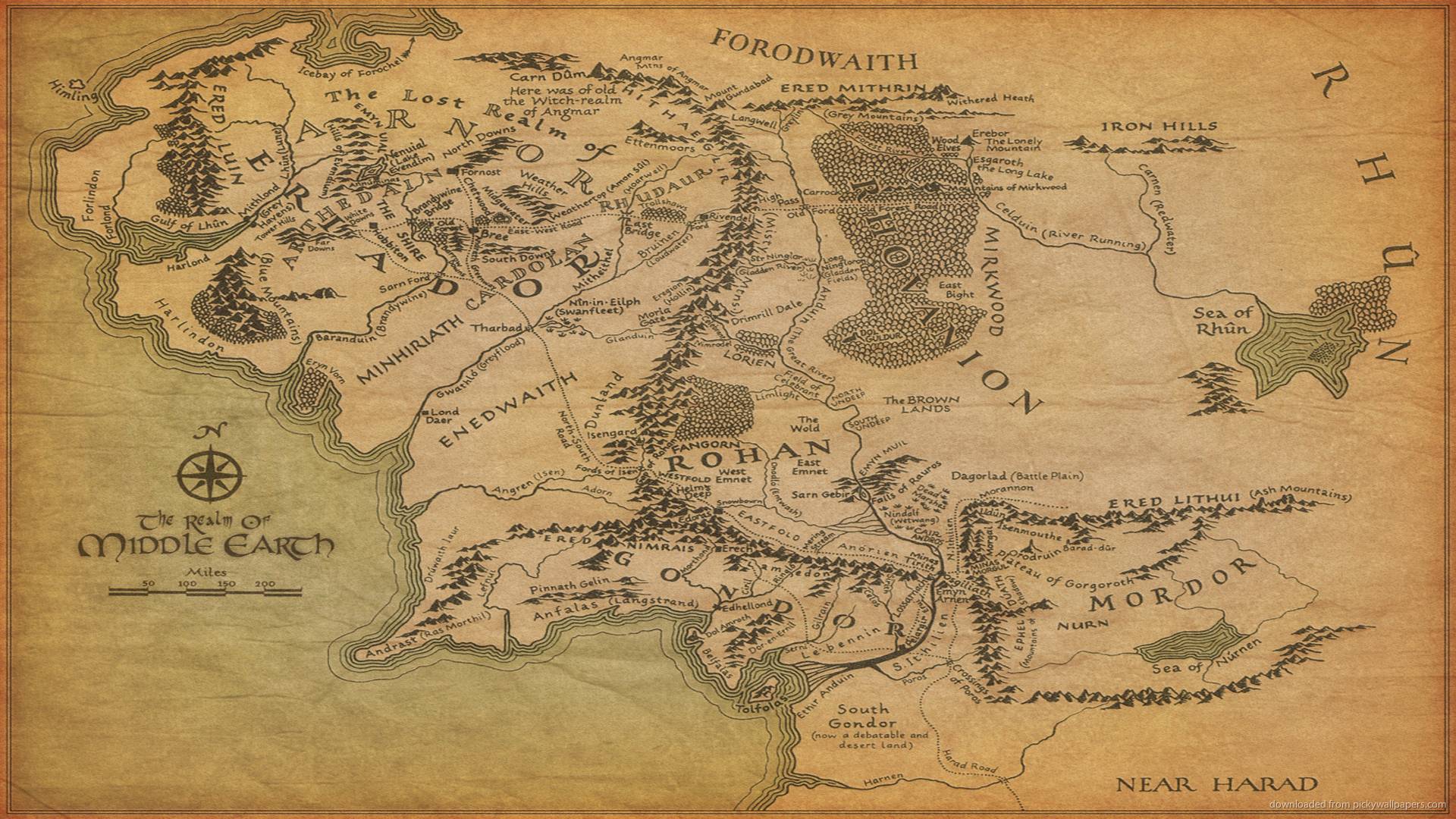
Now let me try quadrupling the size of the world and show 1/4 of it in a map view:
In general this looks okay (and has a big interesting river system, and a big lake, but you might notice that the cities seem very sparse.  That's because Dragons Abound generates a range of 10-20 cities.  That range works well for the original size world, but not so well when the world size is quadrupled.  So the range needs to be adjusted for the relative size of the world.  There are probably a number of areas where this needs to be done.

Here is the same map with that problem fixed:
Now there are a more reasonable number of towns and cities, but this reveals another problem.  You can note a number of orphaned names around the edge of the map, like Nanmrummombrook, Marwynnley and Noyewood in the lower left.  This happens because label placement tries to place labels where they are visible.  Previously, that routine has never had to worry about a label for a feature being off-screen, because in the regional maps almost the whole world is visible.  But now there can be cities and other features just off-screen.  So I need to add some logic to the labeling routine so that it doesn't try to create labels for map features that aren't visible.
That's more reasonable.  On the right edge, Cumden is just barely on the map but the label is still placed where it is visible.

One thing that might not be immediately obvious in the bigger maps is that the number of locations in the world hasn't changed.  Although the map is (in some sense) 4 times as big, the underlying area is still chopped up into the same number of locations.  The initial step in map generation is to cover the world with a Voronoi diagram with a fixed number of locations.  So as the map gets bigger, each Voronoi cell gets bigger as well.

It makes sense to scale the number of locations with the map size, but unfortunately, the performance of Dragons Abound is somewhat worse than linear with the number of locations in the world, so generating maps with a large number of locations can take a long time.  Here's an example of a map with 4x the resolution (number of locations) as the map above:
The added locations change the generation process, so the terrain isn't the same as the above maps, but you may notice the added detail in the coastlines and the land shadows.

Fortunately, when profiling the performance in generating bigger maps, I noticed some obvious problems that were using a lot of processor time.  Some debugging time later, I've fixed the worst offenders, and that allows me to make some bigger maps.  Here's an entire 4x map:
This is effectively zoomed out to 25% size.  This seems to be about the maximum size map that Chrome can display.  The world generation can handle larger maps but the browser crashes when trying to display them.  Firefox seems more capable in this regard; it can display maps up to 9 times the size of my original maps.  Here's a portion of such a map -- I've left it full size, so you can click through to get a better notion of the size and detail of the map.
Firefox can generate a map this big, but I can only screen capture a picture at the maximum browser window size.  I've got a function to save the map as a PNG file, but it can also only save the portion of the map that is being displayed.  I suppose I could scroll the map, capture multiple screens and stitch them all together, but that's a pain.

A better solution would be to save the underlying SVG and then open it in a program like Inkscape.
In the past I've been able to cut & paste the SVG for a map into Inkscape, but the SVG for the world maps is so big that trying to cut & paste it crashes the browser!  Fortunately, I found FileSaver.js and I can use that to save the SVG directly to a file, and then open it in Inkscape and create a very big image that way.

Or at least in theory.  There are a couple of challenges in getting these maps working in Inkscape.

The first problem is that Inkscape makes a few different assumptions from Chrome & Firefox about how to display SVG.  Specifically, if a path doesn't have a fill color specified, the browsers assume that it has no fill; Inkscape assumes that it is filled with black.  So when I open a saved SVG in Inkscape it is mostly black because the top-most layer in the map doesn't have a fill color.  This can be fixed by specifying “fill: none" where needed so that paths display the same in the browser and Inkscape.

The second problem is that Inkscape has some bugs in how it handles masks.  Apparently Inkscape itself only creates masks with a single element, and doesn't handle masks with multiple elements very well.  Dragons Abound creates a number of masks with multiple elements.  The workaround for that problem is to group all the elements in each Dragons Abound mask into a single (unnecessary) “group" element.

The third problem has to do with images and other loaded resources.  These are referenced in the original SVG by a relative path, e.g., “images/background0.png."  My sources are then organized so that the little standalone webserver I use can find those resources in the specified places.  When I take that same SVG and open it in Inkscape, those relative paths are now treated as “file:" URLs and Inkscape looks for the resources relative to the folder where the SVG was saved.  The easy workaround here is to save SVGs into a folder that has the resources in the correct places; this could be the same root folder used by the webserver or a different location that has copies of the resources in the same (relative) locations.

The fourth problem is fonts.  Dragons Abound uses both web fonts and locally stored fonts, all in WOFF2 format.  In the browser, these are applied to text by using a CSS “font-family" style, and before the map is generated, all the possible fonts are loaded into the Web page to be ready to use.  When the same file is opened in Dragons Abound, it looks for fonts in the system font directory, and there doesn't seem to be any way to specify another font directory.  The easy solution (at least for my development machine) is to install the fonts Dragons Abound uses into the system font directory, although this isn't as trivial as it sounds, because the font names much match and there isn't any easy way to change the name of a font in Windows.  But of course, this won't work on any computer that doesn't have the proper fonts installed.  A more portable solution is to embed the SVG fonts into the maps.  This goes onto the TODO list.

After all this, I end up with this interface to the map generation:
The Extent input boxes set the overall size of the world, where 1x1 is (arbitrarily) the size of the original maps.  The vbx (viewbox) size defines how big a piece of the world to show in the map; in this case it is also set to 1x1 so the map will portray the entire world.  The vbx center defines where in the world to center the map; 0, 0 is the center of the world.  Finally, the SVG size parameter controls how many screen pixels to use for 1 unit of viewbox size; set to 775 this makes the displayed 1x1 map on the screen take up 775x775 pixels.  This is handy when I create a very large map.  By setting this parameter to a low value (say 150 pixels) I can make a large map fit entirely on the screen.

By varying these six parameters I have control over the size of the world and the portion of the world to display in the map.  The Generate button does what you'd think; the Display button below it does just the displaying the world part, so that I can generate a world and then display different parts of it by changing the viewbox parameters without having to regenerate the world.  (A better programmer would probably implement this all as pan & zoom.)  The Save PNG button saves the visible map as a PNG file; the Save SVG button saves the SVG for the entire map.  The Test It button is set up to run test code that varies as I develop different features.

Now that I can generate and display all or part of a bigger world, next time I will look at adapting the land shapes to bigger maps.

Tuesday, October 23, 2018

Continent Maps (Part 1): SVG and Coordinate Systems

Up until now, the size of maps in Dragons Abound have been fixed and somewhat indeterminate.  They are what I think of as “regional" scale maps -- not a whole world map, but a significant chunk, like the west coast of the United States, or a part of Europe.  I like this scale quite a bit, but I want to do some experimenting with Dragons Abound to see if I can generate world-sized maps (or at least bigger than the regional maps I currently generate).  But before I start into that, a little digression on fantasy world maps.

When you stop to think about it, the world is a big place.  Most fantasy “world" maps are nowhere near the proper size.  Consider, for example, Middle-Earth, the setting of Lord of the Rings:

While seemingly depicting a huge world, in fact Middle Earth is based upon Europe:
which means a real “world" map of Tolkien's world would be about 50x the size of the Middle Earth map (!).  In fact, most fantasy world maps I see depict what seems to be about a continent or so of the world:
That seems to be about the biggest area that depicts well in fantasy map style.

So generating a real “world map" is probably too ambitious.  A better target would be a continent (or partial continent) sized map.  (Although it's convenient to still think of this as “world" sized.)  So how big a map would that be? If the current Dragons Abound maps are “sub-continent" size, this suggests that I might want to be generating maps that are 8-10x as large.

Before I jump into the challenge of generating bigger maps, I need to have a better understanding of the different coordinate systems Dragons Abound uses.  I inherited multiple coordinate systems from Martin O'Leary's original code, and their interactions can be confusing, even after working with them for two years.  Mostly I've gotten away with not fiddling with them, but obviously I'm going to have to do that to generate bigger maps.

To start with, the “world" behind the regional map is currently generated within a unit square.  Each regional map has locations from (-0.5, -0.5) to (0.5, 0.5) with the origin (0,0) in the middle of the region.
The one oddity here is that the Y axis is reversed from what you saw in high school geometry.  -0.5 is at the top of the map and 0.5 at the bottom.  The Y axis is often reversed in computer graphics.  I've heard this explained as an artifact of how early monitors (TVs) scanned from top to bottom, so the first scan line was at the top, the next just below it and so on, so the Y index of the scan lines went from zero at the top to some positive number at the bottom.  Whatever the reason, SVG (Scalable Vector Graphics) uses this coordinate scheme, so Dragons Abound does as well.

This coordinate system is independent of how the map will be displayed.  It's just a unitless system for constructing the world -- a city is located at (0.12875, -0.223), a border runs from (0.337, 0.010) to (0.333, 0.017), etc.  And while the current regional maps are limited to 0.5 to -0.5, that's not a limit on this coordinate system.  I can create world outside of these limits.

The next coordinate system is what SVG calls the viewbox.  This establishes the actual coordinates that will be used to draw the graphics.  For example, Dragons Abound sets the viewbox to start at (-500, -500) and have a width of 1000 and a height of 1000:
(Upon review, the number at the top of the Y axis should be -500.  Sorry for the typo.)

You'll note that with this choice, converting between the first coordinate system and the second system just involves multiplying everything by 1000.  So to draw something, Dragons Abound finds its location coordinates, multiplies by 1000, and draws to those SVG coordinates.

So I can use the viewbox coordinates to draw a line from (say) (0, 0) to (250, 250).  But I don't really want that to draw a line from (0, 0) to (250, 250) on the computer screen.  For one thing, that would mean that if I wanted to display the map at a different point on the screen, I'd have to change all the coordinates of everything on the map and redraw it.  That would be painful.

To handle where the graphics show up on the screen, there's a third coordinate system which SVG calls the viewport.  The viewport is the actual part of the page where the graphics will be drawn (on a web page, it's an <svg> element).  It has a width and a height and a location.  The location is the coordinates of the upper-left corner of the viewport.  So if I was displaying a map in a viewport at (30, 100) that had a height and width of 800, the viewport coordinate system would look like this:
In SVG, the viewbox and viewport coordinate systems are connected to each other, and SVG takes care of translating between them.  You just draw into the viewbox coordinate system, and what you draw shows up in the corresponding place in the viewport.  (There are some problems when you create a viewbox and viewport that don't have the same aspect ratio.  Then things either get clipped or stretched to fit, depending upon your choice of the preserveAspectRatio attribute.  I just recommend not doing that in the first place.) 

So to recap:  A city located in the world at (0.10, 0.33) is drawn at (100, 330) and shows up on the screen at (110, 764).

You can see why keeping track of this can be confusing!

What happens if I change each of these coordinate systems?  In the first coordinate system, suppose I generate a world that only goes from -0.25 to 0.25 in each axis.  Then the resulting world is only a quarter the size of my usual world and only fills up the middle part of the entire viewport:
(You can also see a few weird edge artifacts that are normally hidden.)  Likewise, if I double the size of the first coordinate system, there's a lot of map that isn't seen because it is outside the edge of the viewport.

What happens if I double the size of the viewbox?  Well, if I also double the ratio between first coordinate system and the viewbox (from 1000 to 2000), then nothing much happens.  If I keep the ratio at 1000, then once again the map is reduced to half size.
However, this time the map has the original area 1x1.  Again you can see edge artifacts that are normally hidden (like the bulbous sides of the forests).  You can also see that the ocean pattern is not correct -- it must have hard-coded some assumptions about the viewbox size.  Likewise, the compass seems to be finding the corner of the viewbox, rather than the corner of the map.

Conversely, if I halve the viewbox size, it has the effect of zooming in on the map:
Here we see only the middle quarter of the map.  This isn't a very useful way to zoom, because you can see that having only half the map visible creates some problems -- the marker for the city “South Owenson" is off screen, for example.  It also effectively doubles the size of fonts, etc., which I probably don't want.

A more useful aspect of viewbox is to change the origin.  So far, I have kept the viewbox centered on the map, but that's not required.  For example, I can shift the map to the right by centering the viewbox on a point on the left side of the map:
Again, you can see edge effects and some other problems, but effectively the map has been slid over to the right.  The usefulness of this may not be obvious, but suppose I generate a map that is twice the width of the normal map.  By default it looks like this:
This looks like any other map, but it's actually only the center part of a bigger map.  So I can now adjust the viewbox to bring other parts of the map into view:
Here I've slid the viewpoint to the left, so we see more of the world to the west of the original view.  Some names have changed on the map, because Dragons Abound currently does some things (like naming features) based upon whether they're visible.  I'll need to change that to keep the map consistent when sliding the viewbox around.  Eventually, though, I'll be able to slide the viewbox around a bigger map and generate regional maps of any desired area.  So I can generate and display a large continent-sized map, but I can also generate regional maps of areas within the larger map.

To summarize, then.  There are three coordinate systems in use.  The first is an abstract coordinate system for the world features.  The second is the viewbox, and it defines the portion of the world that is visible.  The third is the viewport, and that controls where on the screen the map is drawn.  To draw a bigger world, I need to expand the first coordinate system.  To show more on the screen, I need to expand the viewbox.  I can also slide the viewbox around to show different parts of a larger world.

Next time I'll work on fixing some of the inconsistencies that arise when I use the viewport to show only part of a larger map.


Tuesday, October 16, 2018

Sprucing up the Rivers

There are a few problems with the way Dragons Abound draws rivers, and in this posting I'm going to try to fix up some of them.

First of all, I realized recently that I'm still drawing rivers using SVG lines, and changing the width of the river by adjusting the width of the line.  In extreme cases this can result in some odd effects:

And in fact, I've had to add code to avoid these kinds of situations.  But some time ago, I implemented a different way of drawing lines that lets me smoothly vary the width of the line any way I'd like.  But for some reason I'd never switched over rivers to using the new line routines, so let me do that and see whether it improves the river visualization.
Here's a side-by-side comparison with the old version on the left and the new version on the right.  If you look carefully you can see that the transitions are smoother and more natural in the new version.  This is most noticeable in places like the fork where there are some sharp changes of direction.  With the new version, I also have better control over the quality of the path drawing, so I can vary it between smooth and rough as I desire.

That's a small improvement, but the real reason to switch to the new lines is to address the starts (and ends) of rivers:
Rivers start in the mountains and flow downhill to end at the coast.  As you can see in this screenshot, the start of the river is pretty abrupt.  It just starts at a minimum width, and if the river has an outline (as in this example), the outline is missing across the start of the river.  (Rivers have a minimum width to avoid having rivers that are nearly-invisible thin lines.)  This is largely an artifact of the old way of drawing the river, and would have been annoying to fix.  With the new river code, though, I can just set the initial width of the river to zero, so that the river starts with a point:
That works, but looks a little pinched off.  Let me try phasing in the river over the first part of the river:
Now the river starts at a point and then gradually increases to the minimum width.  That looks much nicer.

Another problem area is at the mouth of a river where it joins the sea.  If the land has an outline then it cuts off the river, as you can see in the map above.  I don't think that looks very good, but it's a problem I also see on a lot of my reference maps:
If you look at the river right below the city of Avinnor at the top of the map, you'll see the land outline goes right across the mouth of the river.  So this is something people struggle with too.

The obvious fix would be to draw the river on top of the land outline.  The problem with doing this is that it is hard to end the river exactly where the ocean starts without leaving a gap or an overlap.  So to avoid this, I have been drawing the river a little long and then drawing the ocean on top of the river.  This eliminates any potential gaps.  For similar reasons, the land outline needs to be on top of both the ocean and the land.  So I cannot put the river on top of the land outline without causing a problem where the river meets the ocean.

One solution is to mask out the land outline where the river crosses it.  This is fairly straightforward -- I just need to draw the river a second time in black into a mask, and then apply that mask to the land outline.  If the river has a black outline like the land outline, this works pretty well:
The transition is more abrupt than I'd like, though.  I can address that by broadening out the river where it joins the ocean.
That looks pretty good.  It looks even better when the weight of the coastline is closer to the weight of the river border:
I see a similar treatment on a lot of my reference maps:
Unfortunately, it doesn't look as good when the outline color of the river doesn't match the outline color of the land:
What I'd like to do in this situation is start the river outline as the same color as the land outline and then use a gradient to transition to the river outline color.  Unfortunately, that's not easily done as SVG doesn't provide gradients that follow a path.  There some ugly workarounds, but I'll leave that for another day.

As I discovered while working on the Tolkien-style map, this approach to drawing the river mouth turns out to be exactly backwards for a style which uses a solid black river:
Masking out the coastline at a river mouth with a black river ends up creating an unnatural gap.  In this case I want to turn the mask off and leave a solid coastline.
Dragons Abound has many ways to style every part of the map, and that creates lots of edge cases to make things look good!

There's at least one more improvement I'd like to make to rivers, but I'll leave that for another time.


Monday, October 8, 2018

Lord of the Rings Map Style

This posting by John Nelson has been viral for the last few days -- well, viral in my Twitter feed of cartography nerds, anyway.  It describes how the author re-created the classic Tolkien Lord of the Rings map style in ArcGIS Pro.  (Seems to be a bit of a cottage industry to knock off Tolkien's style.)  It's a fun break from the regular development plan to see if Dragons Abound can replicate a style, so I decided to see how well Dragons Abound could mimic the classic Tolkien map style.

I can't imagine someone reading this blog has never read Tolkien or seen his maps, but if not, here's an excerpt that will give you a sense of the style:
This map was drawn by Christopher Tolkien (J.R.R.'s son) for the original publication of Lord of the Rings.  It's an interesting style, with very heavy mountains, woods and coastlines, red labels and little else.  (In particular, there are virtually no cities marked on the map.)

To start with, I replicated the color scheme of the map, with black borders, red labels and a cream colored background.  The original map is really black & white with red labels, but it was printed on a cream colored paper that in most cases has further yellowed over time.  I like the color combination, so I'll keep the cream colored background for now.
I've also used black rivers as Tolkien used.  However, the coastlines aren't quite right.  Tolkien used a fairly heavy hand throughout the map, and this includes the coastlines.  He also decorated the ocean with two black wave lines.  This is easy enough to replicate in Dragons Abound -- it has a very flexible system for drawing coastal embellishments.
Now let me use a more appropriate font.  The lettering on the original map is hand-drawn, and there's no version of that available.  Nelson used the Aniron font by Pete Klassen, which is based on the font in the end credits of the Lord of the Rings movie, so I'll try the same.
Unfortunately, my program has some problems with this font.  It doesn't seem to be able to accurately measure the size of the font, which results in mis-sized labels and labels that get cut off.  It's a bit of a mess, obviously.  I'll try using Kelt, which is another LotR-inspired font:
This is sized much better, but has another problem, in which some of the letters don't get completely filled.  This turns out to be a 3 year old bug in Chrome.  Frustrating.  Well, I can always use Firefox, which renders the font correctly.

Leaving the broken font rendering aside, there are some invisible rivers that need to be fixed.  That problem is pretty straightforward -- just an error in minimum river width.  The map above also has a faux 3D shading that needs to be removed -- the Tolkien map style is very 2D and flat.

The next thing to tackle is mountains.  The mountains on the LotR map are very bold -- sharp  peaks, thick outlines and mostly solid black shadows.  They are also arranged in long narrow lines.
It's fairly easy to generate mountains with all black shadows that look similar to Tolkien's:
It's more difficult to get anything like the straight narrow lines of Tolkien's mountains.  That's largely because they're pretty unrealistic, as has been pointed out numerous times.  Dragons Abound actually has a way to generate mountains along fault lines, but it doesn't often produce such well-defined narrow mountains ranges.  At best it's an approximate match:
But I won't worry too much about that aspect of the map, since I'm really copying the style and not the geography.

Another unusual feature of Tolkien's mountains is that most of the hills are unshaded:
I haven't done this before, but it isn't too hard to insert an option to turn off shading on hills.
The mountains in this style are so heavy that it is nice to have unshaded hills to lighten the map up a little.

That leaves forests as the last major map feature.  Tolkien illustrates forests as dense maps of egg-shaped trees, bordered by a row of trees with visible trunks:
Tolkien's fill technique is pretty unsophisticated; he basically draws in rows of trees from left to right, top to bottom.  It ends up looking pretty artificial; I probably won't try to replicate that.

John Nelson seems to have replicated this style in ArgGIS by drawing a row of trees along the border of the forest and then filling the remainder with a seamless forest pattern:
Here you can see the obvious edge row, and although the fill pattern is pretty good, if you look closely the repeat is obvious.

I've considered at various times writing code to draw a symbol or icon repeatedly along a path as Nelson does here for the edge of the forest, but I haven't really come up with many problems where I would use that capability.  Nelson needs it because he fills the forest with a static pattern, so the edges would have obvious problems if they were not covered.  But of course, I'll use procedural generation to fill the forest, so that won't be an issue for me.

As long-time readers of the blog are probably aware, I already have the capability to draw forests as individual trees:
These trees are more complicated than Tolkien's trees, but my first thought was to see if I could adapt these trees to produce something like the Tolkien map. Here's an initial attempt:
This is not entirely bad, but there are a couple of problems.

First, the trees are all perfect circles.  That's because Dragons Abound makes clumpy tree shapes by overlapping several circles with scalloped edges.  I can turn off the edges, and only use one circle, but it's not possible with my current code to generate more egg-shaped trees.  Second, the packing of the trees is not entirely satisfactory.  To fill an area, Dragons Abound works from the underlying world locations, which are various sized triangles based upon a Voronoi mesh.  This mesh is not regular, so some areas have many triangles while other areas have few.  The tightest packing Dragons Abound can do is to put a tree symbol in every triangle (as the map above) and this will leave some gaps and some crowded areas.  (There are also some all-black trees generated.  That's just a bug.)  Particularly along the edges it is important to have a tight packing or the forest loses the sense that it's a solid mass of trees.

To start with, let's see if I can generate more egg-shaped trees.  Here's the trees I'm currently using:
Drawing an egg shape doesn't seem to be the most straightforward thing in the world, but according to this page, it's a matter of smoothly lengthening one of the axes as you go around the circle.  (Let's not even contemplate an egg shape that is not axis-aligned!)  In my case, since I want the upper part of the circle to be the longer end, I have to lengthen the y axis when y is less than zero.  (Remember that in SVG, the Y axis is reversed, and negative numbers go upward.)  Here's what that looks like with a modest amount of distortion:
And with a larger amount:
Let me see how a range of these look on the map:
That's a surprisingly big improvement, and probably sufficient.

To address the packing problem, I'm going to try to create polygons for the clumps of forest, and then fill those polygons with trees.  That way I won't be relying on the underlying Voronoi mesh and I'll have more control over placement.

First I need to create polygons for all the forests on the map.  I'm actually already doing this to illustrate forests as masses, so I'm able to easily re-use that now for forests as individual trees.  The Tolkien map also only illustrates the biggest forests, so I took this opportunity to add a forest size cutoff, so that I can create maps with only the larger forests.
Here I've drawn in the two remaining forest areas. You can see quite clearly the varying density of tree symbols when using the underlying Voronoi mesh.  Now I need to work on filling the forest polygons with trees.

If you think of the forest polygons as being filled with an infinite number of points, then the problem is to select some finite number of those points that are randomly but regularly distributed.  This is a sampling problem," so called because we're trying to select a good sample of points.  Mike Bostock has a nice web page explaining why this is useful.  I've had several situations where I would have liked to sample an area in this way, so it seems like a good capability to develop -- I'm sure I'll find many uses for it.

So how can you generate a “random but regular" sampling of points?  The Mike Bostock page also talks about a good distribution that meets this criteria called Poisson-disc sampling, and discusses an efficient algorithm for creating a Poisson-disc sample called Bridson's algorithm.  (More on this and related subjects from Amit and Azgaar.)

One challenge is that Bridson's algorithm provides a sampling for a rectangle, and I want a sampling for an arbitrary polygon.  One way to adapt the algorithm to a polygon is to run the algorithm on the bounding box for the polygon and ignore samples that fall outside the polygon.  This will be somewhat inefficient (in the ratio of the area of the polygon to the area of the bounding box) but should work.

To start with, I'll grab an implementation of Bridson's algorithm from here and use it to sample a rectangle:
To use this with a polygon, I will find the bounding box of the polygon and then generate a distribution within that bounding box, but I will only use the samples that also fall within the polygon:
This works, although as you can see it isn't very efficient -- a lot of samples are generated outside the polygon and will never be used.  To make this more efficient, I can embed a test within the algorithm so that it doesn't explore any point outside the polygon.  As long as I then start the sampling within the polygon (which I can do by picking one of the vertices as the starting sample) and the polygon is reasonably shaped, then the algorithm will only explore points within the polygon or one sample outside the polygon, and will only return the points within the polygon:
Now I can use this routine to generate points for placing individual trees within the forest polygons.  A little tweaking is required to find a spacing that provides a similar visual feeling to the Tolkien map:
Since each tree is individually generated, this doesn't have the outline or pattern fill artifacts seen in John Nelson's ArcGIS map style, or the straight lines of trees from the original map.

Unfortunately, it turns out this has a different problem.  When I went through and eliminated the smaller forest areas, I didn't realize that some of them were actually holes in the bigger forest areas, as shown here:
(Polygon shown in blue and holes in red for consistency.)  This sort of thing is why I hate working with polygons.  In the general case, they're a big mess.  (At least I don't have any figure 8 shaped polygons!)  In this case, I can probably get away with implementing one level of holes.  I hope.

Back to the drawing board.  Here's a polygon with a hole (shown in red):
I need my Poisson disc sampling function to take a list of holes in the polygon and treat those areas the same as the outside of the polygon.  This is essentially just a one-line change:
Seems to work.  So now I need to do the same thing with the forest polygons.  To identify the holes of a polygon, I have to run through all the other polygons and check each one to see if it is inside the original polygon.  (In this case, if any point on a candidate polygon is inside the original polygon, then the whole candidate polygon is inside as well, so I can just check one point.)  Then I pass the list of holes into the Poisson function:
And now the holes are properly empty.

The LoTR map also has a tiny bit of grassland (or maybe swamps) noted -- The Gladden Fields."
The symbols are small, blobby three blade versions of the typical grass symbol.  Let me see how close I can tweak my grass symbols:
It's not quite the same but close enough. I've also dialed back the display of the grass symbols so that there won't be many on the map.

There are a number of features on the original map that I cannot reproduce -- paths and markers of historical events in particular.  But as a last touch, at least one edition of the Christopher Tolkien map had a stylized square compass rose in the upper corner of the map:
I've turned that into a compass rose for Dragons Abound:
I've left in Christopher Tolkien's initials as a tribute.

To finish up I'll add a frame and captions in a book style, and a paper texture background.  The cream map color is a little overwhelming on that background, but the background itself is a pretty good yellowed paper. 

Here's the final result (click through for larger version):
The “Ocean of Ogres" sounds like a dangerous place to sail!