Thursday, October 28, 2021

Map Compasses (Part 1): Introduction

This posting will start a new series on drawing map compasses.  This topic has been on my TODO list since the great Oleg Dolya (aka watawatabou) did a compass generator about a year ago.  Oleg's generator is very good and Oleg was kind enough to share his code with me, so honestly I could probably adapt that code for my own use.  But for a few different reasons, I'd like to write my own generator.

First, I want the learning experience of breaking down map compasses and figuring out how to generate them.  This process helps me understand a lot about what makes something work and what doesn't, and hopefully also gives me insights into the creative process.  Second, I want my compass generator to be based on a procedural grammar (as I did with map borders) so that it is easier to expand the generator to create new kinds of compasses.  Third, I want to use this as an opportunity to share code and give some deeper insight into my development process.


Sharing code like this will be a new adventure for me.  Details are below, but each week I'll release both a new blog posting as well as the code that it discusses so that you can download it and play with it yourself.  I've tried to make this as simple as possible, so that each download is complete and runs right out of the box without any further installs.  (I guess you will need to supply your favorite text editor!)  I'm going to start from bare ground, so even if you don't have any previous experience with building procedural generation or Javascript apps you should be able to follow along.  (And you more expert readers will be bored initially.)  Hopefully we'll end up with a fun and working compass generator,  but the idea is really to walk through the whole process of development and give you a chance to understand and participate.  To that end, each post will also end with some suggested topics that you can explore using that week's code.

As always when I'm tackling a new topic, I like to gather up some good examples from existing fantasy maps as a guide.  I've collected the compasses from all my reference maps as well as from maps on the Cartographers' Guild and from Oleg's generator.  (All of the examples are available in the code repository for you to peruse.)  Like map borders, compasses are an artistic element and there are a wide variety of styles and approaches.  I couldn't find any definitive guide to the parts of a compass rose, so I'll use my own (hopefully self-descriptive) terminology.

The simplest compasses are nothing more than an arrow and a letter:
The most complex are works of art:
Obviously these are beyond my capability to generate.  However, there are a large number of compasses based upon “circles and arrows":
This style of compass has various sorts of arrows toward the different map directions (these are called compass points) and then various circular ornaments interleaved with the pointers.  The parts of these style compasses are fairly simple, but can be combined in many ways to create a nice variety.  For what I imagine are many of the same reasons, these are also the sorts of compasses Oleg's generator produces:

So let's talk about pointers.

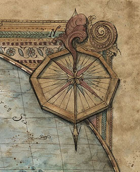
The most common pointer by far is the kind of triangle/diamond shape seen above.  It is often split into two halves with one half black and the other white, but entirely black and outlined white are common as well.  Typically near the center of the compass it narrows back to a point to create a diamond shape, but this is often covered by a circle ornament, so it appears to be a triangle.

One variant of triangle style pointers is to make them wavy as in this example:

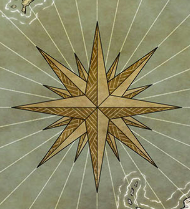
A very particular variant of the triangle pointer style turns all the pointers into rays and adds a central sun:

Apart from the triangle style, the next most common pointer is some variant on an arrowhead:
Occasionally there will be a more artistic version of a pointer, although typically still some variant on an arrowhead:

In very artistic compasses, the pointers may be swords or some other figurative element.

The arrangement of the pointers always includes the four cardinal directions (N/S/E/W).  (Very occasionally a compass will have only a North pointer, but this is usually a very simple compass or a very artistic one.)  The pointers for the cardinal directions are always the longest pointers in the compass.  Other pointers are usually shorter than the cardinal pointers, but sometimes they're all the same length.  Very occasionally the North pointer is longer than the other cardinal directions:


Or the North pointer may be distinguished with an ornament, such as a fleur de lis:
There can be many pointers between the cardinal pointers, but they're always symmetric.  In some cases the finer pointers are just lines:
The pointers are often labeled with directions.  Most commonly the cardinal directions are labeled, but sometimes the intercardinal directions (NE/SE/SW/NW) are labeled as well.  Very occasionally even finer divisions are labeled:

There are a variety of different names for the compass points:
If the directions are labeled, they are (almost always) the outermost elements of the compass.  They often stand alone, but are sometimes placed in a ring as in this example:
If a map contains windrose (or compass) lines, at least one set originates at the compass:
But these aren't properly part of the compass and I won't be concerned with generating them.

It's not unusual for a compass rose to be only pointers (as in the example immediately above) but they often include circular elements as well.  So let's talk about circle elements.

One simple case is a circle or two set behind the pointers:
A variant of this replaces the circle with a scale of alternating black and white bars, similar to the scales used in map borders:
The scale serves much the same purpose as the pointers, breaking up the circumference of the rose into additional directions.

A more complex version of the scale is a kind of vernier scale that provides finer graduations:
As in this case, the vernier scale may be marked as well, although this is a modern invention and not usually seen on fantasy maps.

Generally a scale or vernier scale is outside of the pointers but occasionally (as in one of the examples above) the scale is inside the pointers.  Here's an example where there is a vernier scale of sorts inside the pointers:

Another common design is a sequence of circles of differing radii:
A variant is to draw the circles as bands -- two lines with a contrasting color between:
This may be more common in colored compass roses, where it is easy to distinguish the band.  In a mono-color rose, something of the same effect can be accomplished by filling the space between two circles with a repeated ornament, as in this rose:
The addition of simple dots between two lines makes it read as a band.  This example has a more complex pattern within a band:
While it is common for all of the circle elements to lie entirely behind the pointers, it is also common for some of the circle elements to lie atop the pointers:
Here the outer band is atop the pointers while the inner band is behind the pointers.

Occasionally a circular element lies atop some pointers and below others:
In these cases, the band is almost always “between" the cardinal pointers and the intercardinal pointers.

It is very common to have circle elements covering the middle part of the rose where the pointers meet:
   
It's not unusual for the center to be filled with a decorative element of some sort:
 
There are many variants of this vocabulary, but the basic elements of pointers and circles is sufficient to create a wide variety of compasses, as this sample from Oleg's generator shows:
These are all stylistically quite different, but all made up from the same base elements of pointers and circles.

For this posting I'm going to share the code to set up a basic web page with a button on it to run some Javascript code.  I gave some thought to the different ways I might share code.  There are some online playgrounds that let you mix code and text in interesting ways, and I considered using one of these but I thought that might create some limitations in how I could structure the code.  I also thought that might make it difficult for people to incorporate the code into their own projects.  So I decided to do a more traditional approach and provide code that you can download and run on your own computer.   My plan is to do a separate code release along with every posting in the series, so no matter when you're reading through this you should be able to see the code associated with this posting.  At the suggestion of the inimitable Azgaar, I will also use Netlify to build a website from each code release, so you can visit this code on the web at https://dragonsabound-part1.netlify.app/test.html.  (You'll be able to run the code and examine it in the browser, but you obviously won't be able to modify it yourself.)  So this will hopefully provide the best of both worlds.

After consulting with some (presumably more experienced) voices on my Twitter feed, I've decided to keep the code in a GitHub repository called Procedural Map Compasses.  That repository will have a branch for each part in this series, so the release for this posting can be found in the “Part 1" branch.  Each release should be self-contained and include all the code necessary to recreate what I've done in the blog post.  I'll use this posting to establish a basic framework for loading the code into the browser and running it.  

Note that I develop on Windows and do no testing on MacOS or Linux!  I've made a small attempt to accommodate those users by including MacOS and Linux versions of the Mongoose web server (see below) but I'd welcome contributions from Mac and Linux savvy folks to make the repository better for those users.  Contact me in one of the usual ways if you can help!

To start with, you should download the code repository by cloning the Git repository at “https://github.com/srt19170/Procedural-Map-Compasses.git" and selecting the “Part 1" branch.  (Cloning a repository means making a new copy of the repository, usually on your own computer.  The link above contains instructions if you don't know how to do this.) That should get you a folder that looks like approximately like this:
The main element in the framework is the HTML file called “test.html".  In a web server, this will load the Javascript code and create a simple web page that will provide a button for executing the code.  To make things simple, the Javascript code for generating compasses will live in the same folder as the HTML file.  Javascript libraries (code I did not write myself) will live in a sub-folder called Libraries (although there are no libraries in the code as of yet).

Also in the main folder I have included a simple Web server.  I use Mongoose, and since that's a single file that doesn't require any installation, I will include it in the project code so that you don't have to download it separately.  (I've included versions of Mongoose for Windows, MacOS and Linux, but as noted above, I've only tested these instructions on Windows.  For Linux, you can also see this page for some alternate ways to run a web server.  Remember that you need to run it in the directory with test.html!)  Double-clicking on the Mongoose executable should open up a page in your Web browser that shows the current directory:
In some cases I've had trouble with the URL that Mongoose tries to open.  If you have any trouble, try using “http://127.0.0.1:8080."  If that doesn't work, you're on your own!

At this point, you can click on test.html to open that page, which should display a blank page with a Test button in the upper left:
Let's take a look at what is inside the test.html page:
<html lang="en">
  <body>
    <div id="all" style="display: flex; flex-direction: row;">
      <div id="controls"
    style="display: flex; flex-direction: column; flex: 0 0 30px">
 <button id="testButton">Test</button>
      </div>
      <div id="map"
    style="margin-left:10px;">
 <svg id="svg" width="500" height="500">
 </svg>
      </div>
    </div>
    <script type="module">
      import Compass from './compass.js';
      var testButton = document.getElementById("testButton");
      var svg = document.getElementById("svg");
      testButton.onclick = function () {
   Compass.test(svg); };
    </script>
  </body>
</html>
This is a stripped down vanilla web page.  First it sets up some <div>s for controls and the map (really just a compass, but this is copied from Dragons Abound).  The controls div contains a simple button labeled “Test."  The map div contains an SVG element that will actually display the compass.

It also includes a <script> that does a couple of things.  First the script loads the Compass module from the same folder as the web page.  (Note that Dragons Abound uses ES6 module syntax; this should work in all modern browsers.)  Second, the script attaches the “test" function from the Compass module to the onclick action of Test button.  (This means that when you click the Test button, the “test" function will get executed.  And eventually that function will draw a compass into the SVG element so that it will show up on the page.)  The SVG element gets passed into the test function so that it will know where to draw the compass.

Now let's take a look inside the test.js file:
//
//  Top level file for Map Compass Procedural Generation
//
function test() {
    console.log('Well, at least we got this far.');
};

export default {
    test: test
};
There's not much here yet.  The test() function is defined, but all it does is print a message to the console.  Then test function is exported so that it can be used outside of the module.

To actually see the code work, you will have to open the browser console.  To see the console in Chrome, you need to open the Developer Tools with CTRL + SHIFT + I or F12 and then hit the Escape key if the console is not showing.  On Firefox you can open the console from the Web Developer sub-menu or by hitting CTRL + SHIFT + J.  (Just different enough to be confusing!)  On Chrome you'll see something like this on the left side of your browser window:
The console is the part at the bottom showing the two error messages.  Your messages and layout might be different.  There are many tutorials on the Web to help you understand and use the Web Developer tools in Chrome and Firefox, so please refer to those if you have further questions.

Meanwhile, try clicking on the Test button.  The console should show the test message:
The “onclick()" function I attached to the test button in the HTML page is calling the test() function from the compass.js file.  And that function is using console.log() to print a message to the console.  The console is very handy for these sorts of debug messages and testing.  

In addition to the code files, the compass examples I used above (and others) can be seen in a folder called “Examples" in the repository.  I'd be happy to expand the collection, so please submit any examples you think should be added.  I'm not exactly sure how to best do this, but please submit a change request to that branch with your contribution and we'll see how that works.  Please try to submit compasses that are different from the existing examples and  demonstrate some new variant of compass style.  Include your explanation of the value of the new compass in your submission.

And as mentioned above, I'll also end each posting with “Suggestion to Explore" with some ideas on how you can expand or play with the ideas from the posting.   (You'll see that below.)  Next time I'll start on drawing a compass from a description.

Suggestions to Explore

  • Test.html puts a 500x500 SVG element on the web page.  How would you put a border around that element to make it easier to see?

  • The test function prints a message to the console log.  That requires having the console open.  It would nice to be able to put a message on the web page.  Modify the code so that test() returns a string and display that on the web page below the Test button.

Wednesday, October 20, 2021

Creating a Pencil Effect in SVG (Part 2)

Quite some time ago, I wrote a post about creating a pencil effect in SVG.  It's challenging to do a pencil effect in SVG because SVG is fundamentally a vector graphics format, and pencils are fundamentally not.  I ended up applying an SVG filter that added some texture and other effects to create a line that looks at least somewhat like a pencil:

At the time, I left it at that and skipped over a couple of other characteristics of pencil-drawn lines that I didn't have a good way to replicate.  One of those characteristics is that pencil doesn't completely cover whatever is underneath it.  So when two pencil lines overlap, they build up to a darker color.  You can see an example in the drawing below, where a single pencil makes a spectrum of shades, in part by building up graphite in areas where lines are drawn repeatedly:


Admittedly, artists control darkness by pressure and density of line as well, and the color of the graphite limits how dark you can go.  But in general if we want to have a good “hand-drawn pencil" look, we'd like to get some darker textures where lines overlap.

In SVG, when one line crosses another line, the top line complete covers the bottom line.  So when you have two lines of the same color that overlap, they just seamlessly blend into each other.  Here's an example of a map where I've filled in a forest area with a bunch of scribbled lines in a pencil color:
It has a little bit of texture thanks to the pencil effect, but all the lines just blend into one flat area of color.  That's pretty unsatisfactory.  So how do we get the colors to “build up" where lines cross?

You might think (I certainly did) that opacity is the answer.  If we set the opacity of our lines to (say) 50%, then 50% of the underlying color will show through, and that will let us build up a darker shade where lines cross.  But unfortunately, it doesn't work that way.  If the colors and opacities are the same, then the overlap area looks just like the non-overlapped areas.  No matter how many layers you build up, it always looks the same.

There are other work-arounds that I might consider, but if you have any experience with computer graphics you might have heard of blend modes.  Blend modes control how two colors interact when they overlap.  The default is alpha compositing, which is what SVG does where the top color completely obscures the bottom color.  But there's another mode called multiply that blends two colors when they overlap in a way that would be useful for pencil strokes.

The bad news is that SVG doesn't support multiply blend mode except in filters.  There's no way to tell regular SVG elements to multiply with colors below.  (Except perhaps by abusing filters in horrible ways that I don't want to contemplate.)  The good news is that CSS does support a multiply blend mode!

CSS is a styling mechanism for browser pages that provides a flexible way to control the appearance of page elements.  CSS was invented around the same time as SVG, but unlike SVG has continued to grow and evolve and has added capabilities like blend modes.  In modern browsers you can apply CSS styles even to individual SVG elements, which will enable us to borrow the multiply blend mode from CSS and use it in SVG.  

Here's what the flat fill example from above looks like when I turn on CSS multiply blend mode on all the individual pencil strokes:

Needs some tuning, but you can see that the color now gets darker where strokes overlap.

(There are some reasons not to mix CSS and SVG, the primary one being that the CSS effects will be lost when you isolate the SVG -- say to import it into Inkscape for some manual editing.  But in this case, there's no real work-around that would allow me to create this effect in “pure" SVG.)

There are a number of improvements I can make to the first effort above.  One is to break up the long fill strokes into shorter segments.  An amateur human artist likely wouldn't draw single lines all the way across the area.  He'd fill in using shorter strokes and work in patches across the area.  Splitting up the fill area into realistic patches is a little too challenging, but it isn't too hard to break up the lines going across the fill area into smaller segments:

I've circled an area where you can (faintly) see where long lines have been broken up into consecutive line segments.  Because both ends of each segment have rounded ends, and one segment ends on the start point of the next segment, you get a sort of circle where they overlap.  That's a little too regular to be pleasing, so let I'll make the start and end points a bit more random:

This goes a long way towards making the strokes more evident.  In the same area as above, you can clearly see a stroke ending and an overlap just above.  This example is a bit too obvious for my tastes, so I'll tone it down and adjust it to be a little more subtle:

Another aspect of hand-drawn pencil strokes that I didn't include the first time around is gradient.  Pencil strokes are often darker at the beginning, or where they change direction.  This is partly because humans aren't very precise and don't always hit exactly the right shade when they make a pencil stroke.  If you start too light you can just go over it again, but if you start too dark all you can do is ease up quickly, leaving a darker start to the line.  And it's partly because physiologically it's easier to trail off a line than to trail in a line.  At any rate, you often see strokes like on the right side of this image:
where some strokes start dark and end lighter.  Compared to the pencil strokes on the left side, these seem more realistic.  (Although somewhat exaggerated here.)  

The bad news is that, like blend modes, SVG doesn't implement gradient colors on lines.  The good news is that I already tackled this problem back when I was making river borders work better.  So it's just a matter of reusing that code to occasionally mix in a stroke that starts dark and ends lighter.

But in the process of doing that, I discovered some problems in the code that fills an area with lines.  It was drawing some lines in one direction and some in the other.  And the code itself was complex enough that I didn't really understand how it worked anymore.  So I stopped and reimplemented the code to “sweep" a polygon in a more straightforward way.  There are some efficient algorithms for doing this, but I was content with a simpler implementation based on the description here.  (The basic idea of drawing lines across a polygon at an arbitrary angle by first rotating the polygon and then drawing vertical lines is very clever!)

This change means re-tuning the various parameters, but eventually I have this:
Which you can see now contains the occasional line that starts dark and gets lighter.  I've kept this fairly infrequent.  In this example I've used a fairly wide “pencil" and kept a fair amount of erratic placement.  I think this looks good, but you might prefer an artist with a better “hand" who is closer to that flat machine fill ideal:
Or perhaps a narrow pencil:
I prefer the first version, but all the styles seem pretty realistic to my eye.  Here's a look at the entire map with these changes in place (click through for a hopefully full-sized image):
One area that could still be improved is the line direction.  Especially when seen on a full map, the very consistent line direction doesn't look realistic.  I've done some simple experiments to try to address this and haven't been entirely happy with the results, but I'll continue to think about it.  Maybe that will be in (Part 3) in a year or so!

Wednesday, October 6, 2021

Haunted Forests

(After a long break to pursue other interests, I've returned to Dragons Abound with some new material.  I have at least a few months of postings lined up and we'll see where it goes after that.  Special thanks to the folks who reached out to ask if I was okay!  I was fine, just off doing other things, but the care you showed meant a lot to me.)

The forests I implemented for “Knurden" style maps (here) are essentially a background color filled with scattered trees, like this:

Partway through implementing these forests, it occurred to me that I could create a “haunted forest" by replacing the forest background color with a blurry grey and making skeletal tree icons.  I set that thought aside, but I did parameterize the top-level routine so that it could work with any kind of tree style and make something like haunted forests easy to implement.  Famous last words!  Let's see how right or wrong they are.

The first step is to pick a clump of forest to make haunted.  I want a clump that is fairly small, like the forest north of the river on this map:

I use the debugger to get the size of that forest, and then just pick a forest of roughly that size to make the haunted forest.  For the moment I draw it as a fir forest to check the logic.  On this map I got lucky and got that same forest:
Eventually I might want to use some additional criteria to pick the forest (such as picking one away from towns) but for now I'll just take the first forest I find that is the proper size.

The next step is to draw in the gray fog.  I'll start with just filling in the forest shape with gray:
This is supposed to be fog, so I'll make the edges indistinct.  Maybe it should have tendrils or wisps as well, but I can always add that later.  And I'll make it somewhat translucent as well.
I like the edges here, but overall this is too subtle.  This might be a good place for a radial gradient, so that I can make it heavier and darker in the center and fading out to the edges.  SVG only supports circular gradients, so the fade will not be consistent but might still look good.  I also played around with using some different colors.  I ended up with this:
This looks pretty nicely fog-like, although it isn't perhaps as menacing as I might like for a haunted forest.

The next step is to add some trees to the mist.  As you'll find if Google it, there are a lot of ways to procedural generate tree skeletons.  A common one is “Lindenmayer systems" (or L systems) which is a family of grammars that can be used to generate tree skeletons as well as other phenomenon.  The trees I'm going to generate are so small and simple that an L system seems like overkill.  So I'll just roll my own and see how it goes; I can always do something more complex later if this doesn't work out.

We'll start with the trunks as a smoothly tapered line:
Of course, scary trees shouldn't grow straight like that, so let me add some jitter:
For tree trunks, I want the jitter to go back and forth (I don't want trees shaped like a big C for example) and I want the perturbations to be pretty sharp, not smoothed out as when I create a “hand-drawn" line.  So I had to create a new perturbation function that alternated the direction to perturb the line.

While I'm at it, I also want to apply a mask that fades out the tree towards the bottom, as if it is disappearing in the fog.  I can do this by applying a mask filled with a linear gradient from white to black.
Note that I've adjusted the mask so that the tree doesn't completely fade away.

Now I need to add some branches to the tree.  I'll alternate sides on the tree and make the branches shorter as they get near the top.  Maybe I'll need branches on the branches, but we'll see.  These icons are pretty small.  To make branches, I'll pick a point on the tree, draw a line straight up, and then rotate it either left or right.  After playing around a bit:
(This is at 150% size.)  This looks sort of okay -- good enough to move forward with putting these on the map to see how they really look.

To sprinkle the trees throughout the fog area, I use Poisson sampling, which I've talked about previously.  It takes a few tries to get a good sampling distance, but that gives me this:
I'm not sure whether I like this or not.  At this scale it is hard to be artistic, but these look (to my eye anyway) to blotchy and clumsy.  I made some adjustments to try to keep white space between the branches and to generally thin down the lines.
The “trees" look a bit like scraggly Christmas trees, but there's a limit to what can be done at this scale.  The trees are also too regular in the fill, but that I can address; I tried a couple of different approaches and settled on this:
Now that I'm more-or-less happy with the look of the haunted forest,  I want to put an appropriate label onto the forest.  And this is where I run into a problem.

As it turns out, the haunted forest above isn't really a separate forest.  It's actually part of the larger forest south of the river.  But maps are often drawn with the forests pulled back from the rivers to show how they run, and so this forest gets split by the Flotilla River and displays as if it is two separate forests.  This becomes apparent if I turn off the option to draw the forest back from the river:
*Poof* no more haunted forest.  (The river should be under the forest, but that's a different problem.)

This matters because naming occurs earlier in the map generation process and works on the intact forests.  So there isn't any way to give the haunted forest segment its own name.  The haunted forest really needs to be its own separate forest.  The best way to accomplish this is to split off the haunted forest earlier in the generation process, and modify map so that it is separated from other forests even if the forests aren't pulled back from the rivers.  That's not so easy to do (and my approach is not particularly efficient) but eventually I have this:
The haunted forest is now on a different part of the map,  As you can see I fixed the error so that the forests are now obscuring the rivers, but I've still pushed the forest back away from the haunted forest even though that's not on for display purposes.  So now I can go back to trying to label the haunted forest.

First I'll just put a placeholder name on the forest.  I'm just reusing the existing forest label code, so this is straightforward.
Next I need to generate a good name for a haunted forest.  I haven't done place names in a while, so I have to go back and re-familiarize myself with the code.  I use a library called RiTa.js which I've modified somewhat to meet my needs.  Names are generated using a (mostly) context-free grammar, which I explained in detail here.  But I don't need to create an entirely new grammar; it should be sufficient to borrow the grammar for naming forests, use a lexicon suited for scary haunted places and throw out any name forms that aren't appropriate.  I can borrow some of the lexicon from the similar Lost Coast names.  With some editing, here's a list of ten random haunted forest names:
  • Milky Forest
  • Wailing Forest
  • Wasted Woods
  • Bloodstained Woods
  • The Calamity Forest
  • The Apparition Forest
  • Cruel Woods
  • Unearthly Aberration Forest
  • Sepulchral Talons Forest
  • Foggy Toll
And for my example map:
The “Sunless Forest".  This label style is a little difficult to read on the gray of the haunted forest, so that might need to be tweaked.

The last thing I've added is some code to place the haunted forest as far away from the nearest city as possible.  Although I could see some interest in having a haunted forest right outside of a town, I think on balance it probably makes more sense to have it far away.

And that's about it for the haunted forest, at least for now.  One thing I'm trying to do is stop development of a feature at a reasonable point and let it sit for a while.  Later new ideas might occur to me, or, after having seen it on maps a few times, I might have an idea on how to improve it.  So I'll let this age and possibly revisit it later.  (And if anyone has any good ideas on drawing a skeletal tree better at this scale let me know!)

Next time I'll return to the topic of pencil effects in SVG.