Wednesday, December 27, 2017

City Symbols (Part 5): Larger Buildings

In this series I'm working on procedural generation of map icons to represent cities.  So far I've been focused on generating simple houses:
Now I'm going to look at generating some larger buildings.

One obvious option is just to increase the size of my small buildings by making them wider.  This actually works fairly well:

although obviously the buildings created this way share a lot of visual elements with the small houses.

Another approach is multiple story buildings.  Most of the building blocks are in place for multi-story buildings -- it's mostly a matter of lifting the roof up and sticking in more basic building shapes for the additional stories.  Obviously I don't want doors in the upper floors, and I suspect that having the same window placement in the upper stories will look better than random windows.

Here's a first cut at a two story building:
It's basically just a one story building with the story height doubled.  That's because my code incorrectly assumes that the height of the building shape is also the height of one floor.  I need to separate those two numbers.
That's better.  Now I need to add the windows in to the upper floors.
Looks good.  I've added in some variation in the size of the windows.  Only a small amount so that they still look the same size, but enough to make them look a little more hand-drawn.

Tall buildings start to look like towers, so let me add a roof with battlements.   This is a low wall with gaps like teeth that are familiar from every child's castle drawing:
There's also the version where the battlement has been stepped out from wall to overhang the building.
A simple wall is just a house with a flat roof, and no windows or door:
These are more interesting when they have battlements:
Doorways in walls are a little different than the doors in houses.  I'd like these doorways to have the option to be open and show whatever is behind the wall.  To do that, I actually have to carve the door out of the wall, or I get something like this:
Here the door is not filled in, but the wall behind it still is.  So I'll carve the door out by removing the baseline between the sides of the door and substituting in the path of the door.
Now a castle of sorts is two towers with a wall between them.  Here's an initial cut:
This will probably continue to evolve, but you get the general idea.  Hopefully I'll be able to use all these building blocks together in interesting ways.

Sunday, December 17, 2017

City Symbols (Part 4): Faux 3D for Simple Houses

As of the last posting I had developed simple houses in a number of different styles.
Now I want to look at some 3D effects, such as seen in these city icons from the Western Torfani map:
In the Karambo city icon, you can see that some cylindrical buildings and the domed roofs have been shaded to give them a more 3D look.  And in the right city, you can see cast shadows on the ground and within the city itself.  These sorts of effects are called "Faux 3D" in Dragons Abound.
Let me start with the shading for cylindrical buildings.  At a minimum, that's just putting a dark band along the left side of the house.  I can create the shading band from the fill color of the house by reducing the luminance, although I don't want to use the same shade I'm using for the doors and windows.
You can see this is pretty crude, but at the map scale it's barely noticeable.  I can improve things with a little more elaboration.

Shrunken down to map size that looks pretty good.  SVG also offers linear gradients, so maybe I could take advantage of that.   We need a left-to-right gradient that mimics the layout we have above:

That actually looks pretty good.  I thought the linear gradient wouldn't work at the map scale, but it looks fine.  The colors are a little faded out to my eye, but not enough (at map scale) to worry about correcting.

(Note:  I later realized that the was a problem with the colors in the gradients and corrected this problem.)

Now let's see about giving the roofs a 3D effect.  Unfortunately, SVG doesn't offer exactly the right sorts of gradients to do this easily, but for domed roofs I can probably get by with using a radial gradient and treating the dome as a half of a sphere.

That doesn't look exactly right to my eye, but at the map scale it's certainly close enough.  

The peaked and flat roof styles look strange when combined with a cylindrical building, so I won't use those combinations.  But the eaved roof style (above) looks like a conical roof and I would like to be able to use it.  The gradient I need to do a conical roof correctly is a kind of "sunburst" gradient that pinches a linear gradient to the point at the top of the roof.  I don't think there's any way to do exactly that in SVG (let me know if I'm wrong about that), but I can do a crude approximation using a linear gradient that has been rotated to approximately the pitch of the roof.
I've used some artistic license here in not matching up the gradients exactly, because when I do that the roof and the building blend together too much.  At any rate, I think this is "good enough" at the map scale.

Unfortunately, now that I've added 3D effects to the round houses, the standard flat style doesn't look very good in comparison.  Which means that if I want to use 3D effects, I'll be limited to just round houses.  That doesn't seem acceptable, so let me go back and "3D" the standard houses.  An approach to doing this is illustrated in these icons from the Western Torfani map:
(I've blown this up to make the details more visible.)  In these examples, the foreshortened side of the house and the roof have been added. 

The house side is not too difficult.  I'm not bothering to do real perspective, so this is just a short parallelogram off the left side of the house.

And since this is the shadowed side of the house, it should be in the shadow color.  And for this type of roof ("peaked") the roof side is another parallelogram.
The "eaved" style of roof in 2D looks like this:
For 3D I'm going to make this into a pyramidal roof.  This is basically like the eaved roof above, except the roof side comes to the top center.
Since this roof overhangs the house, I'll add a shadow under the eaves.
The pagoda style roof is much the same, except with curved roof sides.
Now I want to add a shadow to the house.  I'm already doing shadows of this sort for mountains by reusing the outline of the mountain for the shadow but skewing it and filling it with a shadow color.  Unfortunately in this case I don't have the whole outline, but since the house is basically the roof and the body of the house I'll reuse those.

Transformations in SVG are always problematic for me because they are applied to the entire coordinate system, so skewing an object also moves it.  With mountains, I drew them at the origin of the coordinate system, which made transforming them easier but then required me to translate them afterwards.  For houses, I'm drawing where I want them, so the transformations are different.  After reading and re-reading some basic material, I eventually get the right incantation to skew and scale the shadow.  I also reduce the opacity and add some blur:


Here's what they look like on a map:
Next time I'll look at doing some larger buildings.

Monday, December 11, 2017

City Symbols (Part 3): Some Styles for Simple Houses

In the last posting I implemented simple houses to use for city icons:
One basic element I didn't get around to adding last time was a chimney.  This is just a rectangle sticking up off the roof line:
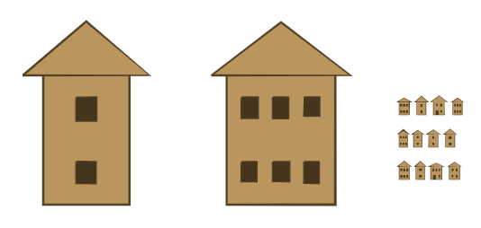
For these to look good at the map scale they have to be pretty sizable and have good separation from the roof peak.
It looks a little odd in a group like that, but of course normally I won't have a chimney on every house.
Here's a quick look at using these on the map to represent a small village:
Looks pretty good so far.  One thing I notice here is that it looks odd to have a house symbol overlapping the ocean (where the circle looks okay, compare Liel Luu above), so that's something I will have to address at some point.

These houses have some variation in things like the roof height, size and number of windows, etc., but they're basically all the same "style".  But I'd like to have houses of different styles, so that (for example) I can use different style city icons for different countries to visually hint at different cultures.

The first style variant I'll implement is pretty simple:  Adding eaves to the roof lines.  These are just little extra lines coming down from the roof:
These might look a little exaggerated but they're still only barely visible in the map view:
So maybe not a very effective styling, but at least easy to implement.  It might be better to fill in the eaves, like so:
This is more obvious than the other eaves style at map scale:
Another variation of peaked roofs is the "pagoda" style roof where the roof line is notably concave.  I'm doing semi-circles and arcs for a number of other things in Dragons Abound (such as labels and mountains) so it's pretty straightforward to replace the roof sides with arcs:
Notice that the arc has to be pretty exaggerated to be visible at the map scale.

Peaked roofs are an artifact of northern cultures where snow buildup is a problem.  In the Middle East and other climes where snow is rare flat or domed roofs are also common.   Since flat roofs are a little easier, I'll do those first.
The flat roof needs to have more thickness than the house outline so that it shows up at the map scale. 
A domed roof is created like the pagoda roof, but in this case using arcs that go outward:
Those roofs look a little crude because I'm only using 6 segments to render them.  But at the scale they'll be used in the map, this looks fine:
The tallest domed roofs start to look a bit like peaked roofs, so when using this style I'll probably reduce the possible height range of the roofs.

With domed roofs we should also have domed doors:
Unfortunately, these aren't really visible at the map scale (at least to my old eyes, YMMV):
Finally, domed roofs really should go on circular (cylindrical) houses.  This is mostly just a matter of changing the baseline of the house to be a curve.  This is surprisingly easy to do, since I already have the same code working to do the domes for the roof and the door.
You can see there are a couple of problems, though.  First, the door is floating because it still thinks it's on a straight baseline between the corners of the house.  Second, the flat line for the dome roof now looks wrong.  The windows should probably also lie along a curved arc, but I'm hoping this won't be necessary at map scale.

Fixing the door is a bit complicated but not too bad.  I need to extend the door downward and find the two points on the baseline where the door would hit. If I'm lucky, I'll be able to connect straight across those two points.  If I'm not lucky, I'll have to recreate the baseline curve between those two points.  Let's see if I'm lucky:
Looks fine, so I guess I'm lucky this time.  (Even if it didn't look good at this scale, it might have been fine at map scale.)  Now I need to do the same thing with the bottom part of the dome roof.  It's probably not necessary, but if we reduce the curvature along the top line it will make the perspective look more correct.
That improves things a lot, but now the straight line of windows does stand out.  Let's see how it looks at map scale:
It's not glaring but it does look odd on the houses with multiple windows.  In for a penny, in for a pound, as they say.  To fix the windows I need to offset them from the corresponding spot on the baseline, so this works something like fixing the door.
Well, it's not what I'd call fine art but it's serviceable.  Let's see what it looks like at scale:
To be honest, I'm not sure that's a significant improvement but maybe it helps a bit.

Up to now I've been using a basic red and black theme for the houses.  That has a certain appeal, but in general I think I want a more muted color scheme with less stark contrast.  To do this, I'll pick a fill color for the houses and then create the colors for doors, windows and outlines from that color.  Here's what that looks like:
This isn't very "artistic" but by using colors that vary only in luminance, the color scheme is guaranteed to work together.  And it means I only have to pick one house color.  Picking a color in the same family as the land or forest will also help the symbols to fit in well with the rest of the map.
One thing I did with mountains and other elements of the map is to create a hand-drawn look by jittering lines and adding some other line variations.  While I can certainly add this effect to these small houses, it is mostly unnoticeable unless the jitter is large enough to interfere with the drawing: 
The one element that does seem to work somewhat is varying the width of the line, which even at the small scale can introduce some interesting variation.

Next time I'll look at giving the houses a 3D look.