Wednesday, August 21, 2019

Azgaar's Fantasy Map Generator

In the previous posting, I generated some maps and did a self-critique.  To bookend that, I'm going to take a look at another really good map generator:  Azgaar's Fantasy Map Generator.  Like me, Azgaar started with Martin O'Leary's generator.  But Azgaar made some different decisions in how he elaborated that generator.  Most notably, he had a focus from the beginning to create an interactive tool for generation, and he's made it publicly available, so it has a thriving community of users over at /r/FantasyMapGenerator.  If you haven't ever looked at Azgaar's generator, I encourage you to do so.  To be honest, this review will be less criticism and more highlighting some of the more interesting aspects of the generator!

The first thing I notice in playing with Azgaar's generator is how fast and smoothly responsive it is.  A few operations (like generating new terrain) take a second or two, but most operations happen virtually instantaneously.  This is in great contrast to Dragons Abound, which can take many minutes to generate and display a map.  I also love that when you zoom in, new details become visible.  At the default zoom level you don't see much more than the outlines of the land and large rivers.  As you zoom in, trade routes, country boundaries, cities and more become visible.  It's all very nicely done.  Beyond the mouse, the interface is handled through a widget in the upper left hand corner of the map.  This pops out to provide access to a variety of options and features.  There's a tremendous amount of control possible.

Beyond those first impressions, let me take a look at three legs of the map generation stool: (1) terrain generation, (2) culture generation and (3) the map display.

To start with, take a look at the options Azgaar provides for terrain generation:
Azgaar provides a list of about ten different land templates.  These include things like a large central island, a peninsula (going off the map edge), a Mediterranean central sea, and so on.  This is really a very clever way to handle this part of the interface.  Most users presumably have a high-level notion of what the map should look like (e.g., “a big island", “like the Mediterranean", etc.) and don't really want to play around with low-level control of the noise generation.  Some of the options like “Pangea" aren't immediately intuitive (to me, anyway) but generating a few sample maps (which can be done quickly!) gives the idea.

The template choice plus size and detail are the primary options for controlling terrain generation.  The templates do a pretty good job at creating usable maps, but it's obvious that most of the land generation is based on noise, so if you're looking for geologic accuracy you're going to be disappointed.  The land shapes also often have the typical ink splatter look of noise-based generation:
but that's an objection you could raise about almost any procedural map generator (including Dragons Abound).

If you don't like the generated terrain, Azgaar provides a tool to paint new terrain:
There are a variety of paint brushes and other tools to use; here I've painted in an isthmus.  So this is very nice for customizing a map, or if you're trying to match an existing map you can generate maps until you get a close approximation and then use the paint brushes to tweak it into alignment.

There's also a tool to create new templates.  I expected this to be something that would take a map and turn it into a general pattern, but in fact it's something quite different:
A template is a sequence of generation actions (like “Create a hill").  There are 8 possible actions, and they each have some parameters that you can assign values or ranges of values (in which case a random value in the range is selected when the action is executed).  This is a very smart way to approach templates, and something I'm inclined to recreate in Dragons Abound.  One of the nicest features of this approach is that you can repeat actions a number of times; something that essentially has to be hardcoded in Dragons Abound.  On the flip side, this is the sort of thing that could become quite a rabbit hole and end up implementing an entire scripting engine.  (Not that I've ever been guilty of that sort of overkill, of course.)

A final option for creating terrain is to upload an image and convert it to a heightmap.  The whole process is described in this blog post.  I haven't tried this myself, but it seems like a useful feature for (say) recreating a map from your favorite fantasy book.

Before I get off of terrain generation, let me take a quick look at rivers and lakes:
Azgaar's river generation seems to be a lot like Dragons Abound's, but there's something odd going on that (at least to my eye) creates rivers with a lot of sharp right angle turns, as you can see in the three rivers on the right side of this map.  As for lakes, I'm not sure what Azgaar's doing, but it looks like they're being placed randomly (as Dragons Abound does).  Lakes also have a different color from both rivers and oceans -- I'd probably make them the same color as rivers.  (Lake color is something you can change.)

The next step in the map creation process is the culture generation.  This step creates the human occupation of the land: states, cities and so on.  The culture generation is described in detail in this post, but the TLDR summary is that it uses a fairly straightforward algorithm that places capitols, towns, and then divides the land up into states.

One interesting wrinkle Azgaar has introduced is the notion of cultures versus states.  A culture is a unified set of beliefs and social norms, like the Kazakh culture, or the Desai of India.  Cultures often follow country borders but not always, and you may have pockets of a neighboring culture across the border in a different county -- like French influences in Switzerland.  Azgaar creates both a cultural map and a state map, and they do not precisely coincide:
Here the dotted lines are country borders and the colors cultures; you can see how the yellow culture is mostly in three countries along the coast, but there is large green culture influence in two of those countries.  I'm not sure how useful cultures really are; they seem to be used primarily to pick city names.  But it's an interesting idea, and certainly has a lot of potential.

Azgaar's generator creates the states by growing out from the capitol city.  This map shows a common problem with this approach:
Here “Repi" has grow to encompass a few islands and has also nibbled a peninsula out of “Rafha."  Furthermore you can see that “Rafha" also has a small chunk of unaffiliated territory (“wild lands") along the coast.  This looks (at least to my eye) pretty unrealistic, especially since you can see the trade routes pass right along the edge of wild lands.  It's hard to imagine why Rafha wouldn't claim those lands right along a trade route, or why they would permit Repi to have that little chunk of land.  Dragons Abound generates states essentially the same way, and despite various attempts I've made to address this, it's a common problem in Dragons Abound as well.

As usual, Azgaar has made the cultures and the states editable.  The names for both the states and the cities are randomly generated from name lists based upon real world cultures (e.g., Chinese, German, etc.)  There are quite a few available:
I'm not exactly sure how the random name generation works; I'm guessing that it does some kind of n-gram generation using syllables and frequencies taken from the list of sample names in that language.
Looking at these city names you'd probably guess (correctly) that they're taken from Spanish.  Changing the namebase for the culture to English and regenerating the names:

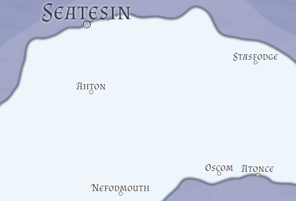
This gives names that are more recognizably English.  But a problem with this sort of name generation is that the names (particularly when you see a large number of them at once, as you do on a map) aren't very plausible.  Certainly something like “Nefodmouth" on the surface seems English but pretty unlikely. If it was an odd one-off you'd probably pass it over, but when every name has that quality it is more noticeable.  (Of course, you can rename all the cities  yourself if you're so inclined.)

On the other hand, one nice feature of this approach is that having different namebases to drive the generation does create a nice association between the cultures and the names.  So here along the coast of Repi:
You can see English names in the north and Chinese names to the south, and indeed there is a culture change between the two areas:
That's pretty cool.  I like map features that imply some deeper underlying mechanisms.  Even though Azgaar doesn't really have much more going on here than random cultures, the map clues give you ample room for your imagination to elaborate.

Lastly, the map display.  The map style is largely controlled by revealing (or hiding) various map layers through a simple pushbutton interface:
This is a nice, straightforward interface and there are 21 layers, so a lot of customization is possible.  At the bottom of the widget you can select any of the 21 layers and set various parameters for the layer, so you could (for example) change the lake color to match the river color.   There are also a few filters you can toggle; grayscale in particular is useful to easily make a black & white map.

Overall the display of the map is clean and pleasing.  There's quite a bit of variety available through customization of the different layers, but it can take a while to learn each of the elements.  But it's certainly possible to vary the look quite a bit.
To indicate forests, mountains, etc., on the map there is an option called “Relief Icons" which does this:
This is a pretty typical style seen in a lot of map tools.  There's currently only the one set of icons and no way to easily switch to a different set.  Oddly enough the icons remain visible even at the most zoomed out view of the map; I expected them to fade away.

The state labels are done in a really nice way that follows the spine of the state:
I need to dig into the code and see how Azgaar has implemented this; it's certainly worth stealing.

Beyond that, labeling is pretty rudimentary:  cities get a horizontal label centered above the anchor point.  Because city labels aren't generally visible until the map is quite zoomed in (and hence there's a lot more room between the cities) the labels don't usually clash, but there are places where it happens, particularly where city labels clash with the larger capitol labels or the state label:
This is probably the weakest part of the map display, but in most cases it's not really a problem.  Using a zoomed out map with state labels but no city labels and a zoomed-in map with city labels but no state labels eliminates almost all the clashes.  (You do still get labels on top of lakes, rivers, relief icons, etc.)

Overall the map display is very functional.  The tool can display a lot of information in many different ways, so by toggling layers and using customization you can usually find a way to display whatever information you need.  You can certainly produce maps that would be very useful for, say, a role-playing game.  (And many people in the community are doing just that.)

So what are my lessons learned?

First, it's that Azgaar has done a really nice job and created a very mature tool.  Although I've recently subscribed to his Reddit group, in the past I mostly followed his blog -- which hasn't been updated in over a year -- so I was quite out of date on his progress.  The tool is really solid and full-featured.

Second, it's really nice to have a responsive user interface and an easy way to tweak a map on the fly.  Azgaar's tool is very much designed to be actively driven by a person building a map.  Sadly, I don't think that's easily possible for Dragons Abound but I certainly should think about adding some more capabilities like that where I can.

Finally, Azgaar has come up with some nice “shorthand" approaches for some complex configuration problems.  I particularly like his templates for terrain generation and the scripting approach for defining templates.  These are things I should steal, er, use as inspiration.  (Update: I'm working on it. :-)


Monday, August 12, 2019

Looking in the Mirror

In which the Author turns a Critical Eye upon his owne Works

Most everybody -- myself included -- is sick of map borders at this point, and over on The Reddit one of the suggestions for a new topic was to post some maps and provide some self-review and criticism.  That's something I can do fairly easily over the summer while spending most of my time on other projects. 

 I fired up the generator and here is the first map that came out:


(Hopefully you can click through on the map to see it full size; if Blogger does something awful I apologize.)

I'm going to try to focus on areas where I think there's something interesting to say, but before I get into particulars, a few general observations.  I think there's a lot to like about this map.  It's well-composed and fairly pretty.  It's using one of my standard map styles, so the colors all work well together.  The subtle textures on both the land and the ocean keep the map from feeling too graphical.  The overall land shape is interesting, there's a nice variety of coastline from smooth to more fractal, and a good mix of islands.  None of the place names seem particularly stupid or artificial (although “Main" forest is borderline).  If I'm being honest -- and hey, why not? -- in my opinion this map is better than most maps you'll see on reddit/mapmaking and not in the bottom tier of the maps at Cartographer's Guild -- but also clearly not at the level of the better mapmakers at the Guild.  I'd say it's at the level of “talented amateur," perhaps.

Now for the problems and discussion...

While the overall land shape is interesting, and there's a nice mix of bays, points and islands, I'm not at all sure this is very “realistic" geographically.  At a regional scale almost any land shape is arguably realistic, and I don't think this map rings any strident alarm bells.  But at the same time, something like this at a larger scale would probably seem pretty artificial.  I haven't yet done a lot of work on continental scale maps, but this is definitely something that will need to be addressed at that scale.  Or I could just stick with regional maps :-)

Overall the label placement on the map is very good.  If you look at the labels you'll see that they're nicely spread out but still clearly attached to features.  There's one major labeling problem on the map -- “The Shellback's Croft."  This labels the unpopulated coastline along the southern part of that shoreline, but the label has been placed at an angle to, and crossing, that shoreline.  The reason for this is pretty clear -- it's not possible to place the label along that shoreline without crossing a coast -- either the coast of the large island at 2 o'clock or the shoreline coast.  It would have been better to place the label crossing the island, but Dragons Abound gets this wrong.  As I've noted before, labels are really hard.  I can make tweaks to fix this particular problem, but getting the right criteria to make labels always look perfect is very difficult.

Another label-related problem is the barrier islands on the lower right corner of the map.  The barrier islands are actually placed a bit off the visible area of the map, with the result that label for the islands ends up on the mainland and orphaned from the reference feature.  This happens because Dragons Abound doesn't display the actual edge of the map (where odd things can happen).  The solution to this problem is to not create barrier islands on the edge of the map; it turns out the code was sort-of trying not to do this, but not checking exhaustively.

One of the striking features of the map is the compass right in the center of the map.  I recently added the functionality to treat a map compass like a label.  During the label-placing process, the compass moves around trying to find a good placement.  In the case of a compass, this means in the middle of the ocean somewhere as far away from other features as possible.  In that respect, this code has worked perfectly -- the spot the compass has found in the center of the large central bay is the biggest area of open water on the map.  Of course, placing the compass dead center on the map is pretty unusual, and not really what I expected.  That said, I don't think it's a big problem, at least on this map.  If I really don't like this and it happens often, I can address it by adding a little heuristic for compasses that tries to push them away from the center of the map.

The final element of the map I'll comment upon are the mountains.  The random parameter selection here has resulted in mountains that are small relative to other icons on the map, and with very abrupt outline changes.  When the mountain icons are small, as they are on this map, it takes many of them to fill the mountain areas, and the result is more of a texture than a few representatives.  (There's something to be said about how the relative sizes of icons on a map affect our perception of the map, but I don't have my thoughts on that organized enough to write about.)  Instead I'll just say that I'm not overly thrilled with these mountains in either scale or shape.  Of course, it's easy enough to tweak the mountain generation parameters to stay away from this particular mountain style, but I have to be careful not to eliminate any creativity in the procedural generation.  (There's something to be said about the interaction between the size of the procedural generation space, the amount of creativity, and the amount of failure, but I don't have my thoughts on that organized enough to write about that, either.)  And something like mountains has lots of parameters, so it isn't always easy to know which parameter to tweak to avoid some unwanted generation.

Here's a version of the map addressing some of those problems:
It turns out that in the previous iteration of this map I had zoomed in to the central portion.  This shows a broader view.  You can compare this version to the previous version to see how the problems were addressed.

Another suggestion I received was to generate a number of maps using the full range of random generation and map styles to explore how well that works.  I don't have time to do a full exploration right now, but I re-generated the above map using a random style and the result was somewhat interesting:
If you compare this map to the previous one, you'll see that the land looks similar but not the same.  However, it is the same land mass -- the difference is that in this second map the sea level is lower, so there is more land showing.  The precise sea level is one of the random parameters in the full range of random generation.

Stylistically, the map is quite different from the previous one.  Most notably, the whole map (except for the edge scale) is in gray.  Forests have been drawn as individual trees rather than masses, and grassland is now empty, but deep grass is rather densely illustrated and given a shading.  There's now a coastal outline and an illustration in the ocean (but no compass).  The labels are all pretty reasonable and well-placed.  It's kind of interesting that on this map the proper names are quite long (“Dronshiduek," "Gupundumgill," “Blenshremmone") while on the previous version they were short (“Su," “Suglen," “Suam").  This is a feature of the name generator; it tries to create names within a similar family of names.

Overall I'd give the map another “talented amateur" rating.  There aren't any glaringly obvious problems.  The style is “okay."  It's not terrible but it isn't particularly compelling either.  Probably the most interesting thing is how different it looks from the original style.

Here's another random map:
Unlike the previous maps, this one is using a pseudo-3D representation of the mountains, and no textures on the map, giving it a more modern feeling (somewhat at odds with the forests being displayed as individual trees).  The colors are muted and there are large areas of white space.  The eye is drawn first to the lower left quadrant of the map, and then to “Lechol City" in the middle right.

There aren't a lot of obvious errors in the map -- the most egregious is the “Five Toparchs" label not fitting the label box.  The creek label up near the barrier islands is also very poorly placed.  If I have any overall criticism of the map, it's that it's a little boring.  But I look at a lot of these, so maybe that's just me.
The next map out of the generator is in some ways the opposite of the previous map.  The colors are quite bold.  The ocean in particular has a deep blue color and is mottled by depth.  The land has a speckled pattern.  Mountains are not shown at all, but the geopolitical borders are shown as blurred shading.  Terrain generation has produced a large number of small islands; particularly in the lower right.  This isn't particularly realistic (and doesn't happen often) but it admittedly makes for an interesting map.  Overall the map is quite dense with labels.

There are a number of problem areas on the map.  Most notably, there are two forests labelled even though forests are not being shown!  That's simply a missing logic check.  The geopolitical borders are also odd.  First of all, I don't much like the style used here with fuzzy borders, but more importantly, the shape of the single country (“Sungon") is a little hard to fathom.  The current algorithm for creating countries has some problems that I need to address.  I'm also not fond of the lakes (near the center of the map) here.  I've written previously about the difficulties of doing lakes well, and I've never been entirely satisfied with Dragons Abound's lakes.   To my mind, lakes got worse when I switched over to generating terrain on a more detailed grid; now lakes have the kind of fractal border that some of the coast has, but I don't think this looks right on lakes.  Lakes also don't follow the terrain correctly.  That's not particularly a problem on this map, but still bugs me.  I should probably just turn lakes off altogether until I can do a better job of generating them.  At least there aren't a lot of terrible label placement problems (although “Pa's Point" is in a bad place).

So what general conclusions should I draw from this review?

First, if you have a lot of different, interacting mechanisms driven by random numbers, then it's difficult to get them to all work correctly every time.  This is made worse if many of the mechanisms are procedural generation.  In procedural generation -- or at least in my interpretation of it -- we try to create mechanisms that can generate a wide variety of different results.  Often that results in a some bad results.  When a lot of these mechanisms are used simultaneously, there's a good chance one of them will throw up a “bad" result.

There are a couple of ways to address this.  First, I can tune the procedural generation as carefully as possible to limit the bad results without (hopefully) eliminating the creative results.  Second, I can post-edit out the bad results -- I can generate maps and simply ignore the ones that I don't think are good.  In practice, I do some of both but should probably work harder on the tuning.

Second, it's clear that labeling and label placement remain difficult problems.  I've added some rudimentary interaction capability to some kinds of labels that allow me to move them or regenerate the name, but it would be useful to have that capability for every label.  Azgarr has slowly turned his map generator into an interactive tool, and while I'm not interested in doing that, I see the appeal of having those capabilities.

I'm curious to hear what other people see in the maps, both good and bad, so I hope you'll share your thoughts in the comments or on The Reddit.