Wednesday, February 1, 2017

Or Maybe Not, Let's Try Again

In my last posting I developed the routine that generated a smooth sequence from high peaky mountains down to low curvy hills:
I'm going to try to avoid the mistake I made last time around of not looking at these on the map until too late, so I need to add some basic capabilities to put these on a map: masking out the background, scaling and translating, and perhaps simple shading.

Masking is fairly straightforward -- I just need to take the outline of the mountain, connect it across the bottom and fill that with the background color.  It's also good to add a little buffer at the bottom of the mountain so that another mountain "behind" the front mountain doesn't peek out.  To test this I need to fill with a color different than the background.
That seems to be working.  The funny little bulge at the bottom right of each mountain is where the outline turns a corner.  I'm using a line-drawing routine that tries to draw smooth curves, so that right angle turn becomes that little bulge.

So far I've just been drawing the mountain outlines at their final size.  Instead, I need to draw them all at a fixed size and then use a scaling transform to make them their final sizes:
Here I've run into one of the problems with scaling this way:  The line width also gets scaled.  If all the mountains are close to the same size it isn't as obvious.
But it's still something I need to address.  The solution is to make the lines thicker as the mountains get smaller, although it turns out that a strict scaling looks "wrong":
At the smaller sizes, the line looks too fat.  So you have to scale the scaling :-).  I find an additional scaling of 1.5 to 2 looks okay:
YMMV -- this is largely a matter of taste.  Another problem I notice here is that the ratio of height to width is okay at the beginning, but too tall at the end.  So I'll adjust the width to get bigger as the mountains get smaller.
Okay, that looks like a pretty decent progression to my eye.  Time to try it on a map.
Too many small hills and no tall mountains (looks like frothy bubbles!), but not bad for a first attempt.  Some tweaking:
That's better, but generating maps with these settings it quickly becomes clear that the transition from tall, peaky concave mountains to broad convex mountains never looks very good.  The convex mountains tend to look much bigger than their concave counterparts.
Since the whole point of this approach is to have a seamless transition from high mountains to low hills, this is not good.  Not only is the perceived size wrong, stylistically there's an abrupt change in the character of the mountains.

Not good.

So back to the (literal) drawing board.  I spent some time doodling examples, and I decided that the (one?) problem is that all the mountain elements change over the sequence from mountain to low hill.  I need to keep at least some elements the same over the course of the sequence so that there's a visual consistency.  I like the curved feet of the low hills, so I decided to try a sequence that maintains that element.  This is the result:

This sequence does seem to have more end-to-end consistency.   Let's see how it looks on a map:
This still needs some tweaking, but that looks visually more consistent than the original sequence.

Another possibility is to go from straight to curved on both ends of the mountain contour, like this:
This is sort of a "melting" sequence from high to low, which is nice.  Here's how it looks on the map:
That also seems pretty good to me.

This project has been a lot of "two steps forward, one step backwards."  I often leave out big chunks of failed development (because I think it would be largely boring) but in this case I hope you're enjoying the journey as much as the destination.  I think the added challenge of making the result artistic adds some interest to the usual challenge of figuring out the implementation.

Sunday, January 29, 2017

The Outline of a Solution

In this posting, I start the re-write of my mountain symbol code.  The first step is to generate an outline of a mountain.  But what I really want is a way to generate a smooth sequence of mountain shapes that vary from concave and pointy to convex and flat, like these (hand-created) examples:
So how can I do this?

If you examine the examples above, you'll see that the two sides of each mountain are mirror images.  From the first example to the third example, the line varies from concave at both ends to convex at both ends.  In the last two examples, the end point of the line (at the top of the hill) stays convex, but the start point of the line goes back to being concave.  So if we could have parameters that controlled the bend of the mountain at the bottom and at the top, we could interpolate between those shapes by changing the parameters from concave to convex and back again.

As it happens, this is essentially how Bézier curves work.  The math is complex, and I'm simplifying a lot, but with a Bézier curve you have a start point, an end point and two "control points" that determine how concave or convex the curve is near the start point and end point.  Another (simplified) way to think about it is that the control points are the direction the line moves off from the start (or end) point.  Here I've drawn in some arrows to indicate those directions:
You can see how the direction of the arrows has changed and caused the resulting Bézier curve to switch from concave to convex.

SVG has the capability to draw Bézier curves, so it's pretty easy (well, figuring out the control points is non-trivial, but otherwise it is easy) to create a routine that draws a mountain using two Bézier curves and interpolates in the way I've outlined above:
That first mountain might be a bit too concave, but I don't have to start at "zero" on this scale if it doesn't end up looking good.

One thing I know from previous experience is that it is nice to be able to generate mountains with rounded tops.  To do that, I can insert another Bézier curve into the mountain shape, connecting the two sides with a flat hump:
The ratio of width and height in these mountains, and how that ratio changes over the sequence is independent of shape.  So I can have narrow mountains or wide mountains that change ratio quickly or slowly:

One thing I notice looking at these shapes is that convex mountains -- the rounded humps near the middle of each sequence -- look visually "bigger" than the most concave mountains.  (And they probably are bigger in the sense of having more area inside.)  That part of the sequence also has a lot of very similar-looking mountains.  With some tweaking and adjustment I can reduce those problems.


So far I've been drawing the mountain shapes with SVG's Bézier curves.  But I actually want to break the curve up into a number of different pieces, so I can do things like perturb the outline.  Breaking an arbitrary path into segments turns out to be a fairly difficult problem, but I can use the browser's built-in capabilities to draw the curve, and then measure along it to chop it up into segments.  If I chop each mountain up into (say) 20 pieces, the result is mostly indistinguishable from the original curve:
Chopping into 8 pieces makes the segments more obvious:
Smooth isn't always better, in this case.  The number of segments will help determine the character of the drawn symbol, so I may end up wanting fewer segments.  We'll see.

It may be obvious, but since the mountain is symmetrical and has a peak in the middle, I have to be careful to use an even number of segments.  Choosing an odd number of segments chops off the top of the mountain:
So this provides the basic capability to define the outlines of the (new) mountain symbols.

Monday, January 23, 2017

Building a Castle in the Swamp

Sometimes building software is like building a castle in a swamp.

You build the software, it burns down, falls over and sinks in the swamp.  So you have to rebuild.

When I put a previous blog post on Reddit, a number of Redditors commented that the mountain symbols would benefit from a greater range of sizes.  With all the mountains about the same size, they tend to make a uniform jumble when grouped together:
The program actually does vary the size of the mountains some, but visually the difference isn't apparent.  However, there's an obvious problem if I increase the variance (somewhat exaggerated here):

The problem is that smaller mountains aren't just scaled-down versions of bigger mountains.  To look good, the smaller mountains need to change their character.  Here's an example from the nice Ehren map from Kacey at the Cartographer's Guild:
The biggest mountains are peaky and detailed, and as the mountains get smaller they get flatter, softer and simpler.  Compare these to my mountains, or this example (taken from here):
The mountains used on this map are basically just scaled down as they get smaller, and look very artificial.


What I'd really like is the ability to smoothly interpolate between mountains that are tall, peaky and concave all the way through short, flat and convex mountains, like these hand-generated examples:
This is possible but certainly a big change from the way the current code works.  Hence the rewrite.

I find that re-writing code is often less effort than you might expect.  The second time around, you can avoid many of the mistakes and dead-ends, and there's often a lot of code that can be partially re-used.  I'm hoping that's the case this time :-).

Monday, January 16, 2017

Purple (?) Mountain Majesties

Previously I looked at scaling the mountain symbols to look good on a map; now I'm going to look at how to color the mountains to fit into the map.

Initially, I wasn't filling in the mountains at all -- just drawing the outline and shading -- but that has a problem:
When you draw a mountain in front of another mountain, the back mountain shows through.  So I need to fill in the mountains so that they properly obscure anything that's "behind" them.
Filling in the mountains is straightforward in the case of a map with a flat background like this one.  It becomes more challenging when the background is more complicated:
In this example, the mountains are using the default land color, but on the map itself the color changes to reflect the height of the land.  What I'd probably like to do is grab an image of the underlying land and paint that into the mountain, but unfortunately that's not possible in SVG.  (Remember that SVG is a vector format -- there is no grid of color pixels to copy as there would be in a raster image.)  The closest I can get is to sample the color at the center bottom of the mountain and fill the mountain with that color.  Doing this makes the center bottom of the mountain match the map.
This looks pretty good, although you can see spots where the mountains seem too light or two dark because the background is changing too much.

Although SVG's fill options are limited, it does offer linear and radial gradients.  Radial gradients aren't of much use here, but with a linear gradient I can make the color of the mountain vary smoothly from top to bottom.  I can make "snow topped" mountains by making the mountain fade to white at the top.
This actually works nicely with a varying background as well:
The intentional gradient on the mountain symbols helps conceal the unintentional mismatch with the background colors.

SVG handles gradients in a slightly unusual way.  Rather than specifying the gradient for the object being filled, you create the gradient in a special definitions section of the SVG file and then reference the gradient.  When I'm creating the gradients for the mountains, each one might be different, depending upon the shade at the base of the mountain.  I could just create a separate gradient for each mountain, but on a map with a lot of mountains that might balloon the size of the SVG file.  So instead I keep track of gradients as I create them, and if I can re-use a gradient I do so rather than create another copy of the same gradient.

Gradients could also be used to indicate something like biomes, e.g., green at low altitudes, brown in the middle altitudes, and then white at the top.  I don't want to implement a three color gradient at the moment, but this is something of the effect:
I can also use the gradient to create the purple mountain majesties of song:
Although I'm not sure that's an option I'll be using often. 

Tuesday, January 10, 2017

Still in the Hills

In the last posting, I looked at a couple of approaches for generating hills but I wasn't entirely satisfied with either of them.  In that situation, I always like to go back and look for inspiration in some of my references maps.  I found that I preferred hills that were with an elongated, organic shape, like these examples:

(The first example is taken from these brushes, and the second example is from Dain's spectacular Tanaephis map over at the Cartographer's Guild.)  Compare the above examples to the hills I generated in the last posting, and you can see that while the above hills flow gently into the land, my hills look more like rigid bumps:
The shape of my hills is essentially a semi-circle; I want something that is more like a bell shape.  A little searching led me to this posting over at Stack Overflow that discusses how to draw a bell-like shape in SVG using Bezier curves.  A little adapting of the code yielded various bell shapes:
The range of shapes in the middle looks about right to my eye.  An immediate improvement I can make is to trail off the line at each end of the hill:
I can also add the usual features that make it look more hand-drawn:
 Now I need to add in the shading, along the lines of what I did for the previous version of hills.
That looks pretty good.  The acid test is to see how they look on the map:
Not too bad.  Here's a close-up:
In fact, these hills look so nice it's making me re-think my approach to the mountains.  More on that to come.

Tuesday, January 3, 2017

A Detour Into the Hills


You may have noticed in my last posting that there were "hills" shown around the mountains on the map samples:
In this posting I'll talk a little bit about how the hill symbols Dragons Abound have evolved.

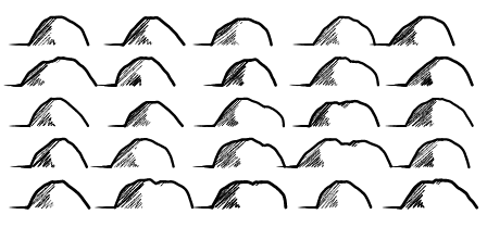
Initially, the hill symbols were just semi-circular arcs.   That's pretty simple, but I developed them for the "D&D" map style (which tries to look like the sort of map a Dungeon Master draws for his campaign) and in that context I think they look fine:
But they don't match the style of the new mountains.

The D&D style has an SVG filter on it to make the hills look more amateur-ish by adding some noise; without that they're very regular:

To make the hills more suitable for the new mountain style, the first thing I tried was to apply some of the usual perturbations and so on to the arcs:

That looks a little better, but without some shading it still doesn't work very well with the new mountain symbols.  I don't feel like writing the shading code again, but the code for the new mountain symbols is pretty flexible, so maybe I can make that produce hills.

To start with, I reduce the size of the mountains and turn off merged mountains:
I don't want any of the decorations (like the clefts) on the mountains, so let me turn off that:
The outline needs to be heavier, and I don't want jagged perturbations on hills:
Those look kind of neat, but I really want hills to have convex sides to distinguish them more clearly from mountains.  Fortunately I can do that by simply changing the sign on the side offset:
I also like hills to be broader rather than peakier, so I'll tweak the proportion of the width to the height:
These hills still have a noticeable peak in the center where the sides come together.  To address that, I'll turn on the "round tops" option and add a flat piece at the top of the hills.  The shading is also a little heavy, so I'll tweak that:
This looks pretty good, but the straight shadow line takes away from the roundness of the hill.  I'd like to curve that line to suggest the hill is round.  Up until this point, I've only had to make configuration tweaks to turn mountains into hills, but this requires a code change.  However, this is the same operation I apply to the sides when I make them concave (for mountains) or convex (for hills).  So it's pretty easy to apply that to the shadow line.

 At this point I can turn on the mountain-merging feature again:
Which I think also looks okay.

I had the idea at this point to add a cast shadow to the hills (and mountains).  I've seen this used on a few maps to add a more "3D" effect (particularly if the map has shadows under tree symbols).  For this line-drawing style, it's pretty easy to add a cast shadow -- it's just a line from the base of the hill that tapers off to nothing:
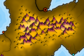
Here's what it all looks like on a map (with labels turned off for clarity):
These look okay -- certainly better than the original hills -- and I like the cast shadow, but these still look pretty lumpy, so next time I'm going to try another approach.