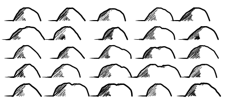
You may have noticed in my last posting that there were "hills" shown around the mountains on the map samples:
In this posting I'll talk a little bit about how the hill symbols Dragons Abound have evolved.
Initially, the hill symbols were just semi-circular arcs. That's pretty simple, but I developed them for the "D&D" map style (which tries to look like the sort of map a Dungeon Master draws for his campaign) and in that context I think they look fine:
But they don't match the style of the new mountains.
The D&D style has an SVG filter on it to make the hills look more amateur-ish by adding some noise; without that they're very regular:
To make the hills more suitable for the new mountain style, the first thing I tried was to apply some of the usual perturbations and so on to the arcs:
That looks a little better, but without some shading it still doesn't work very well with the new mountain symbols. I don't feel like writing the shading code again, but the code for the new mountain symbols is pretty flexible, so maybe I can make that produce hills.
To start with, I reduce the size of the mountains and turn off merged mountains:
I don't want any of the decorations (like the clefts) on the mountains, so let me turn off that:
The outline needs to be heavier, and I don't want jagged perturbations on hills:
Those look kind of neat, but I really want hills to have convex sides to distinguish them more clearly from mountains. Fortunately I can do that by simply changing the sign on the side offset:
I also like hills to be broader rather than peakier, so I'll tweak the proportion of the width to the height:
These hills still have a noticeable peak in the center where the sides come together. To address that, I'll turn on the "round tops" option and add a flat piece at the top of the hills. The shading is also a little heavy, so I'll tweak that:
This looks pretty good, but the straight shadow line takes away from the roundness of the hill. I'd like to curve that line to suggest the hill is round. Up until this point, I've only had to make configuration tweaks to turn mountains into hills, but this requires a code change. However, this is the same operation I apply to the sides when I make them concave (for mountains) or convex (for hills). So it's pretty easy to apply that to the shadow line.
At this point I can turn on the mountain-merging feature again:
Which I think also looks okay.
I had the idea at this point to add a cast shadow to the hills (and mountains). I've seen this used on a few maps to add a more "3D" effect (particularly if the map has shadows under tree symbols). For this line-drawing style, it's pretty easy to add a cast shadow -- it's just a line from the base of the hill that tapers off to nothing:
Here's what it all looks like on a map (with labels turned off for clarity):


First off, these posts are a fascinating look into what goes into good procedural generation!
ReplyDeleteSecondly, is this for a program that can be downloaded and used? Is there source code I could see and play with?
Daniel, thanks for the praise! My source code isn't available yet (still a work in progress) but if you check out some of the first posts on this blog there's a link to the code I started with.
DeleteThose shadows look fantastic!
ReplyDeleteThanks, Ben!
ReplyDelete