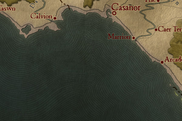
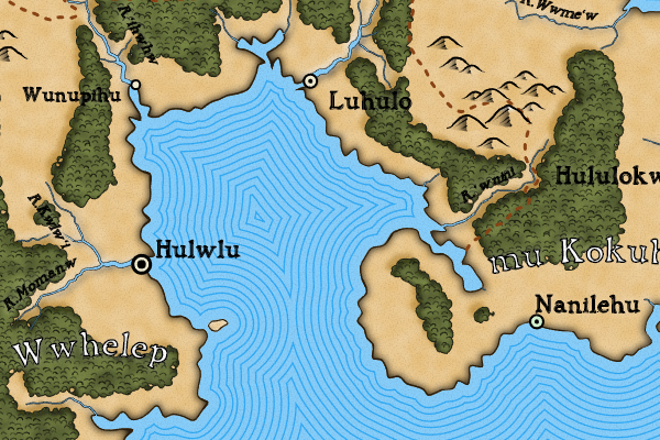
On the land side, coastlines are just lines around the edges of the landmasses, sometimes with some shading added to create a slight 3D effect:
On the ocean side, the base rendering just has the normal ocean coloring.
There are a number of techniques that artists use to embellish the ocean side of the coastline. The most common technique is illustrated in this example from the previous posting:
The artists adds a series of areas around the coast in gradually darkening ocean colors. These areas may (or may not) be outlined in a darker color. Often the areas also get wider as they get darker and farther away from the coastline.
Fortunately, there's an easier way to get this effect (at least in SVG). The key idea is to repeatedly draw the coastline with different size "pens" (some very big!) and different colors, and overlap them to create this effect:
How this works may be more obvious if I turn off everything other than the coastline embellishment:
Here the coastline is drawn first in the darkest and biggest pen, then the next lightest and next smallest pen, and so on. Slightly smaller and darker pens are interspersed to create the dark borders for each region. It culminates in a narrow white line. Half of this is then hidden underneath the rendering of the land.
As the pen gets bigger, the edge of the drawn area tends to naturally smooth out, but as you can see in the above animation, when you move a large circular pen along a path you tend to get a lot of regular circles. That shows up on the map as smooth circular bumps, as in these areas:
That looks a bit mechanical. To address this, I apply some smoothing to the bigger pens. I have to be careful to keep the smoothing consistent between the main pen and the outline pen, and not to smooth near the coast (which would cause problems):
Taking a step back, then, this embellishment is created by drawing a sequence of coastlines from widest to smallest, varying the luminosities of the lines to create a series of gradually brighter regions separated by small darker lines. Inside the program, I have an array of lines to draw -- for each line I have the width of the line, the color of the line, and how much to relax the path.
I'm using a pretty bright sequence of luminosities (I told you that routine would come in handy) for the coastal highlights, but of course this is adjustable. Here's a map where I've made the decoration more subtle:
Here's a map with a common variant of this embellishment:
In this example, instead of varying the color of the sea between the embellishment lines, the sea is kept the same and the lines fade until they match the color of the sea. This is just a different sequence of pens -- all the fat regions are given the color of the sea, and the thin regions are given progressively darker colors as they approach the shore. So we can draw it exactly as we did the original embellishment, just using a different sequence of colors:
One drawback of this implementation is that if the sea has any kind of variable coloration (such as mottling) this will not be reproduced within the embellishment, because the embellishment is created by drawing an SVG path and those paths are a single color. This map illustrates the problem:
You can see that the sea color seems to shift around the blob of land in the center-right of the map. Around 6 o'clock on the blob, the sea has been mottled to a lighter color, but the color in the embellishment doesn't change. In general, it's best to use this style of embellishment on a map with a flat sea color.
Here's another interesting variant of this embellishment:
Here the mapmaker has repeated the coast lines until the entire sea was filled. The endless repetition ends up creating a sort of texture in the sea area. To do this in Dragons Abound I just need to add lots of lines.
This looks subtly better if I vary the distance between the lines slightly.
I'm not sure I like this, but it's an interesting effect.
Finally, it's always fun for me to see how close Dragons Abound can get to my example maps, so here's a render using colors and line sizes (and some additional noise) to match the first example map, in a side-by-side comparison:
Not an exact match (and the example map has some lovely land details that I can't yet recreate) but I think the sea at least looks pretty close.


No comments:
Post a Comment
Note: Only a member of this blog may post a comment.