I chose the parameter-driven approach for a number of reasons. First of all, when I'm implementing something complex like drawing mountains or city icons, I don't know for sure how to do that. Having lots of parameters lets me tweak the behavior of the code in case my initial guesses are not correct. Second, I've always wanted Dragons Abound to be able to draw the same map in a variety of different styles, so reflecting that in the code seemed useful. Finally, I've wanted to see if setting the knobs randomly could produce some interesting and unexpected results.
That first use of parameters has been useful. Even when I have the right general idea about how to do something, I rarely get the details right without some iteration and adjustment. The other uses of the parameters haven't been as fruitful. For one thing, randomly selected parameters don't usually produce anything very interesting. The main reason is that only one or two parameters have to be “bad" to ruin the output. When the random parameters offer up (say) bright pink house icons for cities, it really doesn't matter if the rest of the map is great. Dragons Abound has several thousand parameters, so even if most of them rarely produce anything bad, if you pick them all randomly, chances are very high that one of them will be bad.
On the other hand, even if random parameters usually serve up bad maps, I can look at those maps and pull out the parts that worked well. An example of this happened while I was developing the Iskloft mountains, and stumbled across a nice mountain style:

But perhaps the most important factor to me is the code fragility. Having lots of different ways to work also means there are lots of different ways to break. At times I've found myself spending a lot of effort to fix some code in order to make some particular random combination of parameters work ... only to find that it doesn't produce anything particularly interesting anyway.
So overall my design philosophy hasn't been entirely successful, and I'd like to explore whether a different approach might be better. (Although just because this philosophy hasn't been entirely successful doesn't mean that there's any better approach!) One possibility is to leverage my experience in implementing general-purpose code for a particular feature to rewrite the code in a more specific style. This will probably mean sacrificing the creative part of the code, but might result in code that is more reliable and works better for a small subset of the feature space.
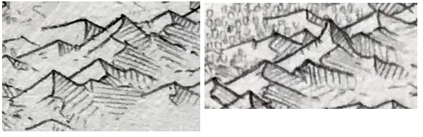
Initially I'm going to try out this idea with mountains, inspired by this map that Reddit user /u/Greypawz posted to /r/mapmaking (excerpt):

But before I can start working on implementing these mountains using my new design philosophy, I have to try to figure out how to draw them. From my previous work on drawing mountains I have something of an internal model of drawing mountains with a number of particular elements: toplines, ridgelines, secondary toplines, secondary ridgelines and shading. Let me analyze these mountains in those terms.
To start with I'll look at the topline of the mountain -- the line that goes from one side of the mountain up over the peak and down the other side. Here I have roughly traced all those lines on the upper mountains in red:


In the part of the mountains pictured above, the toplines are almost all straight segments. In the lower middle part of the map many of the mountains have the left side of the topline (the side that is lit) drawn as a curve:

Another element to look at is the proportions of the topline. I'm aware from my previous mountain experiments that this is an important style element. I measured the proportion of each mountain by enclosing the topline in the smallest possible (axis-aligned) bounding box, as so:

Another aspect that is related to the proportions is the baseline. This is the line that connects the two ends of the topline. Here I've drawn in the baselines and also the peak line that connects the baseline to the highest point on the mountain -- this helps see if the mountain is symmetrical. (I've left out mountains where I couldn't easily identify the baseline because they were obscured by other mountains.)


It's interesting that the baselines have a consistent slant. This area of mountains is in the left center portion of the map on one side of a river valley:


There are a couple of possible explanations. One is that the slant simply reflects the direction in which the mountains are drawn. I naturally draw mountains left to right -- possibly because that's the direction we write, or perhaps because I'm right-handed -- and this might lead to a downward slant in that direction. Another possibility has to do with the lighting. On this map, the light is from the left. If you want the mountains to be mostly lit sides, it is easiest to do this if the faces proceed downward and to the right, because the lit sides are in front of the shadowed sides. If they go upward and to the right the shadows are in front of the lit faces.

(Update from Greypawz: The right slant is not intentional, and it’s been something I’ve been working on fixing.)
I next tried to isolate just the toplines to look at how the lines are actually drawn:


Another important element of this style of mountain is the ridge line. This line comes out from the peak of the mountain and runs vertically “downward" to define a ridge running from the mountain top toward the viewer. It also deviates left and right to follow the contour of the ridge:


Now let's look at the shapes of the ridgelines:

In terms of line quality, the ridgelines are drawn much like the toplines and are equally dark at the peak of the mountain.
There are also secondary ridgelines that come down from secondary peaks. I've highlighted some here in yellow:

Where the ridgelines have sharp angles there are sometimes secondary toplines that come out from the point of the angle and run parallel to the mountain topline. These lines define ridges running parallel to the plane of the viewer:


Now let me look at the shadows. Because the light comes from the left side of the map, at its simplest the shadow for a mountain fills the right side of the mountain between the ridgeline and the topline. This is most obvious in the small mountains:

Note how the shading fills the space between the topline, the ridgeline, and the baseline. Shading is done with simple hatching, and while the hatching usually runs perpendicular to the topline, in some cases it runs parallel to the topline or at some random angle.
The shading is more complicated on some of the larger mountains:

In this excerpt there are three mountains, each with a ridgeline that changes direction several times. The shading for each mountain is broken up into regions bounded by the ridgeline, the baseline and the secondary ridgelines. In each adjacent region the direction of the hatching for the shaded areas rotates 90 degrees. This helps define the shaded area as 3D planes at different angles to the viewer, and is one of the reasons these mountains have such a striking texture.
In my initial appreciation of this map, I thought that the artist also alternated hatching direction to help distinguish one mountain from another mountain in front or in back; but upon closer inspection this isn't true. Most mountains with only a single shadow facet use a hatching pattern perpendicular to the topline.
Finally, I want to look at how the mountains are connected. These mountains are mostly drawn individually, but there are a few cases where mountains are chained together. In the first case, mountains are connected by starting the left end of a topline at the right end of a ridgeline, as in these examples:

This creates a chain of mountains going right and down across the page (as I illustrated in a previous example). In these examples you can also see a variant that connects the ridgeline to the middle of the next topline.
The reverse of this connects the ridgeline of the rear mountain to the right topline of the front mountain, to create a chain of mountains going left and down the page, as in these examples:
In both cases, you can think of this as overlapping mountains from back to front. If a mountain is in front of another mountain it is down the page and to the left or the right, depending upon which way the chain of mountains is intended to run. In several places on the map you can see how the artist has created marching chains of mountains:

Another kind of connection is created by connecting the end of a ridgeline to the peak of another mountain to form a continuous ridgeline across several mountains. This creates a vertical mountain chain, as in this example:

This technique is not much used on this map; the above example is the only really prominent use.
Of note on this map is that the end of one topline never meets the start of another topline. When toplines touch, it is in the middle of the toplines.

If two toplines touch end to end it gives the impression of two side-by-side mountains at the same distance from the viewer. This tends to flatten out the perception of the mountains and make them seem like cutouts. By never meeting this way, the mountains give a greater sense of a profusion of different distances from the viewer and that creates a more palpable feeling of three dimensions.
Nice find and great analysis! Kinda makes me want to try implementing this as well :D
ReplyDeleteAnd since it's the first time I comment here, I want to say thank you for sharing all your process and work, it's been a really good read since the beginning!
Thank you very much! I really appreciate getting the feedback!
DeleteI have now devoured every one of your entries. It's been an interesting path, for sure. Not much to say about this post, but some thoughts I've had along the way. You have one style that shows mountains as a relief of sorts -- something about that doesn't seem to work. They always seem a little too faint, and I can't make them out. Maybe some shadowing would help, somehow?
ReplyDeleteSecondly, have you considered a style that replaces mountains entirely with height lines as a topographic map?
And finally, I want to show my admiration for the fact that you've developed this entirely in javascript. I'm not much of a web designer, but JS always seems clunky and unwieldy to do anything -- and something of this magnitude?
If you binge read the whole blog, my hats off to you! I do actually have a topographical map style but I see I've never posted anything about it. It doesn't work too well -- either the lines look too jagged and unrealistic, or they cross each other. Part of the problem is rendering, but I suspect part of the problem is that my terrain generation creates land that is too rough. I don't really foresee using a topo style so I've never put too much effort into it.
ReplyDeleteAs far as Javascript goes, I've come to rather like the language. Modern Javascript has some nice features, and it's a very forgiving language in many ways (although that can come back to haunt you). There is also a very rich ecosystem of code, so that I can almost always find libraries or code examples for things I'm trying to implement. The biggest drawback is that Javascript in the browser isn't very efficient, although it is much better than it used to be.
For JS efficiency, I've found that using struct-of-array worked better than array-of-struct in mapgen4(*). That is, instead of node.elevation I use elevation[node_id], and then I can used typed arrays (Float32Array, Int32Array, etc.). See an example here. I also tried writing C code compiled to wasm, and found that my JS code written in that style was just as fast as the C code (in wasm). With this style, algorithms like breadth first search runs at around 1 million nodes per second.
ReplyDeleteAs far as output — SVG is usually slow compared to Canvas. This isn't a JS issue but because the browser has to keep track of so many more things for SVG that it tends to be slow. I suspect Azgaar's map generator is slow mostly because of SVG, and not because of JS :-(
(*) In fact, if you've ever wondered what happened between mapgen2 and mapgen4, my mapgen3 project was largely about rewriting the algorithms to use elevation[node_id] instead of elevation.node. I found that it took some getting used to, but it worked really well.