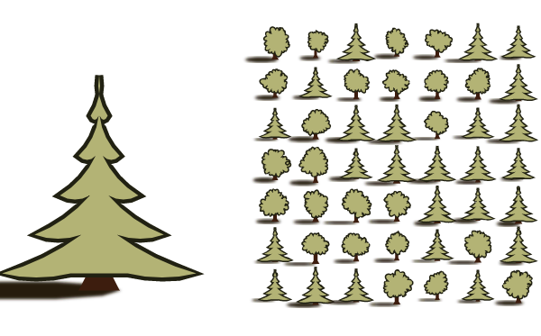
These are the most commonly used tree icons on maps, so they're instantly recognizable. But some maps use icons that look like pine trees:
These are shaped like tall narrow triangles, and usually colored more blue-green than green.
Since conifers typically grow at higher altitudes and in colder climates than deciduous trees, some maps distinguish trees, using the round deciduous trees on the plains and conifers in the mountains, as in this example:
Dragons Abound doesn't currently distinguish these two types of forest, but since it depends primarily on altitude (height) and temperature, that will be easy to add.
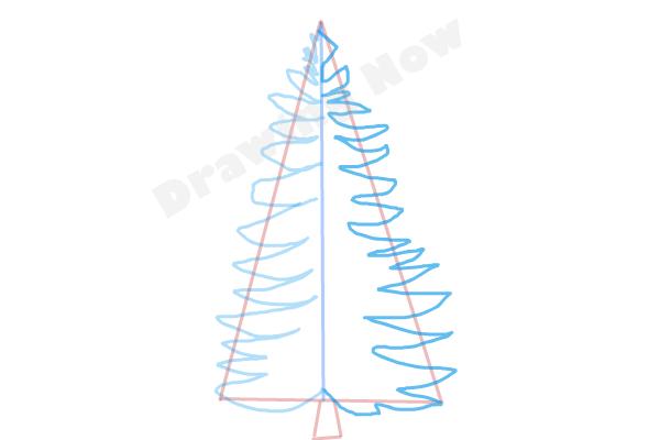
So how do I draw a conifer? The simple sort of pine tree a kid might draw is made by drawing curved branches in a triangle shape:
Each branch is essentially three points connected by two arcs: The two points at the wide interior part of the branch connected by curves to the point of the branch. The interior points lie along a small narrow triangle and the points are farther out.
I'll start with a triangle:
I'm using a little bit of variance in the width of the triangle. The interior points for the branches are going to lie along the sides of this triangle. To find those, I'll break each side of the triangle up into a series of line segments. Each segment will be the base of a branch.
Which looks exactly the same, because of course you can't see the segments making up the sides. Let me mark those.
Now you can see (at least on the larger tree) that the sides have been broken up into a number of segments. It's not immediately obvious, but these vary somewhat in size. I'll add some variation left and right as well.
That might be too much, but I can adjust the amount later.
To add branches, I'll start again with a simple triangle. It looks to me like the branches are something like 2-3 times as long as they are wide, so I'll project a point out from the two base points about that distance and insert it between the two base points.
Hmm. That has a couple of problems. The branches ought to get narrower (and consequently shorter) near the top of the tree. So I can't just break the sides up into random pieces, I need to use smaller pieces near the top. Let me take a step back and see if I can break the sides up into increasingly larger pieces from top to bottom:
Okay, that looks a little better. Let me turn on the "branches" again and see how they look.
My estimate of branch length looks wrong, but otherwise this looks better. Let me reduce the branch length:
This looks better, but the branches aren't really visible at map scale. One problem is that the conifers are at a smaller scale than the deciduous trees, as is apparent if I draw a mix:
So first let me adjust the conifer tree size to make them at least as tall as the same deciduous tree.
The “big" tree is a little overwhelming at this scale, but the map scale trees are now closer in height to the deciduous trees and the branches are visible. Let me make the conifers broader as well, and throw in the tree trunk and shadow so it's easier to compare. (These are just copied from the other tree type.)
Okay, the size looks good enough. The tree still looks a little blocky. Let me try adding some curve to the branches and adjust the proportions:

The top of the tree looks a little weird, but overall I like this shape. The bottom is also a little strange, because instead of having a semi-circular skirt, I've got the last branch coming back up to join a straight bottom. Let me fix those things:
Fortunately, we had a big wind storm here in Virginia that took out our power for 3 days. Between my laptop battery and daily trips to the coffee shop, I had lots of time to work on it. Scalloped bottom:
The scallop routine just connects two points with the appropriate scallops, so I can also use it to draw scallops between the other pairs of branches on the tree. This will add some texture to the tree, the way I added bumps to the deciduous trees to add texture.
The bottom of the tree is pretty wide, so the scalloping always works okay there. The upper branches get closer and closer together, and eventually there isn't even room for a whole scallop, and I get a little chevron on the upper most branches that looks a little odd. But at map scale it's not really visible as a problem, and overall this gives the trees a nice graphic arts feel.
Before I go on, let me fix the problem with the top of the tree, where the two lines don't touch. This happens because the outline of the tree starts and stops there. It actually starts and stops at the same point, but the width of the line gets drawn to the left on the left side of the tree and to the right on the right side, so the lines only touch at the inside corner. When you draw a closed polygon, you want the inside of the line to meet and the outside of the line to meet. In this case, the insides meet but the outsides do not -- to make them meet the outside edges would have to extend far past the actual end of the line. There's probably some clever point about line drawing I'm missing here, but for my purposes it is easier to fix by moving the start and end of the outline to a different point on the the tree where the lines aren't parallel:
Yes, that's better.
Moving on, another option I added with deciduous trees was a gradient to give a 3D look to the tree. I can do the same with conifers, although as with peaked roofs, SVG doesn't offer the correct gradient for shading a cone. I have to make due with a tilted linear gradient:
That adds a little “pop" to the trees.
Another texture option I used for deciduous trees was a noise texture. I can do the same thing for conifers:
This doesn't look terrible but it doesn't look quite right, either, because conifers have needles, not leaves. I need a more needle-shaped noise. I can get that by changing the frequency in just the X dimension to stretch out the noise up and down:
A few last things to fix up before I'm done with conifers. First, let me give them their own color range on the blue end of the green spectrum.
Now let me tweak the forest generation algorithm so that trees in the mountains or in cold areas of the map will be conifers.
Here's an example of a map that shows quite clearly where the average temperature drops and the forests switch from deciduous to conifers. Also note the conifers around the mountains in the lower right, where they are high enough to thrive.
However, it's a little artificial to have such a clean separation of the tree types like that. There should be a transition zone with some mix of trees.
Another problem in the above map can be seen right near the center of the map where a mountain is overlapping a conifer. It's hard to get the overlap correct in all cases, but generally speaking when an element (like the conifer) is further down on the map, it should be on top of elements that are higher up on the map. But since generation of mountains is separate than generation of the trees, it's hard to get this ordering correct -- I generally have all the trees on top of all the mountains or vice versa. To fix this, I have to make a list of all the trees and mountains together, sort them by the position of the lowest point on the element, and then go through the list in that order “popping" each element to the top.
This is what it looks like after those fixes:
You can see here that there's a mix of conifers and deciduous trees in the transition zone. Also, trees are now correctly overlapping mountains.
And that's it for trees, at least for the moment. I always like the latest thing I've implemented just because it seems fresh, but even beyond that I like the way these trees turned out.


They're absolutely gorgeous. I really enjoy these blog posts.
ReplyDeleteI would make them a bit slimmer though, seems like they feel too wide. And the color schemes between the two sorts are a bit too far apart I feel... but that's just minor tweaks.
Thanks! I have actually tweaked the colors a little bit since writing this. The trees get a random color from a range of colors on the blueish end of green, and these happen to be right near the blue end of the possible range.
Deletegorgeous!!!
ReplyDeleteIt's fascinating to follow your progress on this -- one question: is this posted somewhere (GitHub etc) we can download and play with it?
ReplyDeleteThanks! Right now this is just a personal project and the code isn't available... sorry!
DeleteYet another person really enjoying this series. I'm messing around with something similar and have a technical question (apologies if you've covered this). What SVG renderer do you use? I find I can generate a map structure (contours, terrain) with something like 100,000 tiles quickly enough, and this renders quickly enough if I draw with flat colours and polygons. But as soon as I try to use SVG filters (blur, noise) or opacity, it absolutely kills the SVG renderers I've tried (e.g. ImageMagick) when I try to get a PNG out of it.
ReplyDeleteI do all processing and rendering in Chrome. I haven't found anything faster (or more compliant) although the latest versions of Firefox have gotten much better.
ReplyDeleteThanks, I will give it a go.
DeleteNice! thank you so much! Thank you for sharing. Your blog posts are more interesting and informative. Flat Earth Map
ReplyDelete