While working on another feature I was looking at
Western Torfani, one of my favorite maps:
I've learned a lot from this map, and I was curious to see how close
Dragons Abound could recreate this style at this point. I'd done this once before for a blog post but hadn't kept track of the settings I used, so I decided to try again and see how I could do.
There are a number of differences between Western Torfani and the default style I've been using lately:
Most obviously the land and ocean colors are quite different. I can sample the colors from the Western Torfani map and force my program to use the same colors. The same goes for the forests. I can't quite match the ocean texture pattern at the moment but I can use a similar texture. (I actually had the same texture at one point, but I'm switching over to all vector textures and haven't yet duplicated this one.) In the forests, the internal forest texture is darker in the Western Torfani map so I can darken that up on my map. The Western Torfani map has a really lovely texture on the land, which I can't duplicate, but I can use mottling for at least some texture. Although the Western Torfani map has some 3D elements (like the forests and the mountains) there is no faux 3-D shading so I can turn that off. The mountains are quite different -- at a minimum, the Western Torfani mountains don't have snow caps or hashing in the shadow areas, use thinner lines, and are more crowded together. Setting these styles gets me to here:
Better, but the labels here aren't right.
The Western Torfani map is using one of the IM Fell fonts ("IM Fell DW Pica")
for labeling, using the italics version for the city labels and the small caps version for the map feature labels. I can sort-of recreate some of this; I already have the IM Fell fonts as an option, and the code has an untested capability to style different types of labels differently (i.e., make the city labels italic) but doesn't have the ability to use different fonts for different labels. However, you can fake small caps using the SVG/CSS "font-variant" property. This isn't quite as good as using a specifically designed small caps font, but it will work.
The Western Torfani map also uses a dark gray color for labels. My maps currently use black, but I can set the font color to the same dark gray. The Western Torfani map lays out the labels for major features like bays and forests along the major axis of the feature. My program doesn't currently have that capability, so I'll leave those labels as they are.
The Torfani map marks regions with heraldic shields (a nice touch!) which I cannot duplicate, so I'll leave the regions labeled by name. The Torfani map doesn't show borders between the regions, so I'll turn off borders as well.
The Torfani map also uses larger and stronger "halos" to offset the labels; I can duplicate this but I think the halo effect is a bit too strong on the Torfani map, so I'll stick with my default settings there.
All of that gets me to here:
Comparing this to the Torfani map suggests that the mountain outlines are still too thick and, conversely, the river outlines too thin.
The Torfani map also uses a coast decoration I haven't seen before: A single, thick, light-colored line off the coast. I don't currently have this as an option, but my system for drawing lines off the coast is pretty flexible, so it shouldn't be too hard to generate something similar:
The Torfani map also has a forest feature I don't currently implement. Instead of pulling back the forest to show rivers where they pass through, or hiding the rivers entirely, the map shows a sort of "disturbance" where the river passes through the forest:
I've occasionally seen similar decorations on other maps. Here it is on
Taneaphis, another of my favorite maps:
Dragons Abound can't currently do this, but it's a neat effect and since it appears on a number of my favorite maps, maybe it's something I should add!
To start with, I can turn off how rivers currently pass through forests, so that they just disappear underneath the forest:
Next, I need to find the portion of each river that is inside the boundaries of the forest. To do this, I have to take the polyline that is the river and clip it to the polygon that is the forest. I don't have a routine to do that sort of clipping, and off-hand I can't find one already written, so I have to write that myself.
The dumb version is not too difficult. I already have a routine that can tell if a point is inside a polygon. So I just have to walk along the polyline and notice when the points are inside the forest polygon and then again when they're outside. I save all the inside points, and along the way I calculate the actual point where the polyline enters and exits the polygon. That gives me this:
That looks correct, so now I just have to draw an appropriate effect along that path.
It isn't entirely clear what the Western Torfani map is drawing along the hidden rivers, so I'll have to experiment.
One thing I can easily do is use the same kind of bumpy edge I do along the edge of the forest. Since this is supposed to be a seam in the forest that seems like a reasonable idea; it should look like an edge of trees running along the river. Here's an initial attempt:
This has some potential, but there are a few problems. One is that the forest texture clashes with the river path. This will be a problem no matter how I style the hidden river. I can address this by not placing any texture near the river paths. A simple version of this isn't too difficult to do:
The size and styling of the hidden river needs some tweaking to make it more obvious:
That looks ... okay. Or maybe not.
Another thing I can easily do is draw a line along the river:
And I can give a little more substance to that line by making it start wide and narrow as it goes along:
I can't figure out exactly what the Western Torfani map is doing with the hidden rivers:
But it looks like some kind of messy line, basically. I can do something similar-ish by combining bumps and lines:
That's not too terribly different.
The last thing I want to try to replicate with forests is the border drawn along the front edge of the forest to create a faux 3D effect:
This border area can be created by making another copy of the forest and shifting it in the appropriate direction:
Here I've just filled in with a dark shadow. What I want to do is fill that with something a little more artistic. To get a quick notion, I can fill it with a simple "tree trunk" like pattern:
This looks surprisingly good for such a simple approach. But one problem is that, unlike shadows, offsetting this area in the X direction doesn't make any sense. It's better to just offset in the Y direction. An example makes this clearer:
Now the tree trunks don't stick out to the side. The Torfani map uses rough circles filled with the forest color along this border. Unfortunately, I can't use a straightforward SVG pattern to get the same effect because the pattern isn't aligned to the edge of the forest:
Although just by happy chance this pattern doesn't work too badly to give a sort of "scribbly" edge effect. I can add the forest color behind this pattern and jiggle the edges so that it doesn't look so mechanical:
This isn't exactly the same as the Torfani map, but I think the overall look is pretty close.
Now let's see what can be done to adjust the Dragons Abound mountains to look more like Torfani.
There are a lot of options to tweak here, but I'll start off by making the mountains steeper and more jagged.
That's better but there are some problems. In a number of cases, the shadow line is sweeping so far to the left that it's outside the outline of the mountain. There's also a rogue white mountain hiding in the mix, that's typically the result of a bad color calculation.
The shape of the mountains could still use some work, but the colors are not right, so let's fix that first. Dragons Abound normally takes the mountain colors from the underlying land, but the Torfani map uses a different shade for the mountains and the mountain shadows. I have an option to set these colors, so let me use that:
The Torfani map uses a flat color to fill the shaded areas of the mountains, and by default Dragons Abound uses a gradient. Oddly enough, it doesn't look like I ever implemented a flat fill for shading, but that's easy enough to add.
At this point there are still a few significant differences. The Torfani mountains are much more "rugged" than the Dragons Abound mountains. Second, the Torfani mountains have additional details on the lit side of the mountain that add a good amount of texture. With some tweaking and various adjustments, I get this:
Here the shape of the mountains are closer to the Torfani mountains. The Torfani mountains do some interesting things with shading -- both with adding small shading areas for interest and with how shading is distributed. I like the effect very much, but I'm not going to spend any more time right now to try to replicate that.
The Torfani map has a number of features that Dragons Abound doesn't yet implement, such as cliffs, pine forests, bridges over rivers, land and and city icons:
I'll get to some (or all) of these things eventually, but I don't want to tackle any of them for this exercise, so let's see how the real Torfani map compares to the Dragons Abound version:
That's far from perfect, but it's not too terrible, either. Normally Dragons Abound doesn't put forests right up to mountains because it's impossible (or at least very difficult) to get that right. But I can force it to do that, and in this case it doesn't look too bad.
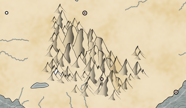
Here's a full map in the Torfani style (click through for full size):
And just for fun, here's the same map in the "Old B&W" style (click through for full size):
If you look closely near the center of the map you'll see a river label on top of the forest with no river in sight. In this style, the rivers are hidden in the forests, but the labeling routine doesn't realize that. There are hundreds of these special cases where map features interact in unexpected ways.


Looks great. Is there a way to feed heightmap information from the original map to your code, and drop the random noise heightmap? That way you could try "re-rendering" the Torfani map (at least the land shapes) using your engine, and perhaps be able to identify stylistic differences quickly.
ReplyDeleteThat's something I'd like to be able to try at some point, but it's not currently a capability. The Torfani map is also at a different scale than my maps, although I could probably deal with that.
DeleteWow such a great development! Just found about your blog last week and have been pouring over your posts, have at least some posts left for this week.
ReplyDeleteThanks! I just put another post up, so you've got another to look at :-) I'm glad you're enjoying the blog.
Delete