 More miscellaneous topics...

Now I'm not a hydrologist, but if I were, I'd probably tell you that's a pretty simple model of river size. (Well, to be fair, if I were a hydrologist I probably wouldn't be doing this as my fun side project so I wouldn't be telling you anything, but you get my point.) A better model would take into account how fast the river is flowing. A faster river carries away more water, so for two rivers with the same flux, the slower river will be wider.
In the real world, rivers vary in size as they go faster or slower. An extreme example is the Swan River in Perth, Australia:

Here's another view:

You can see the width of the river varies drastically. I've never been to Perth, but I imagine the river flows more quickly in the narrower parts and more slowly in the wide parts.


One nice feature of this approach is that it's possible to have a river broaden as it goes through a flat area and then narrow as the slope increases.
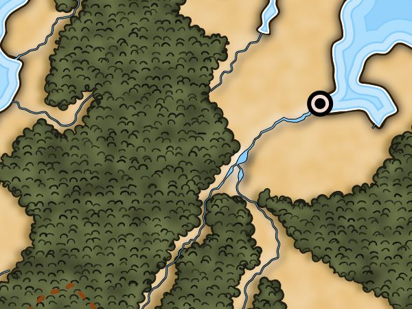
The original screen capture for the map with the two waterfalls looked a little different:

Why the odd pill-shaped lakes? The explanation has to do with the way Dragons Abound draws rivers.
Rivers are drawn as lines (paths) of the proper width. To make a river with a black border (like in the map above) I draw a slightly wider river in black and then a slightly narrower river in blue on top of it. This works fairly well, but one drawback is that SVG doesn't have a way to change the parameters of a line (such as it's width) as it is being drawn. So when Dragons Abound needs to change the width of the river, it has to stop the current line and start a new line. This worked fine for flux-based lines because flux doesn't change much between two neighboring locations on the river. Most of the flux for a location comes from the upstream location, so the flux tends to gradually increase. Consequently, the width of the river gradually increases, about a 1/4 point of width at a time, and that looks smooth to the user.
But with the switch to flux + slope based width, it's possible for the width of the river to change pretty drastically from one location to its neighbor. That's what's happening with the pill-shaped lakes in the map above. That's actually a short line of the proper width -- with rounded ends, which is why it looks like a pill.
The fix when this happens is to take that segment of the river and break it up into a bunch of smaller segments, changing the size by a 1/4 point of width in each of the new segments, so the river seems to smoothly swell (or contract). This yields the map (shown above) with the more natural-looking river swells.

For some time I've had an odd problem with putting labels on the map. They would overlap other labels or land features when they weren't supposed to be overlapping. After some digging, it turned out that the browser was calculating the bounding boxes for the labels incorrectly:But with the switch to flux + slope based width, it's possible for the width of the river to change pretty drastically from one location to its neighbor. That's what's happening with the pill-shaped lakes in the map above. That's actually a short line of the proper width -- with rounded ends, which is why it looks like a pill.
The fix when this happens is to take that segment of the river and break it up into a bunch of smaller segments, changing the size by a 1/4 point of width in each of the new segments, so the river seems to smoothly swell (or contract). This yields the map (shown above) with the more natural-looking river swells.

After some experimentation, I figured out that this was only happening when I used Web fonts. These are loaded into CSS and then applied to the text on the map. The problem is that browsers are generally (1) lazy and (2) asynchronous. Chrome doesn't load a Web font when it is defined in CSS, but waits until it is actually used in the web page. (This keeps your browser from wasting lots of time and bandwidth fetching fonts that are never used.) Second, Chrome continues on with other work while it is waiting for the font to be downloaded across the Web. So in this case, the font loading doesn't start until the labels on the map are being displayed -- which is long after I've randomly selected a font for the map and tried to measure the labels. So how does Chrome measure the labels before the font is loaded? When the styled font is unavailable, the browser fails back to a default system font. So the bounding boxes shown up above are based upon displaying the label in a system font (Helvetica in this case).
The solution is to force the browser to load up all the possible fonts before I try to generate the map. (As long as I start the font loads first, they'll likely finish before the map generation, which takes about a minute or so.) So when the browser first loads the page that generates the map, I iterate through all the possible fonts, add them to the CSS for the page, and then put an element on the page that uses the font. It turns out that the element using the font has to be visible (that is, you can't use "display:none") but it doesn't actually have to contain any text. So it is sufficient to stick an empty <span> element into the page for every possible font. After that, the bounding boxes are calculated correctly:

Another interesting post! I'm enjoying this series :D Will you be making an ebook or something out of this series of posts? I'd find something quite useful :-)
ReplyDeleteThis was a very interesting post for me personally as it gives a solution to a long standing problem of the bounding box on font problem. A simple one at that, so thanks a lot.
ReplyDelete