Saturday, June 11, 2022

Cleanup Time

 With the map compass series done (at least for now) I'm going to take a break from dedicated development and spend some time on cleaning up the existing code.  I'd like to get to the point where I have a number of styles I can use to generate a map that will almost always produce an acceptable result.  There are a few major problems I need to address but most of the problems are fairly minor annoyances that just have to be beaten down one at a time like a whack-a-mole game.

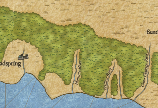
For no particular reason I'll start with forests.  One style of forest that DA uses is called “forest masses" and draws forests as large clumps, as so:


One problem with this can be seen in the individual trees around the Toplant River at the top of the map.  These individual trees clumps shouldn't be used with the forest mass style; they're really intended to be outliers when the forest is drawn as individual trees.  That's a fairly easy fix.

The second problem is the texture of bumps inside the forest mass.  It has a couple of problems.  The bumps tend to line up in rough columns, and there are bumps close to the edge of the mass where they get clipped.  


I wrote this style of forest fairly early on, and the bump texture inside the forest masses is getting placed using a sort of perturbed grid.  Since then I've realized that a Poisson disc sampling is a better approach for filling an area in this way, and in fact I can reuse the basic approach I used for the Tolkien forest style.

Surprisingly, the borrowed code works on the first try.  I just have to tweak the distance between the bumps some to get a decent range of textures.
Pulling the bumps in from the edges of the woods is more problematic.  To do this requires “shrinking" the polygon in which I'm drawing the bumps.  Shrinking/expanding a polygon is a non-trivial problem, as I've discussed in these pages before.  In no wise should you consider writing this code yourself.  In this case, I'm going to try using the polygon-offset library from Alexander Milevski; it is partially based upon the Martinez library, which I have also recommended. 

There are many ways for polygon offsetting to fail, or at least to produce difficult results, such as numerous tiny polygon “islands."  Many of the failure modes have to do with sharp vertices close together -- like the bumps on the forest masses.  So rather than shrink those outlines and let every bump invite trouble, I'll shrink the “unbumped" original forest outlines.  This helps reduce the number of errors, but it doesn't entirely eliminate problems. So this is an area of the code where it is helpful to catch exceptions and route around the damage.

With that and some tuning of the shrinking distance, the bumps are kept from running off the edge of the forest:

There are several other options that control the look of this style forest, but they all seem to work fine.

I most often draw these sorts of forests pulled back to reveal the rivers, as above.  There is an option to draw forests with “hidden" rivers (they're not really hidden, just displayed differently).  Turning that on doesn't work.  There turn out to be a number of problems, mostly “code rot" where I've made changes but older code hasn't been updated (or not properly) to use the new code.  It takes quite a bit of time to run down all the problems, but eventually I have it working again: 


It's kind of a nice effect, looks like a fold in the forest where the river runs.

The ocean visualization is pretty solid, although there's a small bug that causes the ocean to vanish occasionally.  That's pretty easy to fix, and along the way I realized that a map with the ocean as blank space is actually a nice variant.


Here's an interesting problem:


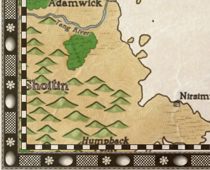
The hills are being drawn in green.  At first it looks like hills are getting filled with the forest color instead of the land color, but on further investigation, that isn't the problem.  The color is a hard-coded value hold over from the Knurden-style map, where the land color is green.  It shouldn't be hard-coded in any case, so I'll make the color derive from the land color if it isn't otherwise specified.


That looks better.  I like the subtle shading on these mountains.

Dragons Abound also crashes fairly frequently when drawing mountains, so I decided to run down and correct some of these.  

The crash has something to do with the the “topline" of the mountain.  The topline is the entire outline of the mountain, and there's a function that tries to clean up the topline if for some reason the topline dips below the baseline of the mountain.  After some tracing, there seems to be a missing parameter in my configuration file, and that causes the topline to get created incorrectly in one case.  I replaced the default value of missing parameter and that fixed the error.  I didn't see any problems in the resulting mountains, so apparently the default value is good enough.  I'm not sure why I had commented it out.

Here's a problem that popped up while I was working on labels:
In the upper part of this image, you can see a bay outlined in gray and labeled “Turquoise Point."  DA has mis-identified the bay as a point.  The primary difference between a bay and a point is that a point has land between the two end points of the green line and a bay has water.  Since there's clearly water between the end points of the green line, something has gone wrong.

This turns out to take nearly a full day of debugging to fix.  The details are complex, but the basic problem has to do with how to tell whether an arbitrary point on the map is in the ocean or in the land.  What makes this complex is that although the general shape of the land is created with a procedural generation algorithm operating on an underlying Voronoi graph, the final coastlines can vary from that for any number of reasons.  The two ends of Turquoise “Point" above are across a small bit of ocean that actually has some land in it -- you can see a small island.  And this was confusing the algorithm.

After no small amount of thrashing around I have a new algorithm that checks for land based upon the actual coastlines as drawn, and that fixes that particular problem:
Now there's no longer the spurious Turquoise Point.  There's now a legitimate point on the far side of the bay -- Dusky Point -- but there's a problem with the label.  That's discussed and fixed in the blog post on labels.

Another problem that popped up while working on labels:
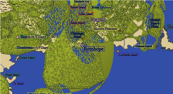
This problem is somewhat similar to the problem with Turquoise Point.  It happens because the Voronoi tiles that make up the map are considered land if any part of the tile is above sea level. In places like this little strait, most of the tiles underneath it have at least one corner on the land, so to the forest algorithm, it all looks like land.  The solution is to use a stricter definition of land which requires the midpoint of the tile to be on land.  
There's still some small overlaps where the rounded edges of the forest intrude on the ocean, but that's fine.

Then there's this:
Bloody hell.  I won't be using that random seed again!  

(More seriously, this is some sort of problem with the polygons that define the forest masses but it seems to be a rare error.  I'll give it more serious consideration if it continues to pop up.)

Next posting I'll switch over to labels as mentioned above.

Sunday, June 5, 2022

Map Compasses Retrospective

I started the map compasses project with two primary goals.  First, to create a procedural map compass generator, and secondly to experiment with sharing my code.

Generating map compasses has been on my list since seeing Oleg's version a couple of years ago.  Oleg was kind enough to share his code with me, but I decided that the compass roses he generates were not usually suitable for my maps and decided to write my own.  I also wanted to experiment with creating what I think of as a conservative generator.

There's usually a trade-off in procedural generation between creativity and acceptability.  If you build a procedural generator that can be very creative and come up with unusual and unique solutions, it's usually the case that the generator will produce a substantial fraction of solutions that aren't acceptable.  In the past I've leaned to the creative side of the spectrum, and (for example) my city icon generator can invent a wide variety of city icons, but there's a good chance that any particular icon won't be acceptable for one reason or another.  Creative generators tend to be only lightly constrained.  They're able to “break the rules" and sometimes that produces a wonderful result, but often it produces a poor result.  That's why a lot of artistic endeavors have “rules of thumb" -- they outline the areas where good results heavily outweigh poor results -- and if you break those rules you can sometimes do something really new, but often at the cost of a lot of failures.

In general, you might not think it a problem to have a procedural generator that occasionally produces a bad result.  Just generate a new result until you get one you like.  And in isolation, that's fine.  But problems arise when you have a program like Dragons Abound which incorporates a number of separate procedural generation systems.  Even though each PG system may only occasionally throw up a bad design, when you have several running in parallel, the chances of at least one of them providing a poor result goes up.  And this is particularly annoying when your program can take several minutes to run.  Having to run over and over trying to hit upon a map where everything is good is annoying.  

And with creative generators, I always think that I'll look at the output and think about the good and bad results and then add those insights back into the generator to improve the good/bad balance.  For example, I might see that “city walls" in city icons only turn out well in certain specific instances and then go back and tune the rule set accordingly.  But in practice, I don't really ever do that.  By the time I'm seeing the bad city icon results, I've moved on to other problems, and about all I ever do at that point is just turn off a rule entirely.  No more city walls, that fixed the problem!

For those reasons, when I started the map compass generator I leaned in the other direction and tried to create rules that would almost always produce an acceptable result.  Overall, I'm happy with how that decision turned out.  The generator mostly creates acceptable (if “vanilla") results, and I don't usually have to re-run the generator to avoid a bad result.  I also think that on a practical level, I'm more likely to see an example of a compass I like and then go back and add that to the generator.  But we'll have to see how that works out.

One feature I thought about while creating of the compass map generator is a “temperature" control.  The idea would be to have a dial (parameter) that I could turn during generation to be either conservative (cold) or more creative (hot).  With rule-based systems, one way this could work would be to assign a temperature range to every option in a rule, e.g., 

<radialElement> => {0} <thinCircle> | {10} <thickCircle> | {50} <weirdCircle>
Here the number in the curly brackets indicates the lowest temperature for this option, i.e., thinCircle could be used even at the coldest setting, but weirdCircle wouldn't be a possibility until you turned the temperature up to 50 or above. This would give me the option to play it safe or gamble, depending upon what I was trying to do.  That's something I'll be thinking about for the future.  

The second goal for map compass generation was to experiment with sharing my code.  I often get asked to share my code, and I usually feel a little guilty saying no.  After all, I got started down the Dragons Abound road because years ago Martin O'Leary was generous enough to share his map generator, and in a way I feel I owe the same grace to the community.  And I often hear the benefits of open source lauded -- maybe I was missing out on the benefits of a thriving community around the Dragons Abound code.  But at the same time, I recognized that sharing my code would have some substantial costs -- not just eliminating any commercial value to the code, but also in terms of the time and energy it would take to share.  I didn't really have any good way to judge whether that balance would be positive or negative for Dragons Abound, so I decided to do an experiment with sharing some code to see how hard it was and how it was received.  Map compasses was the first thing that came along that fit the bill.

In terms of the mechanics of sharing, it proved to be about as difficult as I had expected.  One of the challenges was in producing code as a companion to the blog entries.  I wanted readers to be able to access and run the code as it was in each blog entry.  I ended up doing this by using Git branches -- there's a separate Git branch in the repository for each of the 18 blog entries in the compass series.  This turned out fine, but it was a bit of work.  I had to get used to working in a separate branch for each blog entry, and remembering to start a new branch with each new entry, and so on.  There were several occasions where I screwed this up and had to spend an evening fixing up the branches.

I also didn't want to release branches ahead of the blog entries, and since Git doesn't offer a way to make private branches public (at least not at the free level), it meant I couldn't actually use Github until I was ready to release the code. 

 I also wanted to keep the code self-contained to make it as easy as possible for people to grab the code and start using it.  This involved including small web servers for Windows, Linux and Mac in the repositories, as well as providing a starting web page.
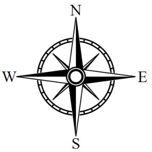
Finally, I wanted to give people a way to run the code online if they just wanted to see the generator run.  I did this using Netlify and once I had established an account, set up a workflow and so on, this was fairly straightforward.  For each new branch I created a new site, gave it a recognizable name, and Netlify handled the rest.  This was probably my most pleasant tool interaction.

There were also some costs in writing the code.  First, I naturally took more care in writing code that I intended to share.  I tried to keep the code straightforward and understandable, so I often avoid things like list comprehensions that less experienced programmers might find confusing.  I also took care to comment anything that might need explanation, and to keep my formatting consistent.  In my “regular" Dragons Abound programming I often leave old versions of functions or temporary code in place as a reminder of the development process or in case I might need them again, but in the shared code I edited such things out.

Another unexpected cost was that I had to copy or rewrite a lot of utility functionality.  In Dragons Abound I have a large library of utility functions to do things like manipulate polygons, work with the map, draw lines, and so on.  Using those in the compass generation required either including lots of Dragons Abound code, spending time adapting the code for the compass generator, or rewriting the functionality.  I ended up mostly adapting/rewriting the code to keep the overall project as simple and understandable as possible.

A final cost of sharing the code was that I took the time at the end of each blog posting to suggest ways in which people might extend or modify the code for that posting.  Sometimes these ideas were extensions of what I'd done in that posting, and sometimes they were foreshadowing something coming in a later blog post.

Overall, the costs of sharing were considerable. I'd say it slowed down my development pace by 50% or perhaps more.  On the other hand, did code sharing have any positive benefits?

Well... A few people seemed to look at the code:

I'd typically get a couple of visitors to the Github repository after every new blog post. 8 users “starred" the repository.  Nobody forked the repository or tried to make a commit to any of the branches.  Although I asked in most blog posts for people to share anything they'd done with the code, I got no comments or emails indicating that anyone had used the code.  (I thought about leaving an obvious bug in the code to see if that generated any feedback but in the end decided against it.)

One of the benefits often touted for open-source code is outside contributors, but my experience has been that few projects get significant outside contributions (and few projects are welcoming of outside contributions, but that's a different problem).  That certainly seems to be the case here.  Of course, there could be many reasons for that.  Although I tried to make the code accessible, few people have the programming skills required to contribute.  And it's not like map compass generation is a problem of wide interest.  Also, my version of it might be poorly publicized or poorly executed.  But whatever the reasons, there was no interest in contributing to the code.

For another data point, we can look at Azgaar's fantasy map generation project which is obviously of broader interest.  Azgaar makes his code available and does a lot of work to create and support an active community of users.  Looking at his code statistics, it's clear that out of his thousands of users only a small handful have made any contribution to the code.

I often get emails or messages asking me to share the Dragons Abound code, and many of these messages claim to be interested in modifying or contributing to the code.  I made sure to bring the map compass experiment to the attention of several people who had made those sorts of requests; none of them responded or engaged with the code.

My conclusion is that there's virtually no software development benefit in sharing the code for this kind of project.  It has significant costs, and seems unlikely to provide any return on the investment.  If you have an interesting and well-crafted project, you'll likely get a fair number of people wanting access to the code, but it seems clear that almost all of these people want to use the code, not contribute to maintaining or improving it.  Which is not to say you shouldn't share your code or make it public, just don't do it expecting to find an engaged and contributing development community.

I've focused above on code contributions, but another possible benefit of the code sharing might be that blog readers get more out of postings that were paired with actual code.  But I don't think this was the case.  I don't have any hard statistics, but I get the sense that people engaged less with the code sharing postings.  (Certainly I didn't get any feedback praising the addition of code.)  I'd guess that most people prefer to read about the highlights and insights of the software development rather than the nitty-gritty details of the code itself.  And that's understandable.  It's a lot of work to read code and comprehend what it is doing.  Unless you're planning on modifying the code yourself, there may not be much to get out of that.

Overall I rate the map compass experiment a success.  The whole process of writing the blog and the code intertwined was new and I think I got something out of it.  I also enjoyed figuring out how to make the code public and accessible.  And it did bring some clarity to my thinking about code sharing.

And now onward to other things!

Tuesday, May 31, 2022

Adding Compasses to Dragons Abound

 As I documented in a previous series of posts, I recently wrote a procedural map compass generator.  That was partly an experiment in making my code publicly available, so I wrote it as a standalone program separate from Dragons Abound so that it could be more easily used by someone else.  (You can play with it here.)  Now I'm going to integrate that code back into Dragons Abound.

The first step is to import the libraries used by the compass generator.  A couple of these are already used by Dragons Abound.  One of these is Nearley, but Dragons Abound is a couple of releases behind the compass generator.  So the first step is to switch Dragons Abound to the current version of Nearley and see if that breaks anything.  It seems to work fine, at least for the first few test maps I generated.

The second step is to bring all the code into Dragons Abound and see if it will run.  In the compass generator, I had a simple function that ran the compass rules and then drew the compass at [100, 100] and size 75 on the test SVG.  I need to tweak that function to use the correct location and size for the map.  Otherwise the compass code “should" work as is.

But the code immediately dies with rather an odd error, which I trace down to a Compass Description Language (CDL) command that reads:

    SPACE(NaN)

A little more tracing and I eventually figure out that the problem is with a utility function called randIntRange(), which is supposed to generate a random integer in the given range.  I borrowed that function from Dragons Abound, but in the course of the Compass work, I beefed up that function a bit to take a wider variety of more convenient inputs, like so:

// Random integer in a range.
// randIntRange(lo, hi)
// randIntRange([lo, hi])
// randIntRange(hi) lo == 0
function randIntRange(lo, hi=false) {
    if (!hi) {
	if (Array.isArray(lo)) {
	    hi = lo[1];
	    lo = lo[0];
	} else {
	    hi = lo;
	    lo = 0;
	};
    };
    return Math.floor(randInt(hi-lo+1)+lo);
};

The flexibility of Javascript isn't always a blessing, but here I'm using it to create a function that takes any sort of representation of a range and “does the right thing."  This new version is compatible with the old version, so I just have to replace the version in Dragons Abound with the one from the compass generator. 

That fix in place, the next problem is an attempt to set the opacity of the compass.  Dragons Abound expects the compass generator to return an SVG element of the whole compass, but in the compass generator project I wasn't actually using the compass SVG for anything so I wasn't returning it.  It's simple to tweak the generator to draw the compass in an SVG group element and return that.

At this point the code is completing, but still with errors.  Some of these trace back to the size of the compass.  The compass generator expects to make square compasses, but Dragons Abound can handle non-square compasses.  (Because some of the canned compasses it uses are not square.)  This leads to a parameter mismatch, where the compass generator expects to get a single number as the size of the compass, and Dragons Abound is supplying an array of width and height.  But in fact, Dragons Abound is providing square dimensions, so the generator can use either the width or the height as the size of the compass.

At that point, I'm finally getting a compass on the map:

The compass is a *little* too big.  This is mostly another parameter mismatch; the compass generator is expecting the size to be the radius of the compass, and Dragons Abound expects it to be the total size of the compass.  So the compass is twice as big as it should be.


That's better, although still a bit larger than it should be.  This image also illustrates another problem -- the compass should be centered on the windrose network.  If you look, you'll see that the center of the E and the S are centered on lines.  This suggests that the bottom-right corner of the compass box is centered on the windrose network.  And in fact, this is another mismatch between Dragons Abound and the compass generator.  The anchor point for images (like the canned compasses) in Dragons Abound is usually the lower left corner of the image.  For the compass generator, the anchor point is the center of the compass.  So for a procedurally-generated compass, I need to shift the center accordingly.


And with that the basic functionality is working.  However, there are still several additional features to implement.

The first and “easiest" feature is to set the font and size of the labels on the cardinal points.  In the compass generator, these are specified in the RTEXT command.  For Dragons Abound, it's better to control that with the map parameters, so that the compass can use a specific font, or default to the same font as the rest of the map.  So before I can fix the font problem, I first have to modify the compass generator code so that the map parameters structure gets passed down to RTEXT (and all the other CDL commands).

RTEXT can be used to write text other than the cardinal point labels, so I want to be careful to maintain that capability as well.  I decide that if the font specified in RTEXT is “cardinal" I'll then look up the compass font and use that instead:


For the moment, that's all I'll do; I'll still take the font style and weight (e.g., bold, italic, etc.) from the RTEXT command but obviously I can pull them from the map parameters in the future if that seems desirable.

The second and much more difficult feature is to swap out all the drawing routines for the corresponding Dragons Abound routines.  The compass generator uses straightforward SVG routines (such as 'circle' and 'path') to draw on the screen.  This results in very precise, mechanical graphics.  Dragons Abound uses drawing routines that insert some of the imprecision of hand-drawing.  By replacing the precise SVG routines with the imprecise Dragons Abound routines I'll get something that looks a little more hand-drawn.

Mostly this is straightforward.  Dragons Abound has routines to draw lines and polygons, so circles are drawn by constructing a circular polygon and then drawing the polygon.  Here's an example with the “hand-drawn" parameters turned up artificially high:
Of course normally this is set to a more subtle level:

There are slight inconsistencies here that aren't immediately eye-catching (examine the inside circle in the NW quadrant) but still result in something that is more artistically appealing than mechanical precision.  (Well, at least to me; your mileage may vary.)

A feature that Dragons Abound has that isn't in the compass generator is to vary the width of drawn lines, again to simulate hand-drawing, or the imperfections of old printing presses on coarse paper.  Here's an example turned up artificially high:
You can see that the circles behind the compass points vary quite noticeably from thick to thin.  Some care has to be taken with both these effects.  It's all too easy to run lines into each other or otherwise create a mess.  But with the proper setting, this produces a pleasingly imperfect result:  
Of course, I can turn both these effects off if I want a very precise render.  (Now go back and look at the first example compass in this posting.  You probably didn't register it at the time, but if you examine it now you'll see these effects.)

When I wrote the compass generator, I used black and white as the colors.  In Dragons Abound, I will also have a dark and light compass colors, but I might want to use some different colors than black and white to better match the map.  To do this, I replace all the “black" and “white" color names in the compass rules with “line" for the line color, “dark" for the dark fill color, and “light" for the light fill color.  Then before I render the compass, I can substitute whatever color I desire.

Here I replace the white with a subtle cream color to make it work better with the dominant land color:


Lastly, I want to add the capability to use a saved CDL compass rather than generate a new one.  That allows me to use a particular compass as part of a map style, or to select from a list of curated compasses.  (I have something very similar for map borders.)  I don't know if I'll have much use for this; almost all of the generated compasses are acceptable to my eye.  But we'll see.

And that's it.  At some point I'm likely to revisit compasses to improve/extend the procedural generation, but for now I'm happy to have something solid working.

Sunday, May 22, 2022

Map Compasses (Part 18): Center Ornament

Welcome back to my blog series on implementing procedurally-generated map compasses!  Last post I looked at some elaborations of the compass points.

This time I want to look at adding a new feature to the compasses -- the center ornament.

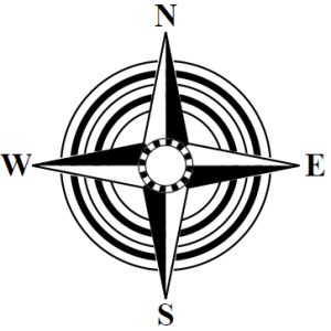
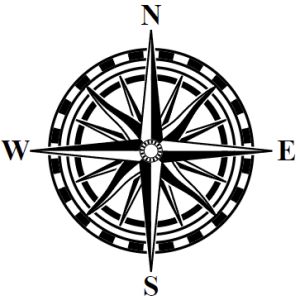
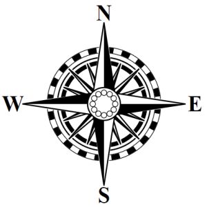
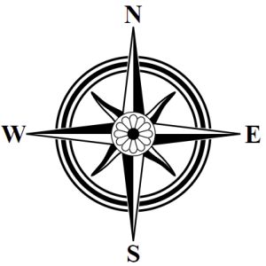
So far, all the compasses I have generated have been what I've called “two level" compasses.  They comprise a back layer of various rings, and a front layer of points.  Some compasses add to this a third layer that creates a center ornament on top of the rings, like this compass from the examples:


Most often the center ornament is a filled circle of some sort that covers the center part of the compass where the primary points meet.  Sometimes it is just a ring, as in this example:

Sometimes the circle is filled with an illustration of some sort, as in this example:

I don't have any way to draw illustrations (yet?) so I'll work on some circles and rings.

To start with, a three layer compass is just a two layer compass with an added center decoration:
<compass> => <twoLayerCompass> | <threeLayerCompass>;
<twoLayerCompass> => <labels> REMEMBER("start") <bottomLayer> <topLayer>;
<threeLayerCompass> => <twoLayerCompass> <centerDecoration>
For the center decoration, I'll start with a plain filled white circle.  To place it, I need to move the “cursor" to the radius I want.  Generally, I'd like the circle come out to about where the shoulders meet on the four cardinal pointers.  This turns out to be somewhere in the range of 51-58 pixels in from the outside of the compass, but I'll add some to the range so that I can get circles that more than cover the center, or that reveal some of the center.  To get to that radius, I'll use RECALL to get back to outside of the compass points, and then SPACE to move inward to around where the four cardinal points meet:
<centerDecoration> => RECALL("start") SPACE(`Utils.randRange(48,63)`) CIRCLE(`1`, "black", "white");
Some examples:

So that works, but I really don't like hardcoding the range for the center decoration into the rule.  I'd rather figure out where the shoulder of the cardinal points is and work from there.  Unfortunately as it stands that information isn't available.  The rule that creates the cardinal points looks like this:
<cardinalPoints> => RECALL("start")
		    RPOINT(0, 4, `Utils.randRange(0.825,0.925)`, 1, 1,
		    "black", "white", "black");
The third parameter to the RPOINT command is what places the shoulders of the cardinal points.  Since it is less than 1, it is treated as a percentage of the current radius, and the actual value is calculated in the implementation of RPOINT, so it isn't known until the CDL is actually executed.

To work around this, I'll create a special RECALL point “shoulder" with the idea that this won't be set by a REMEMBER command but instead set within the execution of the CDL when an RPOINT is drawn.  Since the cardinal points are always the last ones drawn, this will let me RECALL back to exactly the correct radius.

To do this, I'll modify Draw.rpoint so that it returns the radius at the shoulder, and I'll modify Draw.repeat to return that as well.  Then, in the CDL interpreter I can do this:
	} else if (op.op == 'RPOINT') {
// Draw radial compass points let shoulder = Draw.repeat(svg, center, radius, op.start, op.repeats, op, Draw.rpoint); memory['shoulder'] = shoulder; if (debug) console.log('Draw radial compass points.'); }
and save that value into the memory under the name 'shoulder' so that I can then jump to that radius with a RECALL command.  Now I can write:
<centerDecoration> => RECALL("shoulder") CIRCLE(`1`, "black", "white");
and the center decoration will be exactly the size to reach the shoulders of the cardinal points, regardless of the configuration.


It's nice to have a little variation on the size of the center decoration.  I can do this by putting in a random SPACE to move the radius in or out a bit.
<centerDecoration> => RECALL("shoulder")
		      SPACE(`Utils.rand(-2,2)`)
		      CIRCLE(`1`, "black", "white");

With that in place, let me elaborate that a bit and do multiple circles, as I did with rings:
<centerDecoration> => RECALL("shoulder") SPACE(`Utils.rand(-2,2)`) <circleFilled>;
<circleFilled> => <thinCircleFilled> | <thickCircleFilled> | <thickThinFilled> |
                <thinThickFilled>;
<$circleSpacingFilled> => 1 | 2 | 2 | 3;
<thickThinFilled> => <thickCircleFilled> SPACE(<$circleSpacingFilled>) <thinCircleFilled>;
<thinThickFilled> => <thinCircleFilled> SPACE(<$circleSpacingFilled>) <thickCircleFilled>;
<thinThinThinFilled> => <thinCircleFilled> SPACE(<$circleSpacingFilled>) <thinCircleFilled>
	          SPACE(<$circleSpacingFilled>) <thinCircleFilled>;
<thinThickThinFilled> => <thinCircleFilled> SPACE(<$circleSpacingFilled>) <thickCircleFilled>
                   SPACE(<$circleSpacingFilled>) <thinCircleFilled>;
<$thickWidthFilled> => 2.5 | 2 | 1.5;
<thickCircleFilled> => CIRCLE(<$thickWidthFilled>, "black", "white");
<thinCircleFilled> => CIRCLE(<$thinWidth>, "black", "white");
This is just the ring rules copied and slightly modified to suit the center decoration.  It produces circles within circles, some with thick outlines.  Some examples:


I don't love duplicating a big chunk of rules this way, but this is an area where using a rule-based generator has shortcomings.  There isn't really a notion of a “parameter" in these types of rules, so that limits how reusable the rules can be.

A variant of this type of center decoration is to have the inner circle be filled with black (as in one of the example compasses above).  That produces center decorations like this one:


Here's an example of a different style of center decoration:
Here the middle of the center decoration is empty, and let's the compass underneath show through.  This has to be drawn in a slightly different way.  It's really three lines:  a thin black line, a thick white line, and another thin black line.
<whiteRing> => <thinCircle> <thickWhiteCircle> <thinCircle>;
<thickWhiteCircle> => CIRCLE(<thickWhiteWidth>, "white", "none");
<thickWhiteWidth> => 3 | 2.5 | 2;
Here again there's a certain amount of redundancy with the similar rules for the first layer of the compass; since you can't parameterize rules for the fill color or the width, this is inevitable.


The second example here is on the edge of what I consider acceptable.  Since the rules have no way of knowing the current radius, there's no way to change the style of the center decoration for the compasses with very narrow cardinal points.

This compass from my examples has a scale as part of the center decoration:
There are several differences between the scale I'll use here and the ones used further out in the compass.  There isn't room for a lot of the elaboration I was able to use there, and likewise the lines have to be generally quite thin.  Also, it's problematic to start this scale with 8 segments in synch with the cardinal points, because it “disappears" as in this example:

Using just the simplest form of the scale seems to work the best:

At it's smallest, it really just looks like a pattern or even something like a flower.

Speaking of flowers, let's do a flower.  This is something that's going to take some careful planning, so I'll implement some better mechanisms for knowing where the current radius is and moving to a specific point.  To start with, I'll implement a one-time variable that will always be the current radius.  I don't know if I'll really need this, but it seems useful and easy enough to do.  I just add this line at the top of interpretCDL:
    for(let i=0;i<cdl.length;i++) {
	const op = cdl[i];
	memory['radius'] = radius;
	if (op.op == 'CIRCLE') {
Next I'll implement a command to move to a specific radius.  The SPACE command moves relative to the current radius; the MOVE command will just jump to the given radius.  In the CDL grammar, the command looks just like SPACE; in the interpreter it looks like this:
	} else if (op.op == 'SPACE') {
// Skip some space radius -= op.n; if (debug) console.log('Skip some space.'); } else if (op.op == 'MOVE') { // Move to the specified radius radius = op.n; if (debug) console.log('Move to a radius.');
So now I can just jump to a particular radius that works well for a flower.  We'll start with just a blank canvas:
Now we'll add some radial circles.
Now I'll move back out to the center of the radial circles and draw a white circle.

That looks pretty cool just like that, so I'm going to keep that as an option.  But to carry on, I'll now draw radial lines to the center of the compass.
That isn't what I was intending to do but again it looks pretty good so I'll keep it.  What I want is to shift the lines so they match up with the radial circles to form petals.
Optionally, I want to add a white or black center disk:

It can also look good to put the flower on a black background:
Here's another fun variant -- it should be obvious how it is drawn:
You can see the rules for all of these in the compass.rules file.

I can also do a center star of sorts:
I'm reusing the compass points to draw this, and there are a couple of drawbacks to this approach.  For one thing, I can only draw black stars, and secondly, because of a bug in Chrome there are some faint white lines visible.

This will wrap up compasses for now, although I'll have at least one more posting where I integrate this into the Dragons Abound code.  If you want the final version of the compasses code, you can download the Part 18 branch from the Procedural Map Compasses repository on Github.  You can also try out this code on the web at https://dragonsabound-part18.netlify.app/test.html although you'll only be able to run the code, not modify it.

Next time I'll write a short post-mortem on the Compasses project, what worked and what didn't, and what I learned from it.