Wednesday, February 3, 2021

Knurden Style: Forests (Part 5)

 In the last posting, I created individual trees:

Now I'll work on drawing forests.

In the Knurden map, forests are blobs with individual trees around the edges (and other decorations):
At a simplified level, these forests are a solid color surrounded by a ring of trees.  But drawing this isn't so easy, because the solid color in the center of the forest obscures the trees on the back edge of the forest and is in turn obscured by the trees on the front edge of the forest.  We can't even draw the back trees and then draw the solid color on top of them, because that would cut a straight edge across the back trees!  So how can we draw this effect?

My breakthrough realization was that the trees on the back edges of the forest are a lot like the partial trees in the middle of the forest.  I could draw in the solid color, and then draw “half trees" along the back edges, and then full trees along the front edges.

To start, I have to figure out how to draw a half tree.  To a first approximation, these half trees are like shortened full trees without the bottom part of the outline.  I'll tweak the shape and remove the outline:
But here the dark shadow on the right side of the tree goes across the bottom, which makes these look like complete short trees.  So I'll adjust the shadow so that it doesn't go across the bottom, so the bottom part of the tree looks more cut off.  And I'll draw the top half of the outline.
That looks pretty good (and this is somewhat larger than the trees will be on the map).

Before I can try these half trees out I need to fill in the solid color blob in the middle of the forest.  These really aren't a solid color on the Knurden map but I'll get to that eventually.  For now I'll just get the solid blob down.  This isn't too hard, because I have another forest style that also starts with a blob of color.  But even if I didn't, this is straightforward: identify the area where the forest will be and fill it with color.
Here I'm using a darker version of the land color; I'll probably tweak that eventually.

Now I need to draw the half trees on the “back" edge of this polygon.  But how do I tell which edges are on the back of the polygon?  That turns out to be surprisingly easy.  Imagine that you're walking around the polygon clockwise:
You'll realize after a moment's thought that whenever you're walking to the right, you're on the back edge of the polygon.  (This is one reason it is useful to have your polygons consistently clockwise or counter-clockwise ordered.)  So I can walk around the polygon clockwise, dropping half trees whenever I find myself going to the right:
One thing to note is that this will drop the trees in the wrong drawing order.  The trees need to be drawn from back to front, and this will often drop trees from front to back.  So after creating the trees you have to reorder them from back to front before drawing them.

The other half of this is to draw full trees on the rest of the polygon.  One subtlety to note before we do that.  Because the back trees are only drawn from the midpoint up, and they're drawn on the polygon, the midpoints of those trees are on the polygon.  So I need to do the same thing with the full trees. I don't want to draw them on the polygon, but shift them down some so that their midpoints are on the polygon as well.  Otherwise the front trees will look taller than the back trees.
Overall, this looks pretty good, but there are a few gaps.  After some debugging work, it turns out these are due to a coding error in my routine to interpolate a polygon.

To place the trees regularly around the edge of the polygon, I'm taking the original polygon and interpolating it to create a new polygon which has a point at every place where I'm going to place a tree.  Interpolating a polygon is a little tricky.  Imagine that you have a polygon and you're going to interpolate it so that you have points at some fixed interval instead of the original points:
Here I have a simple two segment polyline in black, and then I've marked out along it in red new points at a fixed interval.  But what happens when I create a new line based on those points?
Whoops!  I've cut off the original corner.  Less obvious but also problematic is that the last segment is much shorter than the other segments.  We really want an interpolation routine that (1) maintains all the original polygon points, and (2) equalizes the intervals between the new points.  It isn't possible to do both perfectly, but a reasonable compromise is to interpolate each line segment individually, selecting the number of pieces for the segment to get as close to the desired interval as possible.  That gives you something like this:
Now I've retained all the original points, and although the points on the second segment are further apart, I've avoided a very short interval right at the end of the line.

So how do you subdivide the segment?  The basic idea is to divide the length of the segment by the desired interval, and then round that number to the nearest integer.  That gives you the number of divisions, and you use that to calculate the actual interval.  (In the worst case, the actual interval will be +/- 50% of the desired interval, but it will usually much closer.)  Since this is a simple line segment, you can create the intervening points using the slope of the line.  Here's what that looks like in Javascript:

// Divides a line segment into step-sized chunks
function divideLineSegment(p1, p2, step) {
    // How many steps in this line?
    const n = Math.round(Utils.distance(p1, p2)/step);
    const dx = (p2[0]-p1[0])/n;
    const dy = (p2[1]-p1[1])/n;
    const npl = [p1];
    // We do this n-1 times so that we can use p2 as
    // the last point just to be sure it doesn't move
    // because of a rounding error.
    for(let i=1;i<n;i++) {
npl.push([p1[0]+dx*i, p1[1]+dy*i]);
    };
    npl.push(p2);
    return npl;
};

Note the trick here that uses the last point rather than calculate it from the slope.  This makes sure the point doesn't move due to a rounding error.  That's important when we're trying to get things to match up precisely on the screen.

Fixing that routine fixes most of the gaps:
Some gaps still arise where line segments are an awkward length, but happily the effect is actually better with occasional small gaps.

There are a couple of other elements needed to complete the forests.  To give the solid interior of the forest some variety, Daniel does a couple of things.  First, he scatters some treetops throughout the forest.  These are basically the same as the half-trees used to line the back edge of the forest, but to my eye a little bit shorter.  To create a good scatter of trees, I can use a Poisson sampling, as I've done before in similar cases.

That gets me to this:
The second thing Daniel adds are some patches of lighter and darker color, as if you're seeing the highlights and shadows of trees without the outlines.  However, the colors are not paired light + dark as they are in a tree, just scattered about.  I can add these by reusing the Poisson sampling to place light and dark patches.  He just draws these as short vertical lines, so I'll do the same.  The contrast on these is not as obvious as on the tree shadows and highlights, so I'll dial that back as well.
This looks okay, but this sort of thing -- a small, irregular dash of color -- is where SVG is weakest.  These spots lack any sort of character.  I've tried adding a blur, but that is not an improvement.  They're not terrible (especially when less zoomed), so I'll certainly keep them in, but I wish I could do something a little better.

Moving on, the last thing Daniel does is to give the solid color in the interior of the forest a slight light to dark gradient in the direction of the lighting.  This is somewhat harder to do in SVG because gradients are based on the rectangular bounding box of the polygon, meaning that they don't follow the contours of the polygon.  So instead of having the left edge of the polygon be lighter in color, you have the left area of the polygon lighter in color.  Which is not the same thing at all, but if the gradient isn't too obvious it still looks okay in many cases:
A side-by-side comparison of the original forests to the DA version:
Obviously it's not a precise match but I think it's pretty close and the overall “feel" is not bad.

In the course of implementing these forests I realized I already had a couple of other tree styles that could be used to draw forests this way instead of the Knurden-style trees, if I just implemented the half-tree and tree highlights.  This turned out to be more difficult than I expected (largely because of a pernicious bug that took a long time to find) but the results are fairly good:
Here I'm using the “fluffy" tree style, and I've implemented a (fairly rudimentary) half-tree as well as the highlight patches for inside the forest.  You can see some problems (primarily the half-trees along the left edge of the forest) but overall I think it looks pretty good.  The colors are more muted in this style, so it isn't as “graphic" as the Knurden style.

Here's the same forest style using fir trees:
This works better (or at least I like it better), partly because the geometry of the fir tree is closer to the Knurden oval tree shape.  

Next time I'll do labels (*) and clean up some last details.

(*) I came back to this to do the last two hybrid forest styles, so you can see the labels are actually implemented in those screenshots.

Tuesday, January 19, 2021

Knurden Style: Trees (Part 4)

 Now that mountains are in place, I'll turn my attention to work on trees:

There's more than one challenge in drawing these forests, but I'll start with drawing the individual trees that are used on their own and as the edges of the forests.  Here's a zoom that shows some trees in more detail:
These are really quite simple -- rough oval shapes with a highlight and a shadows.  There's no trunk but there is a cast shadow.  I have a fairly flexible tree drawing routine, but it seems like overkill for a simple oval shape, so I'll do this as a separate implementation.

I already have a routine to make an egg shape, so I'll start with that:
The trees on the original map are more ovals than egg shapes, but I rather like these shapes so I'll stick with them for now.  The red dot at the bottom of the tree is the anchor reference point.

Now I'll shrink these down to closer to the map size (although I'm showing them here at 2x), turn on some of the hand-drawn line qualities, and fill them with the background color:
So far so good.  The next step is to add a shadow.  This is done by adding a dark line down the correct side of the tree and then blending it into the rest of the tree.  First I have to try to snip out the correct part of the polygon that is the outline of the tree -- the right side of the polygon assuming the tree is lit from the left. 
Here I've simply drawn the snipped out line again as a heavier line.  (Which is kind of an interesting look in itself, but let's keep going.)  Now I'll modify the routine to draw the line in a darker version of the fill color and then blur it so it blends into the body of the tree:
Problem!  The blur smears outside of the tree.  In drawing the mountains this wasn't a problem because the line was inside the edge of the mountain, so even after blurring was still inside the outline.  But the trees are so small that even a small amount of blur leaks out past the edges.  The fix is to use the tree outline as a clipping area to eliminate anything outside of the tree outline.
And ta-da!  Shaded trees.  The drawback is that we have to create a clipping path for every individual tree on the map.  Programmatically this is easy enough to do, but if I do this too much I can end up handing the browser a very big and very complex SVG.

(Aside:  You might think this could be handled by drawing all the trees into a layer and then applying a single mask to the whole layer.  This would fail when two trees overlapped each other.  Both trees would have to be unmasked, so the blur from one tree would leak into the other.)

(As it turns out, at map scale the blur probably isn't even necessary.  But since you can zoom DA maps to any scale, it's nice to have it to look better when you zoom in.)

After a quick check to make sure the shadow works when the lighting comes from the right, I can move on to doing the highlight.  The highlight works much like the shadow, but it is only on the upper part of the tree.  I'll also make the highlight more yellow, as I did for mountains:
Here I've switched the light to come from the other side, just to make sure this works both ways.  The last part of the individual trees is the tree shadow.  This is just a gray ellipse at the base of the tree.  I'll start by putting an ellipse down on the position of the tree, and I'll make it red to see a bit more easily.  
Now I need to shift it down and in the opposite direction of the light.  I'll also stretch it out a bit: 
That looks pretty good.  Now I need to make the shadow gray and put it behind the tree.
I've made the shadow color 50% opacity, so it should take on the color of the background when it is on the map.

I can test this out by using these trees in the existing style that draws forests as masses of trees:
It's not quite like the Knurden map, but I think it actually looks pretty good.  And you can see how the mountains and this type of tree do work together nicely.

Next time I'll work on using these to create the actual Knurden-style forests.

Monday, December 28, 2020

Knurden Style: Basic Map (Part 3)

Last time I wrote the code to generate mountains in the Knurden map style; this time I want to set up a basic map style corresponding to the Knurden map and display the mountains on it.  Here's a reminder of the Knurden map style:


So let me work on some of the basic map settings to match this map.

I can start by setting the basic land and ocean colors.  The ocean is mottled, and Dragons Abound already supports that.  (The land has a special mottling that I'll get to.)
The ocean looks rather dark in comparison to the original map because the original map has wide band of lighter colors around the coast.  This is something I can try to replicate using my existing coast decoration specification.  One problem is that I don't have a specification to blur the coast decorations, but that's easily added.  I'll also add in the same number and spacing of “wave" lines around the coasts.
After some experimentation (and fixing a couple of bugs I found in how the coastline was being masked) I ended up with this.  It's not perfect but at least has a fairly similar feel.

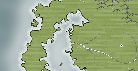
Moving on from the ocean, one difference in the maps is that the Dragons Abound maps have rivers that are the ocean color, rather than white (or the coastal water color) as in the Knurden map:
Dragons Abound has an option to pick up the coastal water color but it seems to be turned off.  (Probably some change broke it and I haven't fixed it yet.)  Fortunately, I can also just force a particular color:
(This river has some other problems, but I'm not going to tackle those at the moment.)

The land on the Knurden map has an interesting texture applied to it:
Horizontal streaks of (alternating) slightly darker and slightly lighter colors have been blended into the map's base land color.  Let me see about adding that.
As usual, I start with the “minimal viable product" as they would say in agile development circles.  (Although I guess I'm both the developer and the customer.)  Here I've just overlaid alternating dark and light bands on the map and applied a hefty blur.

As a first step to refining this texture, I'll break the lines up into segments and some variation in line length, thickness, tapers and so on.  I also set the opacity of the lines to roughly 50% and toned down the dark/light adjustment.  I've turned off the blur as well so I can see better what I've got:
Straight horizontal lines don't look very convincing.  When people draw horizontal lines, they tend to have an arc to them because our arms pivot on our elbows.  And right-handed people often draw on an upward angle.  I'll also add in some more random variation in spacing.
This looks pretty good, and not too different from the original map.  This is the sort of thing I can (and do) spend endless time tweaking, so I'll call it a success for now.  (At some point I'll have to think about how to draw a “brush stroke" in SVG, although lines with width variations are not a bad subsitute.)

Now let me switch over the mountain style on this map to use the Knurden-style mountains.  Dragons Abound is set up with some routines that fill areas with mountains (possibly with mountain chains embedded) that work with generic routines to create, move and draw single mountains.   So all I really need to do is call the mountain filling routines with pointers to the Knurden-style mountain functions. This exposed some bugs that I needed to fix, but with that done I have this:
Which I think looks pretty good and recreates the original's style well.

So that finishes off mountains, and next time I'll tackle the forest style.

Tuesday, December 15, 2020

Knurden Style: Mountains (Part 2)

In this posting, I'm going to work on recreating the mountain style used on the Knurden map, as shown in this excerpt:

The mountain outline here is pretty straightforward: A flattened vee with some concavity on the sides.  To get started, I'll grab some code from my existing mountains and delete out a lot of the details to get just the topline:
Well, at least it's a start!  I need to connect the tops of the sides and add some rounding.  I'll put in some size variety as well.
That looks close to the basic shape, but it's a little too jagged.  The Knurden mountains are very smooth and rounded, so I'll relax the curve I'm using to draw them.  I'll also make the proportions a little taller.
I know from experience I can make myself crazy chasing the perfect exact shape for a mountain, so I'm going to settle for this, which I hope is close enough. 

The shape is okay, but the quality of the line could be improved.  There's some width variation in the lines on the original map, and that's something I can already imitate.  The lines also tend to trail in and trail out (start small or end small) and that's something I can only do as a kludge, so this is a good opportunity to add that to my line drawing routine.  With that in place, I can have each line randomly trail in and out:
That adds some nice variation to the lines.

Next let me fill the mountains with a background color.
Okay, there may be a small problem here!  It looks like I'm not moving the baseline of the mountain when I move the rest of the mountain.  For mountains, I draw them in the center of the map at (0, 0) and then move them where they need to go.  In this case, I left the baseline (the invisible line that goes across the bottom of the mount) behind when I moved the mountains.  
That's better I suppose but apparently I still have something wrong.  As it turns out, I have some points in the baseline twice and one half of the baseline is backwards.  All that confuses the fill algorithm!  After straightening out the problem:
This is now mostly good.  You notice that I make the bottom of the mountain roughly convex and add some variation.  On this map that won't be too important, because the mountain matches the map color, but it helps sell the mountain as a 3D shape.  The area of the fill doesn't always match up precisely with the mountain outline (because the mountain outline is drawn with some jitter) but on the map the land behind the mountain will fill any gaps.

Now comes the more difficult job of shading the mountain.  I've magnified several mountains here to show in more detail how they are shaded:
It looks to me like the dark side of the mountain is shaded with some thick lines that start off parallel to the back side of the mountain and diminish as they go to the baseline (as noted in red).  On the light side of the mountain, there's a single broad stroke that goes 1/2 or less the distance down that side of the mountain (as shown in blue).  

Since the shadow side is below the lit side, I'll start there.  The first step is to try to get the shadow side of the mountain, duplicate it, and offset it into the inside of the mountain:
That looks okay so far, but the shadow line doesn't start up at the peak, so I need to shorten the top part of the line.
The next step is to draw the line in the shadow color, which is about 15-20% darker than the background color.
This causes the line to extend past the mountain baseline in some cases.  That's probably okay because the background will be the same color as the mountain.  More of a problem is that the line may be too big for some of the smaller mountains, but I'll wait to see before worrying about that.

For the bigger mountains, I need to add some additional lines of shadow.  After making a stupid mistake that took a while to find (nested for loops that were using the same loop variable) and adding some variation to the lines, I have this:
This looks pretty good on the largest mountains but the smaller mountains are a little messy.  I'll add some special cases for small mountains:
Okay, that looks reasonable.  Let me move on to the highlight.

The highlight is similar, but it is in a light color, on the other side of the mountain, and is wider and shorter.
That's an okay start but there are a few problems to address.  First, the color is not quite right.  This is evident if I put one of my mountains alongside one of the originals:
In the original, the color has been made more yellow to suggest sunlight.  I can do this by adding some green and taking away some blue:
That looks nicer.   The highlight is broader than the shadow, and closer to the outline, so it sometimes obscures the outline, as in the mountain above.  To fix this, I can draw the outline last so it is “on top" of the highlight.  I can also add a small blur to the highlights and shadows to soften their edges a bit.
This looks pretty good to my eye. 

I've added two new mountains to this map excerpt, see if you can spot them:
(Reviewing this several days later, I can't remember which ones they were!)

That's good enough for now, I think.  Next time I'll try them out on a map.

Thursday, December 3, 2020

Knurden Style: Overview (Part 1)

 I recently came across a map on Cartographer's Guild I liked quite a bit:  The Kingdom of Knurden by Daniel Hasenbos.  I've followed Daniel for a while and he's an excellent artist.  This map has an almost “comic book" style that blends bright primary colors with simple, bold graphical representations for forests and mountains:

(There are really two different styles on this map, because Daniel has rendered the northern part of the map quite differently, but I'm focused on the southern part as shown above.)

This is quite different from the styles that Dragons Abound currently implements, so I thought it would be a fun challenge to try to reproduce this style.  There are a number of different design elements that contribute to the overall style, and I'll be implementing them piecemeal over the following blog posts, but I wanted to start with a high-level analysis of some of the most interesting elements.

Hills and mountains both are represented by simple shaded, rounded vee shapes:

The inside of the mountain shape has two shading areas, based upon the background color.  The lighter shaded area is to the “lit" side of the mountain and is typically smaller; it is a rounded rectangle that starts at the top of the mountain (extending down a bit on the unlit side) and runs parallel to the line that defines the lit side of the mountain.  The darker shaded area is below the lighter shaded area and to the “unlit" side of the mountain.  Hills are simply small versions of the larger mountains.

Overall, the design of the mountains is simple, but creates a pleasing sense of perspective and mass.  Especially where the mountains overlap, the shading creates a nice illusion of depth.  The rounded shapes used for both the mountain outline and the shading give the mountains a smooth contour that suggests welcoming old mountains worn down by erosion and time.  (In contrast, the mountains in the northern part of the map are shown as sharp, connected ridges that seem much more forbidding.)

Forests are represented by masses outlined by individual trees:

The individual trees are simple upright ovals, with a two-tone shading scheme very similar to the mountains.  There is a highlight on the top and lit side of the tree, and a bigger shadow on the unlit side of the tree.  Unlike the mountains, the trees also cast a gray shadow on the ground.  (Which, oddly, doesn't seem to quite align with the highlights.)  A forest is depicted as a circle of these individual trees, with the interior filled with a formless color.  In this color there are two types of decorations.  The first are blotches of the tree highlight and shadow colors, as if you were glimpsing tree shapes within the undifferentiated mass.  The second are disconnected tops of individual trees, as if they were sticking up from the undifferentiated mass.  In addition to the forest mass, there are individual trees scattered nearby.

The design of the forests is more complex than the mountains.  The use of small individual elements within the forests (as well as the decorations) produces a textured feel that the mountains lack, but the use of the same highlighting scheme makes them harmonious with the mountains.  Of all the elements on the map, only the trees and forest shapes cast a shadow.  This makes them seem more representational and distinct than the other elements.  (The city icons in particular seem flat and symbolic in comparison.)  Depicting the interior of the forests as a solid mass gives the impression of a dense, thick, unrelieved forest, particularly in comparison to the individual trees scattered about the edges of the forests.  The line of individual trees around the edge of the forest creates a very specific demarcation.  There's no gradual transition from grasslands to forest, but rather an abrupt transformation.

Something I haven't seen before is the land texture:


Horizontal strokes of lighter and darker colors have been added to a base color to create a land texture.  The color differences are subtle but it adds some interest to what would otherwise seem very flat.

The treatment of the coast line also features something I haven't seen before:


Like many maps, the water features some closely placed wave lines.  But there's also a wandering, fanciful line on the inside of the coastline.  This line loosely follows the coast, occasionally interrupted by a bigger “loop".  The coastline also features a small shading line underneath this line.

The upper part of this map transitions into a realm of snow and ice that is also imaginatively drawn but I'll focus on the lower part of the map.  In the following posts I'll try to capture something of the flavor of this map by implementing some of these features.