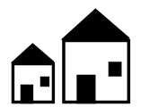
To start with I'm going to try to generate a simple house:
Basically an outline with doors and windows. Typically one or two of these little house icons is used for a small city (e.g., Maltina or Pahamo in the map above), and often fill in the spaces in a big city (e.g., Monterey or Gafemnoro in the map above). These simple houses also have many of the elements used to draw bigger buildings like towers, i.e., a roof, windows, doors and so on. One of the challenges will be to make these drawings look good at map scale. The example maps above are higher resolution than Dragons Abound maps, and those icons are already small. For my maps, the small buildings will be around 6 pixels wide at the default resolution.
Of course, I don't want to generate the same house over and over, so one thing that's worth thinking about up-front is how the procedural generation will vary the house, and which parts are constant and which can change. The key constant element here is probably the height of the house, or more accurately the height of one story of building. I can vary the width of the house, the height of the roof and the placement of the doors and windows, but it doesn't make sense to have buildings with different scales:
(Although I suppose if you had hobbits and giants living in the same city...) I also want to limit the number of constants so that I can generate a nice variety of houses, but I also want the variable factors to stay reasonable. One good way to do this is to generate the other variable factors based upon the constants, for example, by saying that the width of the house can vary from 1 to 2 times the height. In this case, I'm going to try to base everything off the height.
The first step is to generate the basic outline, with some variation in the width of the house and the height of the roof:
At this point it occurs to me that it will probably be useful to separate the creation of the house from the drawing of the house. My top-level code looks something like this:
function createSimpleHouse(world, mapParams, x, y, height) {
  const house = {};
  createHouseOutline(world, mapParams, house, x, y, height);
  createHouseRoof(world, mapParams, house);
  return house;
};

function drawSimpleHouse(world, mapParams, svg, house) {
  const allhouse = svg.append('g');
  drawHouseOutline(world, mapParams, allhouse, house);
  drawHouseRoof(world, mapParams, allhouse, house);
  return allhouse;
};
Creating houses with black roofs is now just a matter of making that an option in drawHouseRoof:
Likewise, I need to fill the main part of the house, either to obscure the background or to make them a particular color, like the red icons in the example map above.
Now let's add doors and windows. The door height and width are determined by the building height, and at least initially it can be anywhere along the front of the house, with a little buffer at either side.
And we need to be able to fill the doors in as well.
One interesting point about my example maps is that doors don't always appear on buildings (perhaps the door is on a different side). So to accommodate that I'll put a random chance on a door appearing.
Now I need windows. Windows can vary more than doors in terms of height and width, so I'll pick a size randomly and then fill in to either side of the door (if there is one). The top of the window will be set to align with the top of the door.
One thing I learned in doing mountains is that scaling down doesn't always look good. You need to generate graphics at the scale it will be used and tweak it to look good at that size. So for the most part in this series of postings I'll be showing images at the tiny scale they'll be used.
So how does this look at map scale?
So how does this look at map scale?
That's not too bad. The details are clearly visible and it's easy to distinguish the different houses.


They do look nice, but I think every house should have at least a door or a window. The completely empty fronts seem wrong to me.
ReplyDeleteThey look better in an icon with other buildings, but you're not entirely wrong. Further along in the development I ended up turning the chance for empty buildings down quite a bit.
ReplyDeleteThanks for your post which is truly informative for us and we will surely keep visiting this website.
ReplyDeleteFront Entry Doors
Windows And Doors Las Vegas