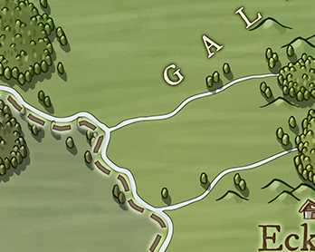
Now that mountains are in place, I'll turn my attention to work on trees:
There's more than one challenge in drawing these forests, but I'll start with drawing the individual trees that are used on their own and as the edges of the forests. Here's a zoom that shows some trees in more detail:These are really quite simple -- rough oval shapes with a highlight and a shadows. There's no trunk but there is a cast shadow. I have a fairly flexible tree drawing routine, but it seems like overkill for a simple oval shape, so I'll do this as a separate implementation.I already have a routine to make an egg shape, so I'll start with that:
The trees on the original map are more ovals than egg shapes, but I rather like these shapes so I'll stick with them for now. The red dot at the bottom of the tree is the anchor reference point.Now I'll shrink these down to closer to the map size (although I'm showing them here at 2x), turn on some of the hand-drawn line qualities, and fill them with the background color:
So far so good. The next step is to add a shadow. This is done by adding a dark line down the correct side of the tree and then blending it into the rest of the tree. First I have to try to snip out the correct part of the polygon that is the outline of the tree -- the right side of the polygon assuming the tree is lit from the left. Here I've simply drawn the snipped out line again as a heavier line. (Which is kind of an interesting look in itself, but let's keep going.) Now I'll modify the routine to draw the line in a darker version of the fill color and then blur it so it blends into the body of the tree:Problem! The blur smears outside of the tree. In drawing the mountains this wasn't a problem because the line was inside the edge of the mountain, so even after blurring was still inside the outline. But the trees are so small that even a small amount of blur leaks out past the edges. The fix is to use the tree outline as a clipping area to eliminate anything outside of the tree outline.And ta-da! Shaded trees. The drawback is that we have to create a clipping path for every individual tree on the map. Programmatically this is easy enough to do, but if I do this too much I can end up handing the browser a very big and very complex SVG.(Aside: You might think this could be handled by drawing all the trees into a layer and then applying a single mask to the whole layer. This would fail when two trees overlapped each other. Both trees would have to be unmasked, so the blur from one tree would leak into the other.)
(As it turns out, at map scale the blur probably isn't even necessary. But since you can zoom DA maps to any scale, it's nice to have it to look better when you zoom in.)
I've made the shadow color 50% opacity, so it should take on the color of the background when it is on the map.
After a quick check to make sure the shadow works when the lighting comes from the right, I can move on to doing the highlight. The highlight works much like the shadow, but it is only on the upper part of the tree. I'll also make the highlight more yellow, as I did for mountains:
Here I've switched the light to come from the other side, just to make sure this works both ways. The last part of the individual trees is the tree shadow. This is just a gray ellipse at the base of the tree. I'll start by putting an ellipse down on the position of the tree, and I'll make it red to see a bit more easily.
Now I need to shift it down and in the opposite direction of the light. I'll also stretch it out a bit:
That looks pretty good. Now I need to make the shadow gray and put it behind the tree.I've made the shadow color 50% opacity, so it should take on the color of the background when it is on the map.
I can test this out by using these trees in the existing style that draws forests as masses of trees:
It's not quite like the Knurden map, but I think it actually looks pretty good. And you can see how the mountains and this type of tree do work together nicely.Next time I'll work on using these to create the actual Knurden-style forests.


