Last time I wrote the code to generate mountains in the Knurden map style; this time I want to set up a basic map style corresponding to the Knurden map and display the mountains on it. Here's a reminder of the Knurden map style:
I can start by setting the basic land and ocean colors. The ocean is mottled, and Dragons Abound already supports that. (The land has a special mottling that I'll get to.)
The ocean looks rather dark in comparison to the original map because the original map has wide band of lighter colors around the coast. This is something I can try to replicate using my existing coast decoration specification. One problem is that I don't have a specification to blur the coast decorations, but that's easily added. I'll also add in the same number and spacing of “wave" lines around the coasts.
After some experimentation (and fixing a couple of bugs I found in how the coastline was being masked) I ended up with this. It's not perfect but at least has a fairly similar feel.
(This river has some other problems, but I'm not going to tackle those at the moment.)The ocean looks rather dark in comparison to the original map because the original map has wide band of lighter colors around the coast. This is something I can try to replicate using my existing coast decoration specification. One problem is that I don't have a specification to blur the coast decorations, but that's easily added. I'll also add in the same number and spacing of “wave" lines around the coasts.
After some experimentation (and fixing a couple of bugs I found in how the coastline was being masked) I ended up with this. It's not perfect but at least has a fairly similar feel.
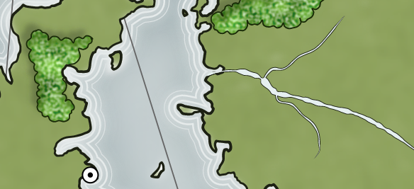
Moving on from the ocean, one difference in the maps is that the Dragons Abound maps have rivers that are the ocean color, rather than white (or the coastal water color) as in the Knurden map:
Dragons Abound has an option to pick up the coastal water color but it seems to be turned off. (Probably some change broke it and I haven't fixed it yet.) Fortunately, I can also just force a particular color:The land on the Knurden map has an interesting texture applied to it:
Horizontal streaks of (alternating) slightly darker and slightly lighter colors have been blended into the map's base land color. Let me see about adding that.As usual, I start with the “minimal viable product" as they would say in agile development circles. (Although I guess I'm both the developer and the customer.) Here I've just overlaid alternating dark and light bands on the map and applied a hefty blur.As a first step to refining this texture, I'll break the lines up into segments and some variation in line length, thickness, tapers and so on. I also set the opacity of the lines to roughly 50% and toned down the dark/light adjustment. I've turned off the blur as well so I can see better what I've got:
Straight horizontal lines don't look very convincing. When people draw horizontal lines, they tend to have an arc to them because our arms pivot on our elbows. And right-handed people often draw on an upward angle. I'll also add in some more random variation in spacing.This looks pretty good, and not too different from the original map. This is the sort of thing I can (and do) spend endless time tweaking, so I'll call it a success for now. (At some point I'll have to think about how to draw a “brush stroke" in SVG, although lines with width variations are not a bad subsitute.)Now let me switch over the mountain style on this map to use the Knurden-style mountains. Dragons Abound is set up with some routines that fill areas with mountains (possibly with mountain chains embedded) that work with generic routines to create, move and draw single mountains. So all I really need to do is call the mountain filling routines with pointers to the Knurden-style mountain functions. This exposed some bugs that I needed to fix, but with that done I have this:
Which I think looks pretty good and recreates the original's style well.So that finishes off mountains, and next time I'll tackle the forest style.


No comments:
Post a Comment
Note: Only a member of this blog may post a comment.