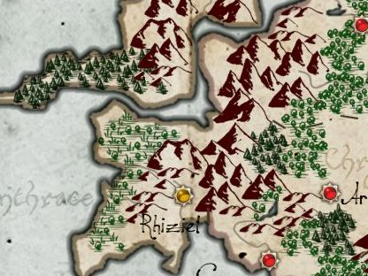
Another approach to illustrating a forest is to fill the area with individual tree symbols. Here's an sample of that from one of my example maps:
Tree symbols like these fit well on maps where the rest of the representation is also symbolic.
Usually mapmakers have a small number of different tree symbols to provide some variety. If you look closely at this sample you can see that although it looks varied, there are only 4-5 different tree symbols.
But sometimes just one symbol is used:
I don't really like this approach, but it can look okay when the symbol is tightly packed and forms an overall texture.
Sometimes map-makers use different symbols to distinguish temperate forests from alpine forests and swamps:
In this example you can see that the map has fluffy trees, pointy trees and trees mixed with plants in the swamps.
The usual approach for the tree symbols is a stylized tree shape with some rudimentary shading and a line to indicate a trunk, sometimes with a shadow underneath the tree. But some map-makers use simpler symbols, sometimes no more than a rough brush stroke.
Over the next series of blog posts I'll work on implementing this style of forest illustration in Dragons Abound. Obviously I'll be procedurally generating the individual trees, and I intend to tackle both deciduous (fluffy) and coniferous (pointy) trees.


No comments:
Post a Comment
Note: Only a member of this blog may post a comment.