One
problem with this map is that borders and rivers are obscured by
the forest. The solution is to draw the forest first and the borders
and rivers last, but this turns out to be one of those impossible
ordering situations. I want the mountains after the rivers and borders,
and the forests before the rivers and borders, but I also need the
mountains after the forests. (So that I can avoid the mountains when
drawing the forests.) That doesn't work: I can't draw the mountains first *and* last. The solution in this sort of
situation is to draw the mountain on a different layer. Then I can draw
the mountains first, but put its layer on top of the rest of the land
so that it is displayed last.
This
works, but doesn't look particularly good. There's a weird refraction effect where the rivers cross the psuedo-3D forests, for one thing. Looking
at sample maps that use forest masses, most of them part the forests
around the rivers.
So
perhaps it is worthwhile to see if I can do that. This is much like
pushing the forest back from the coast -- but instead of staying a
certain distance away from the sea, I stay a certain distance away from
river locations. The only pitfall here is that I don't want my forest
edges to overlap -- which can happen if I set this distance too low.
You
can see a couple of spots on this map near the ends of rivers where the
forest edge is getting drawn back on itself. As long as it's only
small spots like that it looks fine.
So let me see about adding that texture to my forest masses.
The basic shape used in these textures is just a bump. Sometimes these bumps are peaky (left side of the examples above) and sometimes flatter (right side). These bumps can be fairly widely spaced (upper right) or packed tight (lower left). So it looks like the basic functionality I need is to fill a forest mass with bumps, with a couple of parameters to control bumpiness and spread. This is basically the same algorithm I use to place mountain symbols on the map, although this will be simpler.
Here's a first try:
Nailed it! Although it may benefit from a *few* tweaks.
Okay, that's not too terrible. The bumps are a little too regular in size and shape, though. And the color of the bumps needs to be a darkened version of the forest mass color, not black.
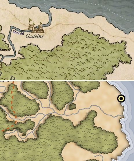
For fun, I did a side-by-side comparison between my forests and one of my example maps:


Awesome! It's looking very good indeed. The texture on the forest and the river running trough it really adds a lot to the look and feel. Looking forward to your next update!
ReplyDeleteThanks for the feedback. I agree about the texture, it really makes the forest work.
DeleteI think the shadowing around the edges really takes away from the handmade look I think you are going after. Other than that, it's looking great!
ReplyDeleteI like the shadow edges, so I've been a little surprised that so many people don't like it. Because naturally I expect everyone to agree with me on everything :-)
DeleteAll of this is just utterly mind-blowingly awesome. The only suggestion I could think to make would be a grittier texture for the ground, the current one has a real blurry-perlin-noise feel to it. Which is still awesome, of course!
ReplyDeleteA gritty land texture is on the TODO list. SVG is an inherently vector format, so some things that would be easy in a raster format (textures being one) are a little more challenging in SVG.
DeleteThis really is some great stuff, it's looking fantastic. I will join the pile-on about the shadowing, though- it feels a little jarring considering the pen-and-ink look for the rest of the elements.
ReplyDelete