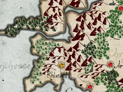
There are two basic approaches. The first approach is to fill the area of the map where the woods are with individual tree symbols.
Usually mapmakers have a small number of different tree symbols to provide some variety.
But sometimes just one symbol is used.
Sometimes map-makers use different sets of symbols to distinguish temperate forests from alpine forests and swamps.
The usual approach for the tree symbols is a stylized tree shape with some rudimentary shading and a line to indicate a trunk, sometimes with a shadow underneath the tree. But some map-makers use simpler symbols, sometimes no more than a rough brush stroke.
The second approach is to illustrate the woods as a single mass without distinguishing individual trees.
This is often shaded to give it a three-dimensional but flattened look. Sometimes the interior of the shape is mottled to suggest individual trees.
Partial tree shapes can be added along the edges of the mass to create interest:
Or in the interior of the mass to add texture. Different shapes can be added to signal different types of forest.
With enough tree shapes within the mass the result is a hybrid: the forest as a mass filled with tree texture:
Initially I'll be working on implementing the "forest mass" style of illustrating a forest.


No comments:
Post a Comment
Note: Only a member of this blog may post a comment.